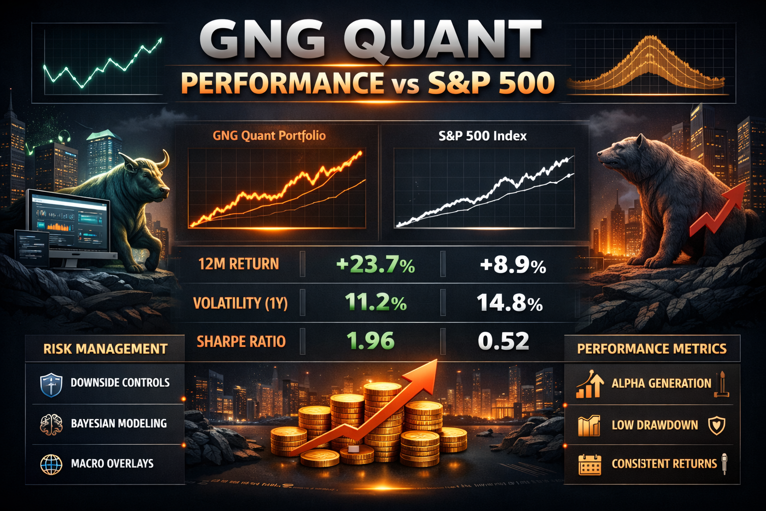
A performance update for GNG Research members
Every pilot trusts their instruments until the day they don't. The altimeter reads 5,000 feet. The world outside the cockpit is nothing but clouds. You're flying on faith in a number.
GNG Quant Powered by Vulcan is an instrument. Since late December 2025, we've been flying blind — running weekly screens, logging the top 200 names across 5,000+ tickers, and then waiting to see if the altimeter was telling the truth. No adjustments. No 'well, the market was weird that week.' Just the raw forward return versus the S&P 500, measured at 5 trading days and 21 trading days, for every single run.
Eight weeks of live out-of-sample data just printed. Here's what the clouds revealed. GNG Quant is available on every stock details ticker page and in research terminal as a metric. Example Stock page to look at I used for a new article coming out later today is (GILD)
What We're Actually Testing
A quick map for members who are newer to how GNG Quant works. Every Sunday the system screens 5,000+ tickers across 170+ metrics, ranking everything from gross margins and ROIC to momentum and safety scores. It outputs two ranked lists of the top 200 names.
The global list takes the best 200 stocks regardless of which sector they're from. The sector-neutral list enforces representation across sectors so one hot theme can't dominate the whole screen.
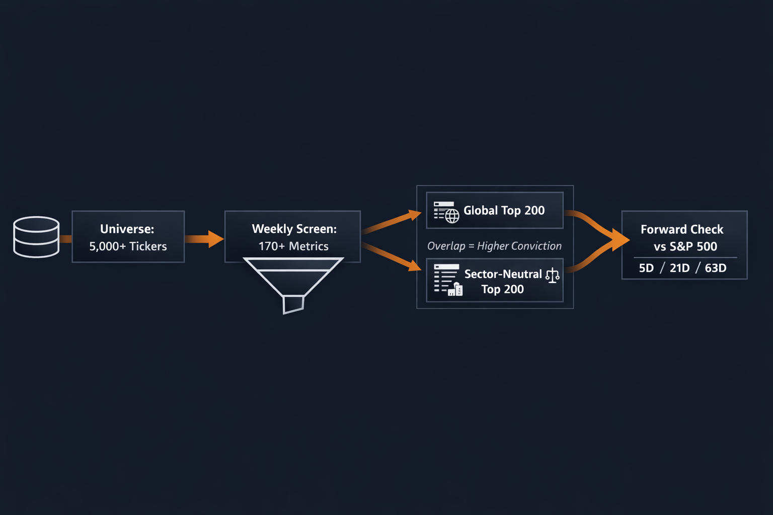
Running both isn't redundancy. It's a stress test. When a name shows up near the top of both lists, that's the market and the model independently arriving at the same answer. Those double-signal names are where the diligence should start.
The forward-check script then asks a cold, unsentimental question: did the screen's top 200 actually outperform the S&P 500 over the following 5 trading days? 21 trading days? It doesn't grade on a curve. It doesn't care about macro excuses. It computes the alpha.
The 5-Day Read: Eight Out of Nine
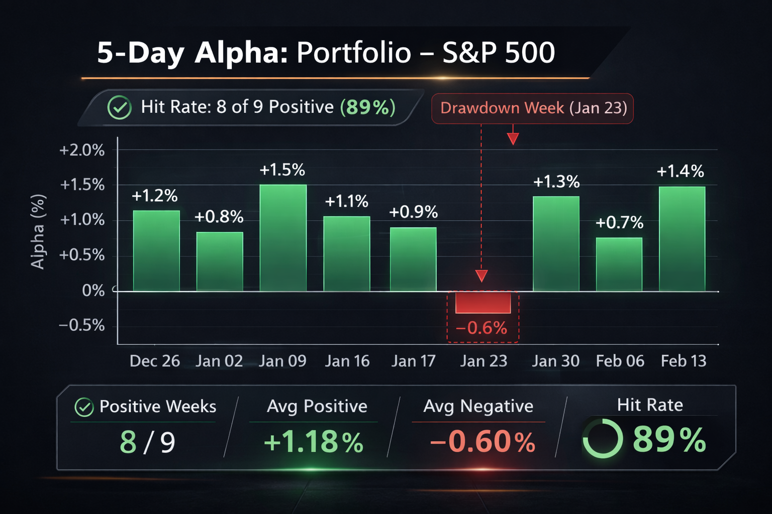
Across nine tracked windows from December 26, 2025 through February 13, 2026, the hit rate on the 5-day horizon is 89%. Eight positive. One negative.
Average alpha across both surfaces, all nine windows: +1.34% per 5-day period.
Now about that January 23 run.
Both surfaces went negative. Hard. The global screen was down -2.96% versus the S&P while the benchmark returned +0.40%. The sector-neutral wasn't much better at -2.50%. It was a clean miss on a rough week for the screen's highest-conviction names.
I'm not going to explain it away. Markets rotate, and sometimes the quality-momentum combination that usually wins gets punished in risk-off rotations where everything correlates to one. That week, it did. The screen paid tuition. The 89% hit rate is real because the 11% miss is also real, and I'd rather you see it clean than wonder if I'm hiding something.
What the data also shows: the model bounced back. February 6 posted +2.62% average alpha. February 13 came in positive again. The instrument righted itself.
The 21-Day Read: This Is the Number I'm Watching
Here's where I'll be honest — the 5-day data is encouraging but the sample size is still small enough to keep me humble. Nine windows isn't a career. It's a start.
The 21-trading-day data is different. Five completed windows. Five positive. No misses.
Average alpha at 21 days across both surfaces: +5.22%. Five for five. No misses. Every single measured window positive.
Read that again. Over a one-month holding horizon, the screen has generated +5.22% average excess return versus the S&P 500, across every single measured window. The global surface averaged +5.44%. Sector-neutral averaged +5.00%.
I don't know what to do with a number like that except say it out loud and keep tracking it. The data will either confirm it or it won't. Right now it's 5 for 5.
What Happens If You Compound It Out
A thought experiment worth running: if you treated each 5-day window as a sequential rebalance, put the same dollar to work each week, and compounded the returns forward, what would the equity curve look like?
Across nine runs, the S&P 500 benchmark compounded to roughly +0.16% total. The strategy — averaging the global and sector-neutral surfaces — compounded to roughly +12.79%. That's approximately +12.61% cumulative excess return over the sequence.
Global-only: +13.38% excess. Sector-neutral-only: +11.84% excess.
One hard caveat before this number runs away from its context: these nine windows overlap in calendar time. You can't literally run all nine simultaneously. This is 'what if each window ran independently' math, not a live NAV. But the directional story is clear — the screen has been finding excess return consistently, not randomly.
What GNG Quant Is, and Isn't
This isn't a black box that magically prints money. It's a ranking engine. It surfaces a shortlist of names that are statistically more likely to beat the index, based on the way those names score across a broad, multi-factor set of metrics.
It does not replace diligence. It does not replace position sizing. It does not replace risk management. It is not a license to go all-in on whatever shows up in the top ten.
What it does do is compress your search time. It cuts the universe from thousands of names down to a few hundred that are, historically and now in live forward-testing, tilted toward outperformance.
And it does it consistently enough that the forward alpha is no longer theoretical. It's measured.
The Member Takeaway
If you're a member, here's what I want you to do with this information:
Use the top 200 lists as a hunting ground, not a portfolio.
Prioritize the overlap names that score highly on both global and sector-neutral lists.
Run your fundamental thesis, your valuation work, and your technical timing against that shortlist.
If a name still looks good after diligence, size it appropriately.
If it doesn't, skip it. The screen will give you more names next week.
The big unlock isn't "buy everything." It's that you no longer have to guess where to look.
What We're Watching Next
The next major milestone is when the 63-trading-day data starts printing. That's where the signal gets harder to fake.
Short-term alpha can be noise. One-month alpha can still be luck. A full quarter of sustained outperformance across repeated runs starts to look like an edge.
We're not there yet. But we're building the track record in public.
And so far, the instrument is reading higher than the benchmark.
Stay tuned. The instrument is showing something interesting.
Appendix: How to Read the Alpha Numbers
In your forward-check logs, each run prints the following fields for each surface:
bench: the S&P 500 return over the measured horizon
port_mean: the equal-weight average forward return of the top 200 names in that surface
alpha: the difference between port_mean and bench (port_mean - bench)
port_n: how many tickers were successfully measured for forward returns
asof_coverage: how complete the as-of price data was
fwd_coverage: how complete the forward return data was
When forward bars are not yet available (for example, 63 trading days after a recent run), the script will print port_fwd_n=0 and fwd_coverage=0.000. That just means the horizon hasn't elapsed yet.
The key thing to focus on isn't any single week. It's whether the hit rate stays high and whether the average alpha remains positive as more windows print.
That's the difference between a lucky streak and a real instrument.