Your Complete Guide to the Company Details Page
Alright.. welcome to article number five in the Getting Started series. If you've been following along, you've already explored the Research Terminal, the Portfolio Tracker, the Dividend Forecaster, and Watchlists. Now we're going deep on the page you'll probably spend the most time on: the Company Details Page.
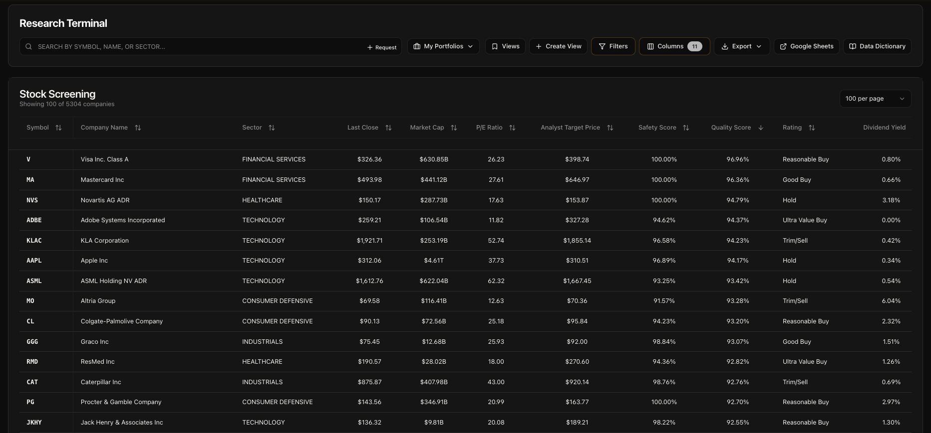
This is the page you land on every time you click a ticker. Whether it's from the Research Terminal, a watchlist, an article, or just typing the URL directly.. this is where you get the full picture on any stock. Price charts, valuation overlays, GNG scoring, options chains, dividends, financials, technicals, news, and more. All on one page.
I designed this page to be the single place you'd go to get the full picture on a stock. No tab switching, no bouncing between different tools. Everything you need is right here, organized in a way that makes sense. Let's get into it.
What Is the Company Details Page?
The Company Details page is your single-stock deep dive. It pulls together everything GNG knows about a company into one scrollable page. We're talking price history going back to 1999, valuation multiples overlaid on the chart, proprietary GNG scoring and fair value analysis, full options chains with Greeks, dividend history with growth rates, 47 key metrics, a complete technical indicators dashboard, quarterly financial statements, company news with sentiment analysis, and a sidebar with a live sentiment gauge.
Every company in our database of 4,591 active stocks has one of these pages. And the data updates daily through our automated pipeline, so what you see is always current.
How to Get There
There are a few ways to land on a Company Details page:
Use the search bar at the top of the screen. This is the most common and easiest way.
Click any ticker in the Research Terminal. Every row in the table is clickable. Click the symbol and you're there.
Click a ticker in your Watchlist. Same thing. Any ticker row takes you straight to its detail page.
Type the URL directly. Go to gngresearch.com/stock/AAPL (or whatever ticker you want). Replace AAPL with any symbol.
Click a ticker mentioned in an article or news item. Ticker links throughout the platform all lead here.
That's it.. no hidden menus or secret handshakes required.
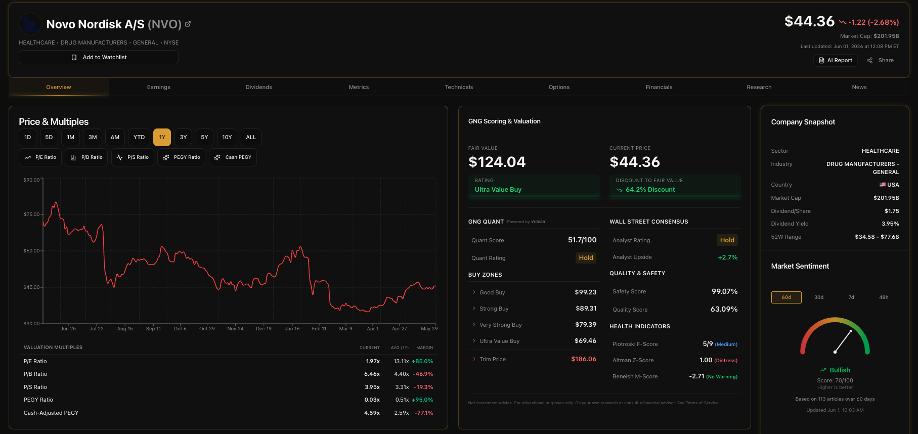
The Ticker Header
The very top of the page gives you the essentials at a glance. On the left side you've got the ticker symbol displayed big and bold in gold, the exchange badge (NYSE, NASDAQ, etc.), and a LIVE badge with a green pulse animation when the market is open. Below that is the company name (which links to the company's official website if we have it) and the sector and industry.
On the right side, you've got the current price in large text, the dollar change and percentage change for the day (green for up, red for down), the market cap, the last updated timestamp in Eastern Time, and a share button so you can send the page to someone.

The Navigation Bar
Right below the header, there's a sticky navigation bar that stays pinned to the top of the screen as you scroll. This is your quick-jump menu. For stocks, you'll see eight sections:
Overview - Price chart and GNG Scoring
Options - Full options chain (if the stock has options)
Dividends - Dividend history and metrics
Metrics - Key valuation and financial metrics
Technicals - Technical indicators dashboard
Financials - Income statement, balance sheet, and earnings
Research - Related GNG articles
News - External company news
Click any section and the page smooth-scrolls right to it. The active section gets a gold glow underline so you always know where you are. If you're looking at an ETF instead of a stock, the tabs adjust automatically. ETFs show Overview, Dividends, Metrics, Holdings, Research, and News instead.
Overview - Price Chart
Alright, this is the first thing you see below the header and it's one of the most powerful sections on the page. The Price & Multiples chart shows the stock's price history with 11 different timeframes you can toggle between.
Price & Multiples Chart
The chart displays the stock's closing price as a line. Green line means the stock is up for the selected period, red means it's down. You can switch between 1D, 5D, 1M, 3M, 6M, YTD, 1Y, 3Y, 5Y, 10Y, and ALL timeframes using the buttons at the top. The default view is 1Y.
For the 1D and 5D views, intraday data is available with prices delayed up to 20 minutes during extended hours (4:00 AM - 8:00 PM ET). All other timeframes use end-of-day closing prices.
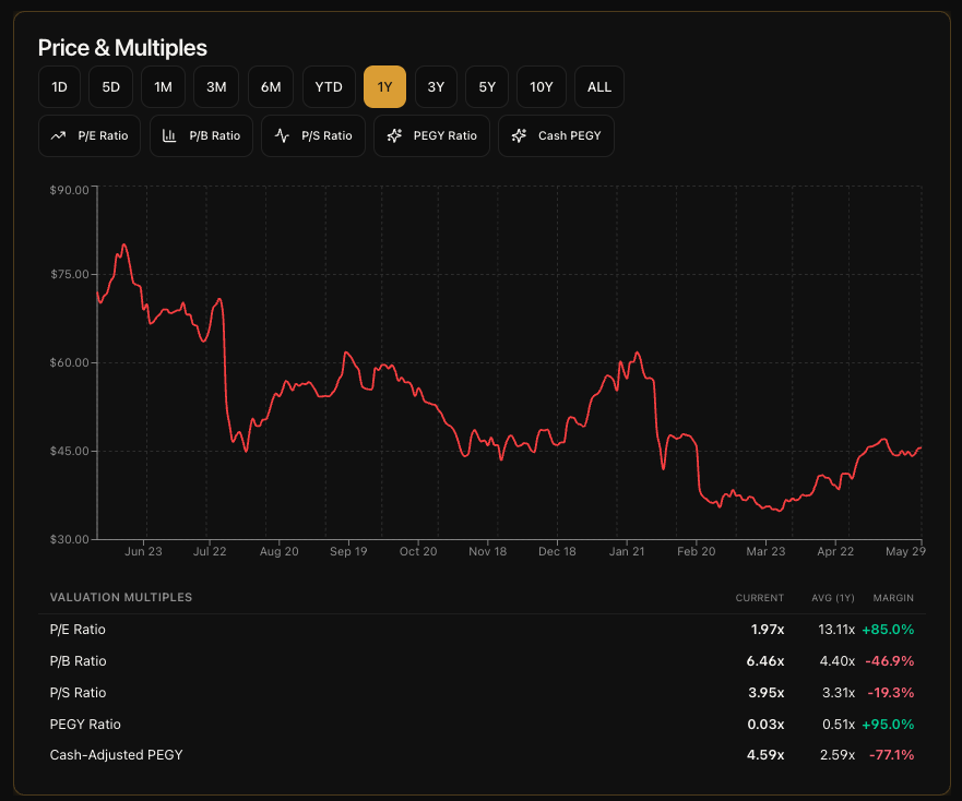
Chart Overlays
This is where it gets really interesting. Below the timeframe buttons, you'll see five overlay toggle buttons: P/E Ratio, P/B Ratio, P/S Ratio, PEGY Ratio, and Cash PEGY. Click any of them and a second line appears on the chart, plotted on its own axis on the right side.
Here's what each one tells you:
P/E Ratio - Shows you how the market is valuing the company relative to its earnings over time. When this line is high compared to its historical average, the stock might be expensive. When it's low, it could be a better value. This is the one I look at most often.
P/B Ratio - Compares the stock price to the company's book value. Useful for capital-heavy businesses like banks, insurance companies, and manufacturers. A low P/B relative to history can signal undervaluation.
P/S Ratio - Price relative to revenue. This one's especially useful for growth companies that might not have consistent earnings yet. It tells you what you're paying per dollar of sales.
PEGY Ratio - This is like a PEG ratio but factors in the dividend yield too. It's great for dividend-paying growth stocks. A lower PEGY generally means better value when you account for both growth and income.
Cash-Adjusted PEGY - Same concept as PEGY but adjusted for the company's cash position. This gives you a cleaner picture for companies sitting on large cash reserves.
You can toggle multiple overlays on at the same time. Each one gets its own color in the legend at the bottom of the chart. The real power move is turning on P/E and watching how it tracks (or diverges from) the price line over a 5Y or 10Y period. That tells you a lot about whether a stock's current price is justified by fundamentals or driven by sentiment.
Micro KPI Cards
Below the chart, you'll see five compact cards showing the current value and historical average for each valuation multiple: P/E, P/B, P/S, PEGY, and Cash-Adjusted PEGY. Each card also shows a Margin vs Average badge. A green badge with a positive percentage means the current value is below the historical average for that timeframe, which could indicate a margin of safety. A red badge means it's above average.
These cards update dynamically based on whichever timeframe you have selected, so if you switch from 1Y to 5Y, the averages recalculate. It's a quick way to see at a glance whether a stock's multiples are elevated or compressed relative to its own history.
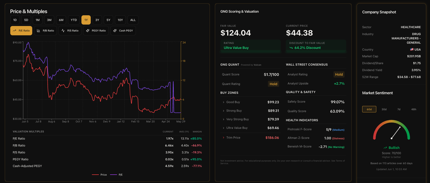
GNG Scoring & Valuation
This section sits right next to the price chart in the overview area. It's the card on the right side. I want to be upfront about this: GNG Scoring is a Pro feature. I always want to be transparent about this stuff, so let me break down exactly what each tier sees.
What Free Users See
If you're on the free tier, you'll see a clear upgrade prompt explaining what GNG Scoring includes: Fair Value Analysis, the 7-Tier Valuation Rating, Safety & Quality Scores, and Financial Health Indicators. There's a button that takes you straight to the billing page if you decide to upgrade. No bait-and-switch, no blurred-out data.. just a clean explanation of what's behind the paywall.
Fair Value & Current Price
For Pro users, this section opens up with the two most important numbers displayed big and bold: the Fair Value estimate on the left and the Current Price on the right. Our fair value estimate is generated by combining multiple valuation methodologies. The exact methods and weighting are proprietary, but the goal is to give you a single number representing what we think the stock is actually worth.
Below the fair value, you'll see the Rating badge. There are seven tiers:
Ultra Value Buy - The strongest buy signal (green glow)
Very Strong Buy - Significant undervaluation (green glow)
Strong Buy - Clear undervaluation (green glow)
Good Buy - Moderate undervaluation (blue glow)
Reasonable Buy - Slight undervaluation (blue glow)
Hold - Fairly valued (gold glow)
Trim/Sell - Overvalued territory (red glow)
Below the current price, you'll see a Discount/Premium badge that tells you whether the stock is currently trading below or above fair value, and by how much. A green "X% Discount" badge means the stock is trading below fair value. A red "X% Premium" means it's above. If it's within about 2%, you'll see "At Fair Value" in gold.
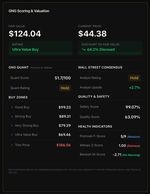
Buy Zones
On the left column of the scoring card, you'll see a list of price levels called Buy Zones. These are specific price targets that indicate different levels of conviction:
Good Buy - A reasonable entry point
Strong Buy - A more attractive entry point
Very Strong Buy - Deeply discounted
Ultra Value Buy - Exceptional value opportunity
Trim Price - The level where the stock may be overextended (shown in red, separated by a divider)
Each zone shows a specific dollar price. When the current price drops below one of these levels, that's the system telling you the margin of safety has increased to that zone's threshold. The exact methodology behind these price levels is proprietary, but the concept is straightforward: lower prices mean more margin of safety, and each zone represents increasing confidence.
Quality Scores
On the right column, you'll see two proprietary scores:
Safety Score (0-100%) - This evaluates how financially safe the company is. A higher score means lower risk of financial distress. Think of it as a measure of how well the company can weather downturns, service its debt, and maintain operations.
Quality Score (0-100%) - This evaluates the overall quality of the business. A higher score means stronger fundamentals across the board. It looks at profitability, consistency, and competitive positioning.
Both scores are displayed as percentages with large, easy-to-read numbers. These are the same scores you can filter by in the Research Terminal.
Financial Health Indicators
Below the quality scores, you'll see three well-known financial health indicators, each with a color-coded interpretation:
Piotroski F-Score (0-9) - A classic fundamental scoring system. Scores of 7-9 are labeled "High" in green, 4-6 are "Medium" in blue, and 0-3 are "Low" in red. Higher is better. A score of 8 or 9 generally means the company has strong and improving fundamentals.
Altman Z-Score - Measures the probability of bankruptcy. Scores above 2.99 are labeled "Safe" in green, 1.81 to 2.99 are "Gray Zone" in yellow, and below 1.81 are "Distress" in red. You want to see "Safe" here.
Beneish M-Score - An earnings manipulation detector. Scores below -2.22 are labeled "No Warning" in green, meaning the company's financials appear clean. Scores above -2.22 show "Possible Manipulation" in red, which is a flag to dig deeper.
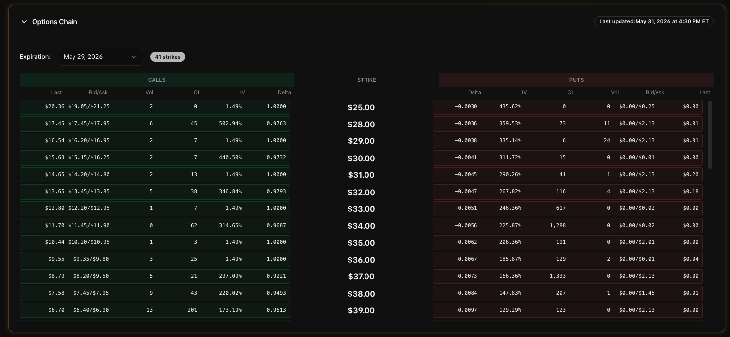
Options Chain
If the stock has options available, this section appears right after the overview. It's collapsible, so it doesn't take up space if you're not interested in options. Click to expand and you'll see the full options chain organized into Calls and Puts tabs.
Each option contract shows the strike price, last price, bid/ask, volume, open interest, implied volatility, and the Greeks (Delta, Gamma, Theta, Vega). There's a "Last Updated" timestamp so you know how fresh the data is. Click on any individual contract row to see more details in a modal popup.
I built this because every time I wanted to check options data, I had to leave the platform and go to a different site. Now it's right here on the same page as everything else. Additionally, click on a option to chart historical data.
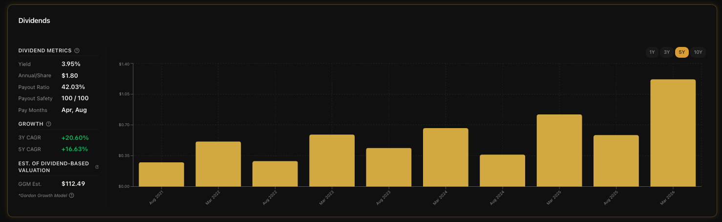
Dividends
If the company pays dividends, this section shows up with a bar chart on the right and a stats sidebar on the left. The chart displays individual dividend payments as gold bars, and you can switch between 1Y, 3Y, 5Y, and 10Y periods using the toggle buttons in the top-right corner of the chart.
The stats sidebar gives you everything you need to evaluate the dividend at a glance:
Dividend Metrics
Yield - The current annual dividend yield. This tells you how much income you're getting relative to the stock price. Higher isn't always better though.. you need to check payout safety too.
Annual/Share - The total annual dividend payment per share in dollars.
Payout Ratio - What percentage of earnings the company is paying out as dividends. A lower ratio means more room to grow the dividend or reinvest in the business. If this gets too high (above 80-90% for most companies), it could be a red flag.
Payout Safety - A score from 0 to 100 that tells you how sustainable the dividend is. Higher is safer. This is one of the first things I check when evaluating a dividend stock.
Frequency - How often the company pays: quarterly, monthly, semi-annual, or annual.
Growth
3Y CAGR - The compound annual growth rate of the dividend per share over the last 3 years. Green means growing, red means shrinking.
5Y CAGR - Same thing but over 5 years. This gives you a longer-term view of dividend growth trends.
Dividend-Based Valuation Estimate
GGM Estimate - This is a Gordon Growth Model estimate that calculates an intrinsic value based solely on dividend data. It's separate from the main Fair Value in the GNG Scoring section. Think of it as a dividend investor's sanity check: "based on dividends alone, what should this stock be worth?"
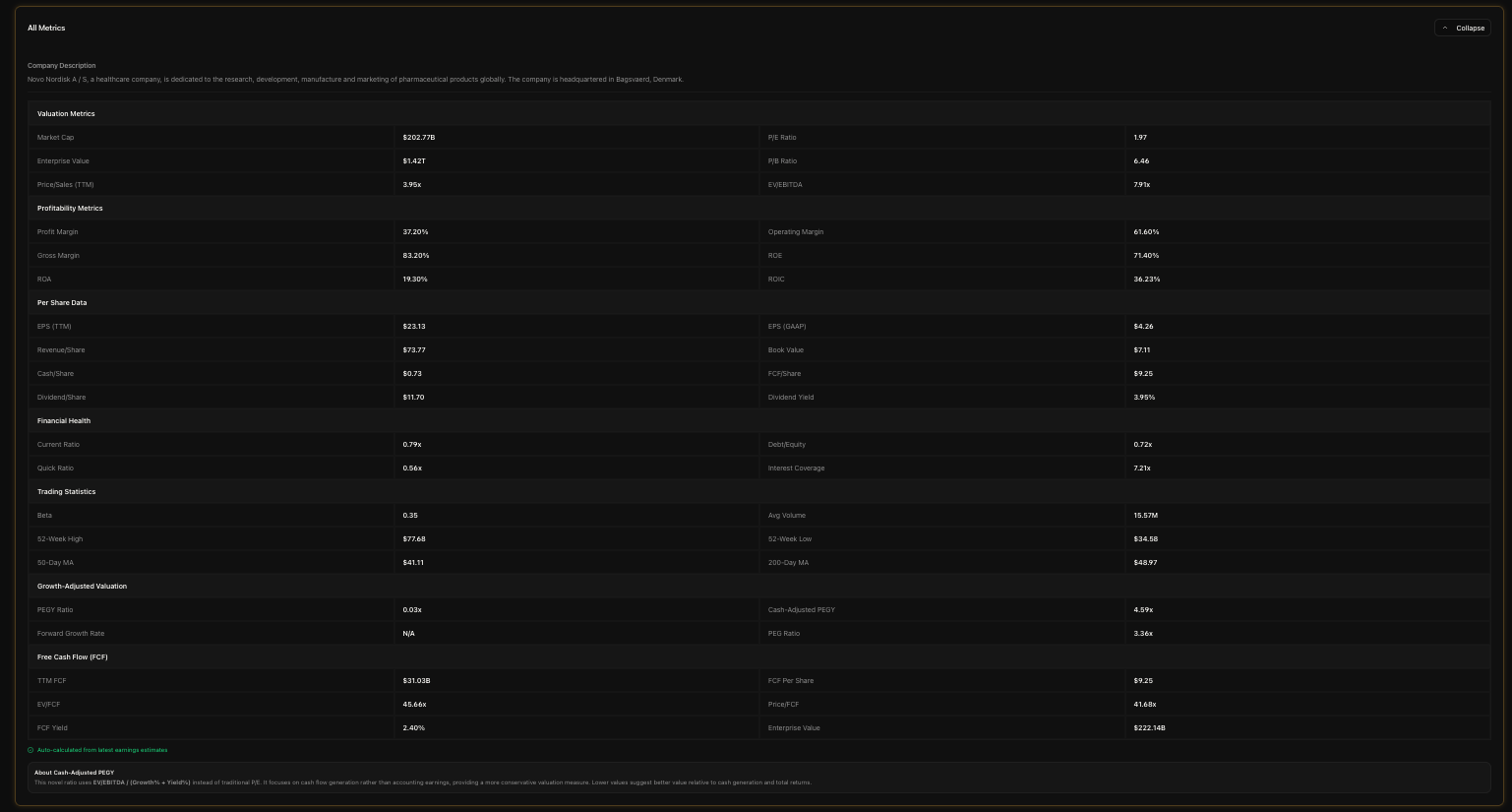
Key Metrics
This section gives you a comprehensive view of the company's financial metrics. It comes in two views that you can toggle between.
Compact View (16 Metrics)
By default, you see the compact view with 16 metrics organized into four groups:
Valuation - P/E Ratio, EV/EBITDA, Price/FCF, FCF Yield
Profitability - Profit Margin, Operating Margin, Return on Equity, ROIC
Financial Health - Debt/Equity, Interest Coverage, Current Ratio, Quick Ratio
Trading Statistics - Beta, Average Volume, 52-Week High, 52-Week Low
This is the quick-glance view. If these 16 metrics look good, the stock is probably worth digging deeper on. If something jumps out as a red flag, you know where to focus.
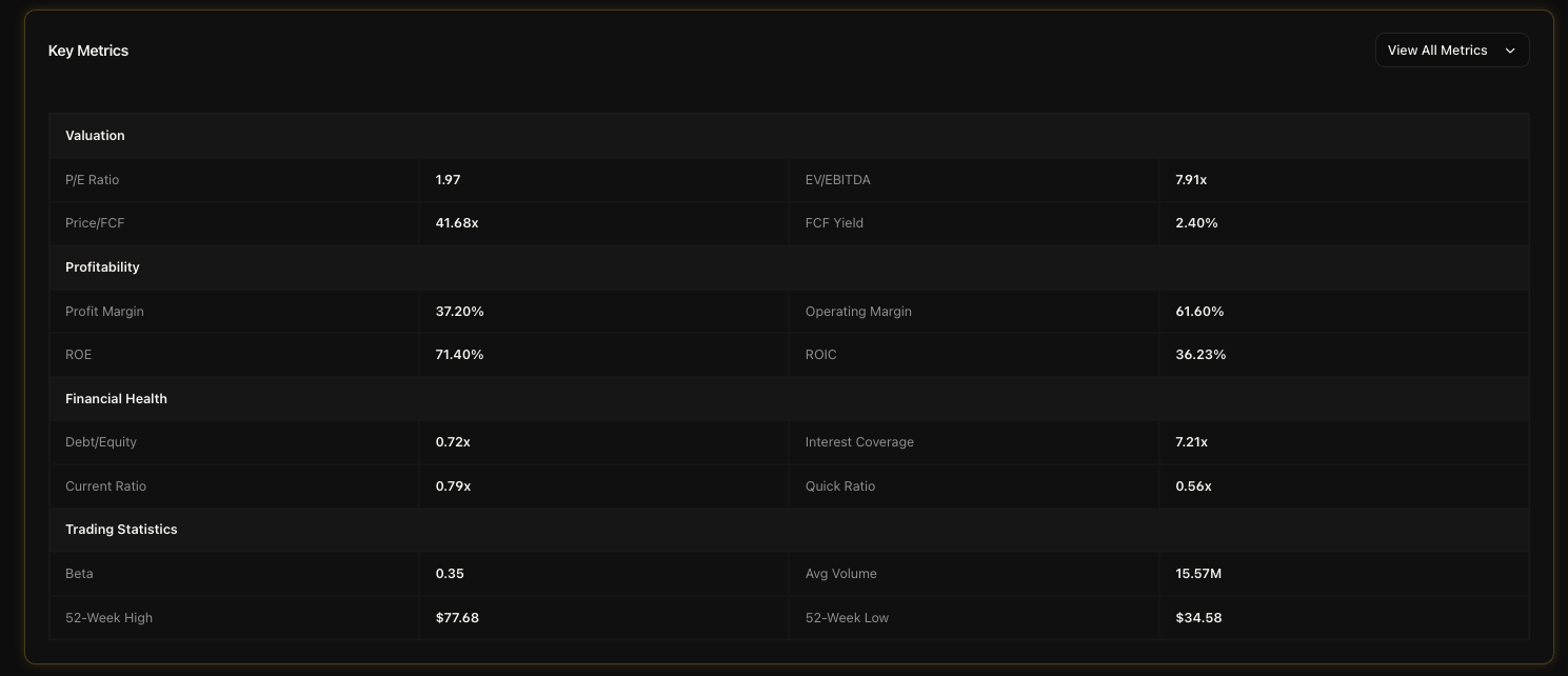
Full View (47 Metrics)
Click the "View All Metrics" button and the section expands to show all 47 metrics across seven categories: Valuation, Profitability, Growth & Value, Margins & Returns, Cash Flow, Debt & Liquidity, and Market & Trading. This is the full breakdown. Every financial metric we track for the company is here in one organized table.
You can collapse it back down at any time by clicking the collapse button at the top.
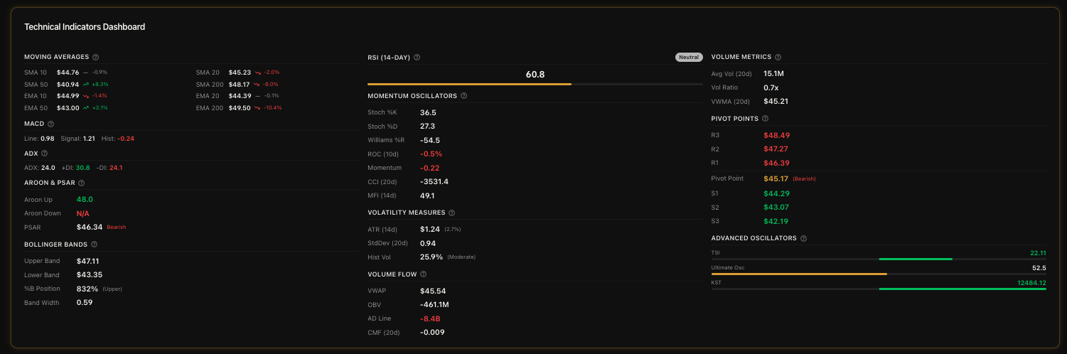
Technical Indicators
If you're into technical analysis, this section is going to make you very happy. It's a three-column dashboard packed with indicators, and everything is color-coded so you can spot signals at a glance.
Column 1: Trend Indicators
Moving Averages - SMA and EMA for 10, 20, 50, and 200-day periods. Each one shows the percentage difference from the current price with trend icons.
MACD - The MACD line, signal line, and histogram. Green histogram means bullish momentum, red means bearish.
ADX - Trend strength indicator with +DI (green) and -DI (red) directional lines.
Aroon & Parabolic SAR - Aroon Up (green) and Aroon Down (red) plus the Parabolic SAR with a Bullish/Bearish label.
Bollinger Bands - Upper and lower bands, %B position indicator, and bandwidth.
Column 2: Momentum, Volatility & Volume Flow
RSI (14-Day) - Displayed as a large centered number with a colored progress bar. Green when oversold (below 30), red when overbought (above 70), blue when neutral.
Momentum Oscillators - Stochastic %K/%D, Williams %R, Rate of Change, Momentum, CCI, and Money Flow Index. Each color-coded based on signal direction.
Volatility Measures - ATR, Standard Deviation, and Historical Volatility.
Volume Flow - VWAP, On-Balance Volume, Accumulation/Distribution Line, and Chaikin Money Flow.
Column 3: Volume Metrics, Pivot Points & Advanced Oscillators
Volume Metrics - 20-day Average Volume, Volume Ratio (green if significantly above average, yellow if below), and VWMA.
Pivot Points - Three resistance levels (R1, R2, R3) in red, the Pivot Point itself in bold with a Bullish/Bearish label, and three support levels (S1, S2, S3) in green. Pivot points are especially useful for day traders and swing traders to identify potential entry and exit levels.
Advanced Oscillators - True Strength Index, Ultimate Oscillator, and KST. Each uses a centered bar that's green when positive and red when negative.
All of these indicators update daily. The color coding makes it easy to do a quick visual scan.. if you see a wall of green, the technicals are generally bullish. A wall of red means bearish. Mixed signals mean the stock is in a transitional phase.
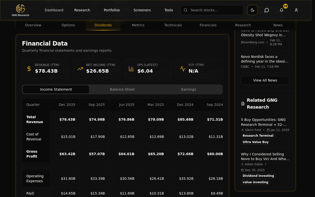
Financial Data
This section gives you the raw financial statements. At the top, you'll see four KPI tiles showing the headline numbers: Revenue (TTM), Net Income (TTM), EPS (Latest), and Free Cash Flow (TTM). These give you the big picture before you dive into the details.
Below the tiles, there are three tabs you can switch between:
Income Statement - Revenue, gross profit, operating income, net income, and all the line items in between. Quarterly data going back 12 quarters.
Balance Sheet - Total assets, liabilities, equity, cash, debt, and everything else on the balance sheet. Also quarterly going back 12 quarters.
Earnings - Reported EPS vs. estimated EPS for each quarter. This is where you can see the earnings surprise history.. did the company beat or miss expectations?
I find the earnings tab particularly useful. A company that consistently beats estimates is generally executing well. A string of misses is a warning sign worth paying attention to.
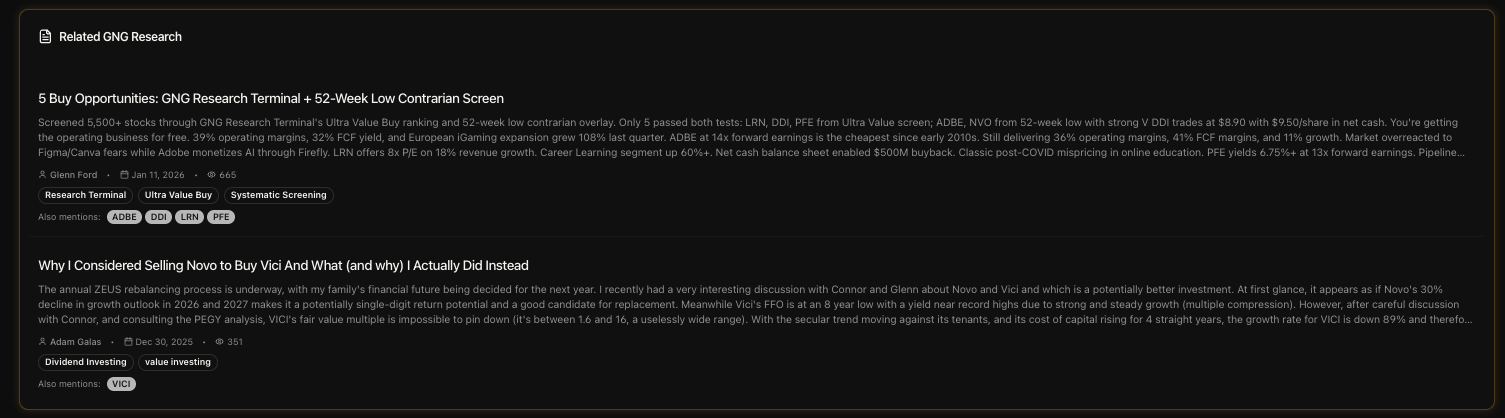
Research & News
The last two sections before the page ends are Research and News. They're separate but work together to give you the full information picture.
Related GNG Research
This section shows any GNG articles that mention the ticker you're looking at. If one of our analysts has written about the company, their articles show up here with the title, author name, publish date, and tags. Click any article to read the full analysis.
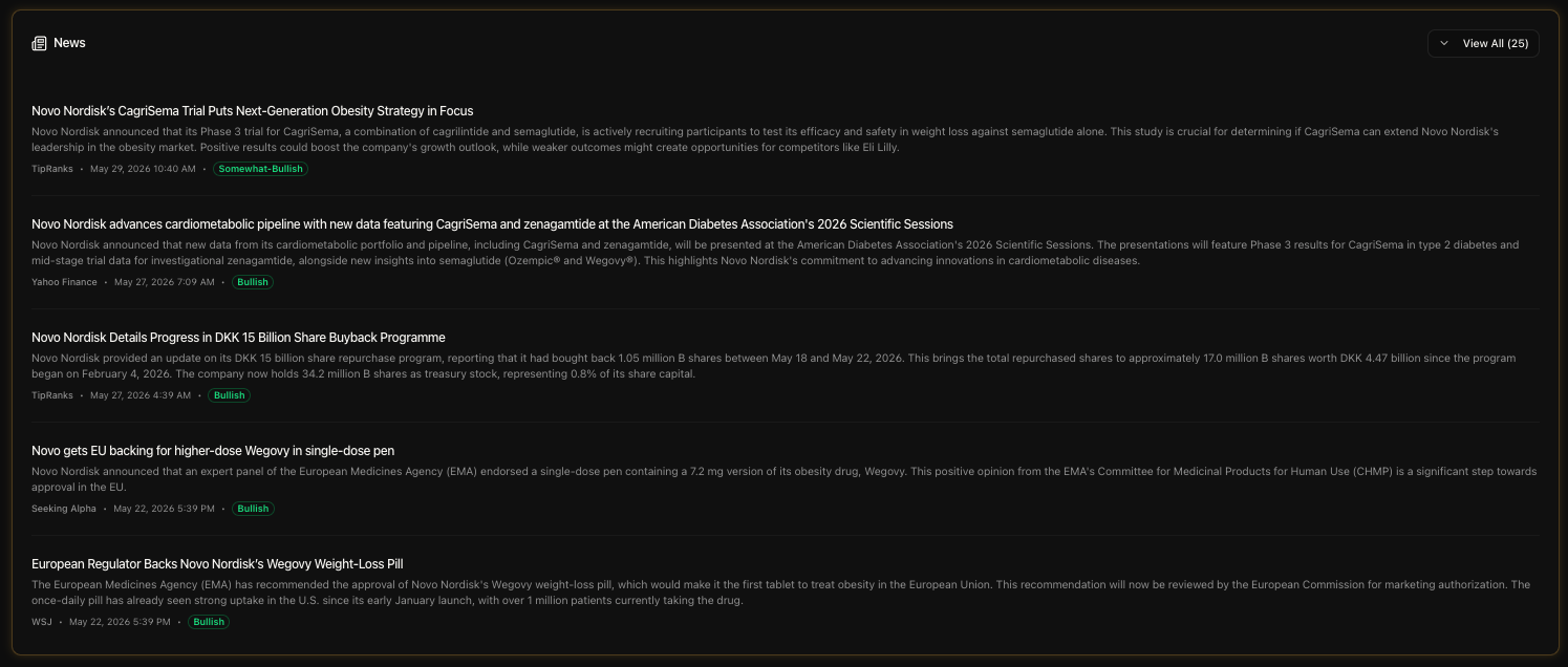
Company News
Below that, the News section pulls in external news articles about the company. Each news item shows the headline, the source (Reuters, Bloomberg, etc.), the publish timestamp, and a sentiment badge. The sentiment badges are color-coded:
Bullish - Green badge, positive sentiment in the article
Neutral - Standard badge, balanced reporting
Bearish - Red badge, negative sentiment
Click any news headline and it opens the original article in a new tab. The sentiment analysis is done automatically, so take it as a general indicator rather than gospel truth. But it's really helpful for quickly scanning whether the news cycle is positive or negative for a stock.
The Sidebar
On the right side of the page (on desktop), there's a sticky sidebar that follows you as you scroll. It has four sections stacked vertically.
Company Snapshot
A quick-reference card showing the sector, industry, market cap, dividend per share, dividend yield, 52-week range, and next earnings date (when available). This is the stuff you want at a glance without scrolling anywhere.
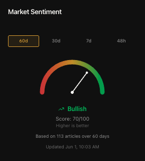
Market Sentiment
This is one of my favorite features on the whole page. It's an animated gauge that shows the overall sentiment for the stock based on news analysis. You can toggle between four time periods: 60 days, 30 days, 7 days, and 48 hours. The gauge swings from bearish on the left to bullish on the right, with the needle showing where sentiment currently sits.
The 48-hour view is especially useful when there's breaking news. If a stock just dropped on earnings, flip to 48h and see if the immediate news reaction is overwhelmingly negative or if sentiment is already starting to recover. I use this all the time.
Latest News & Related Research
The sidebar also shows the 5 most recent news items and up to 6 related GNG articles in a compact format. These are the same items from the main News and Research sections, just condensed into the sidebar for quick access. Each one is clickable. There's a "View All" button that smooth-scrolls you down to the full section if you want to see everything.
What's Available on Each Tier
I always want to be transparent about this stuff. Here's the honest breakdown.
Free Tier
The free tier gives you an enormous amount of data on the Company Details page. You get:
Full price chart with all 11 timeframes
All 5 valuation overlay toggles (P/E, P/B, P/S, PEGY, Cash PEGY)
Micro KPI cards with margin vs average
Complete options chain with Greeks
Full dividend history, metrics, growth rates, and GGM estimate
All 47 key metrics (compact and full view)
Complete technical indicators dashboard (all 3 columns)
Full financial statements (Income, Balance Sheet, Earnings)
Company news with sentiment badges
Related GNG Research articles
Sidebar with company snapshot, sentiment gauge, news, and research
This is likely to change adding more behind the paywall soon.
Pro Tier
Pro adds the GNG Scoring & Valuation panel. This is the only section gated behind Pro on this page. Specifically, Pro unlocks:
Fair Value estimate
7-Tier Valuation Rating (Ultra Value Buy through Trim/Sell)
Discount/Premium percentage badge
Buy Zone price targets (Good Buy, Strong Buy, Very Strong Buy, Ultra Value Buy, Trim Price)
Safety Score (0-100%)
Quality Score (0-100%)
Financial Health Indicators (Piotroski F-Score, Altman Z-Score, Beneish M-Score)
Everything else on the page is the same for all tiers. I wanted the free experience to be genuinely useful, not a crippled preview. The GNG Scoring panel is the premium layer that adds our proprietary analysis on top of all the raw data.
Pro Tips
Here are some shortcuts and tricks I use myself when researching a stock on this page:
Use the subnav to jump around fast. Don't scroll through the whole page looking for financials. Just click "Financials" in the subnav and boom.. you're there. The sticky nav means it's always one click away no matter where you are on the page.
Turn on the P/E overlay and switch to 5Y or 10Y. This is my favorite trick. It instantly shows you whether the stock's current P/E is elevated or compressed relative to its own history. If the price line is going up but the P/E line is going down, that means earnings are growing faster than the price. That's a good sign.
Quick Piotroski check. Before diving deep into any stock, I glance at the Piotroski F-Score first. If it's 7 or above, the fundamentals are strong and improving. If it's below 4, I want to understand why before going further.
Collapse the Options section if you don't need it. If you're not an options trader, collapse it to keep the page cleaner. The section remembers its state, so you won't have to collapse it every time you visit.
Use the 48-hour sentiment for breaking news. When a stock moves big on news, flip the sentiment gauge to 48h. It gives you the most recent pulse of how the market is reacting. Then compare it to the 30-day or 60-day view to see if the reaction is an outlier or part of a trend.
Check Pivot Points if you're timing an entry. The technicals section has R1/R2/R3 resistance and S1/S2/S3 support levels. These are especially useful for day traders and swing traders looking for specific price levels to set limit orders.
Yield + Payout Safety is a red flag combo. In the dividends section, if you see a high yield (above 6-7%) combined with a low Payout Safety score (below 40), that's a warning sign the dividend might not be sustainable. One of those situations where a high yield is a trap, not a gift.
Compare EPS surprise history in the Earnings tab. A company that beats estimates quarter after quarter is typically being conservative with guidance, which is a good sign. Three or more consecutive misses is a pattern worth watching.
Use the sidebar sentiment as a contrarian signal. When the 60-day sentiment is extremely bearish on a stock with strong fundamentals (high Safety Score, high Piotroski), it might actually be a buying opportunity. The market is emotional in the short term but rational in the long term.
Wrapping Up
That's the Company Details page from top to bottom. Every section, every feature, every metric. This is the page where all the data comes together into one view, and whether you're a fundamental investor, a technical trader, a dividend hunter, or all of the above.. there's something here for you.
If you have any questions or feedback about the Company Details page, drop it in the comments below or jump into Rocket Chat and let me know. I read everything. And if you haven't explored a stock page yet, go to gngresearch.com/stock/NVO right now and click through all the sections.. honestly, the more you explore it, the more you'll find.
Thanks for reading, and I'll see you in the next guide.