Monte Carlo Simulation Tools - Your Complete Guide
Alright.. welcome to article number six in the Getting Started series. Now we're getting into one of my favorite tools on the entire platform: the Monte Carlo Simulation Suite.
This is the tool I built because I got tired of looking at a single price target or a single expected return and thinking "okay, but what if?" What if the market tanks? What if it rips? What if we just get years of sideways chop? Monte Carlo answers all of those questions at once by running thousands of possible futures and showing you the full range of outcomes.
This guide covers everything. Setting up a simulation, understanding every configuration option, reading your results, comparing scenarios side by side, and all the little details that make this tool genuinely useful for real decision-making. Let's get into it.
What Is Monte Carlo Simulation?
Imagine taking your portfolio and running it through thousands of possible futures. Not one optimistic guess, not one worst-case scenario, but thousands of randomly generated paths based on real historical data. That's Monte Carlo simulation in a nutshell.
Here's the basic idea: we take the stocks in your portfolio, look at how they've actually performed historically, and then use that data to generate thousands of random price paths going forward. Each path represents one possible future. Some paths are great, some are terrible, and most land somewhere in the middle. When you stack all of those paths together, you get a clear picture of the range of outcomes.. not just one number.
I built this because I wanted to know the range of possibilities, not just one best guess. A single expected return doesn't tell you much. But knowing that there's a 95% chance your portfolio stays above $85,000 and a 50% chance it hits $120,000.. that's actually useful information you can make decisions with.
It's not a crystal ball. It's a stress test. And honestly, once you start using it, you'll wonder how you ever made allocation decisions without it.
How to Get There
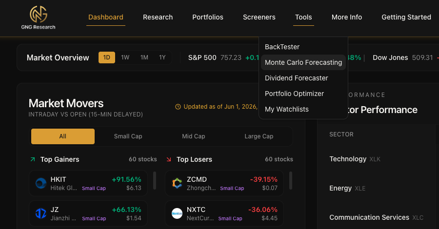
Getting to the Monte Carlo tools is simple. Click Tools in the top navigation bar. You'll see "Monte Carlo Simulation" right there in the dropdown. Click it and you're in.
That's it.. one click from the dropdown.
The Main Page: Setting Up Your Simulation
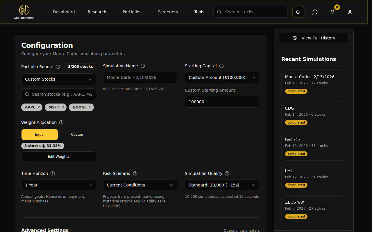
When you land on the Monte Carlo page, you'll see a clean configuration card with everything you need to set up and run a simulation. On the left side there's a sidebar showing your recent simulations and quick stats. Let me walk you through each piece of the setup.
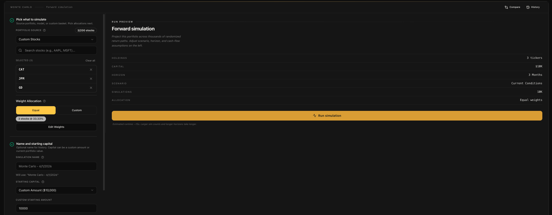
Choosing Your Input Source
The first thing you'll pick is where your stocks come from. There are three options:
My Portfolios - Use one of your actual portfolios from the Portfolio Tracker. This pulls in all your holdings with their real weights. Perfect for stress-testing what you actually own.
Model Portfolios - Use one of the pre-built model portfolios on the platform. These are curated strategies you can test without building anything from scratch.
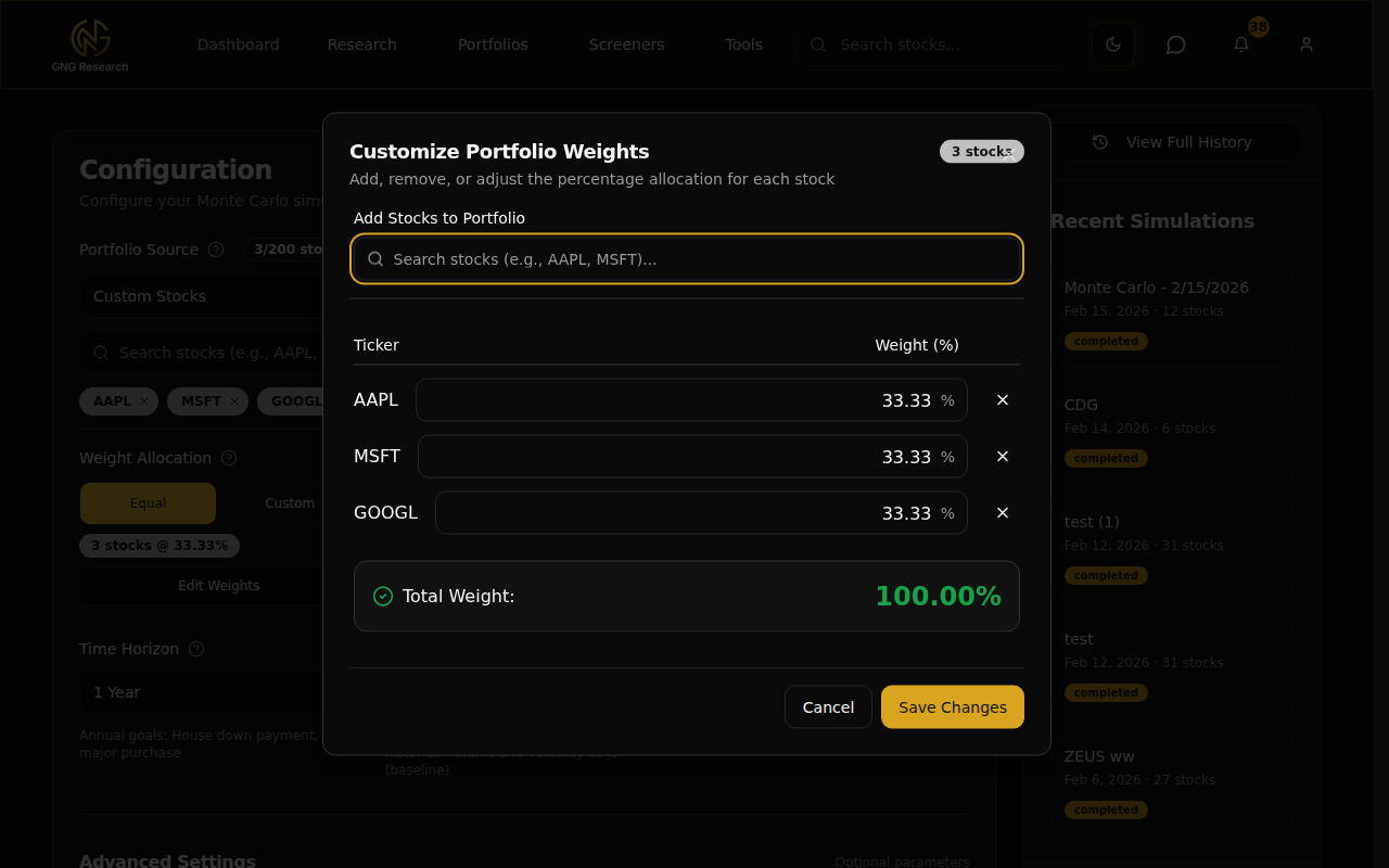
Custom Stocks - Search and select any stocks you want. This is the most flexible option. Just start typing a ticker or company name into the search box and an autocomplete dropdown will show matching results. Click to add, and they show up as removable badges.
For portfolios and models, you select from a dropdown that shows the portfolio name and how many stocks are in it. For custom stocks, you get a search box where you can add tickers one at a time.
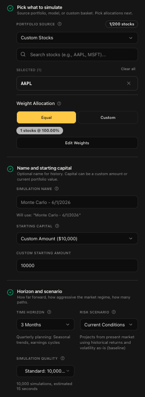
Naming Your Simulation
You can give your simulation a custom name, or leave it blank and it'll default to something like "Monte Carlo - Feb 16, 2026". If you run the same simulation again, it auto-increments the name with (1), (2), etc. so you can always tell them apart in your history.
I'd recommend naming them something descriptive. "Tech 3-Stock 1Y Conservative" is way more useful than "Monte Carlo - Feb 16, 2026 (3)" when you're looking at your history later.
Starting Capital
Next up is how much money you're simulating with. You've got two choices:
Custom Amount - Enter any dollar amount. The default is $100,000. You can go as low as $1,000 or as high as $100 million.
Current Portfolio Value - If you selected one of your portfolios or a model portfolio as the input source, this option pulls the actual current value. One click and it's set.
The Configuration Grid
This is where you dial in the key parameters for your simulation. Three dropdowns, each one matters.
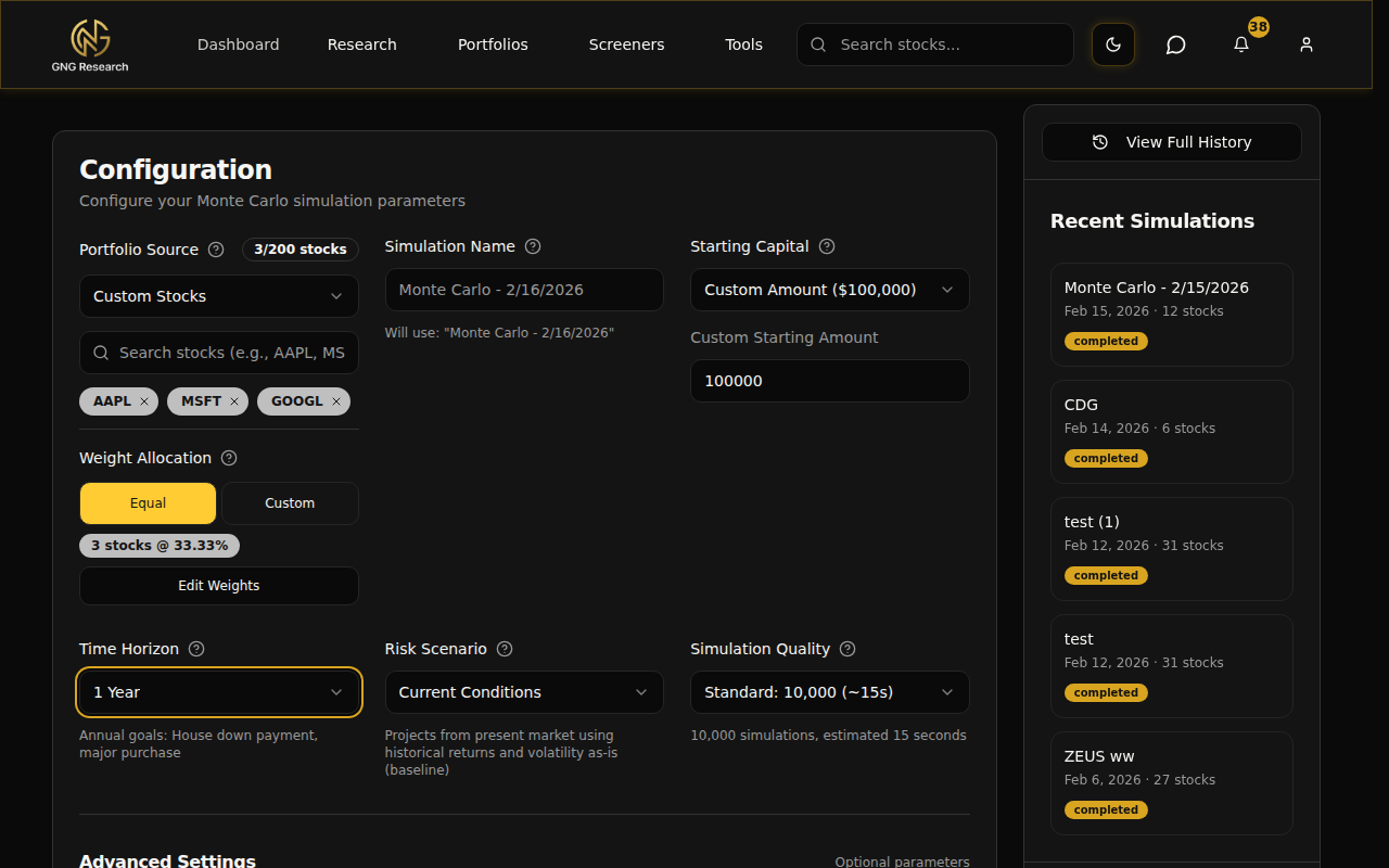
Time Horizon - How far into the future do you want to simulate? There are 13 options ranging from ultra-short to long-term:
1 Week (5 trading days) - Ultra-short term. Good for earnings events.
2 Weeks (10 days) - Short-term swing trades.
3 Weeks (15 days) - Short-term trading horizon.
1 Month (21 days) - Monthly outlook and tactical positioning.
3 Months (63 days) - Quarterly planning and earnings cycles.
6 Months (126 days) - Semi-annual goals like emergency fund building.
9 Months (189 days) - Medium-term goals.
1 Year (252 days) - Annual goals like a house down payment.
2 Years (504 days) - Short-term wealth targets.
3 Years (756 days) - Medium-term goals like grad school or first home.
5 Years (1,260 days) - Long-term wealth building. This is the default.
7 Years (1,764 days) - Retirement planning.
10 Years (2,520 days) - Legacy and generational wealth planning.
The number in parentheses is trading days, not calendar days. Markets are closed on weekends and holidays, so a 1-year simulation is 252 trading days.
Risk Scenario - This is where you tell the simulation what kind of market environment to assume. Five options:
2008 Crisis - The worst-case stress test. Simulates a 70% drop in returns with 3x the normal volatility. "What if we hit another 2008?" This is the answer.
Conservative - Below-average returns (80% of historical) with 20% higher volatility. Think cautious assumptions.
Current Conditions - The baseline. Uses your stocks' actual historical returns and volatility as-is. No adjustments. This is the default and what I'd start with.
Optimistic - Above-average returns (120% of historical) with 10% lower volatility. A favorable market environment.
Bull Market - The best-case scenario. 50% higher returns with significantly reduced volatility. Strong tailwinds everywhere.
Simulation Quality - How many random paths do you want to generate? More simulations means more statistical accuracy, but takes longer:
Quick: 5,000 sims (~8 seconds) - Fast results with good accuracy. Great for initial exploration.
Standard: 10,000 sims (~15 seconds) - The sweet spot between speed and precision. This is the default and what I'd recommend for most use cases.
Premium: 50,000 sims (~90 seconds) - High accuracy for when the numbers really matter.
Expert: 100,000 sims (~3 minutes) - Maximum precision. The tail percentiles (p5, p95) become very stable at this level.
Weight Management
Once you've got your stocks selected, you need to decide how they're weighted. Two modes:
Equal Weight - Every stock gets the same percentage. Three stocks? Each gets 33.33%. Simple and clean.
Custom - You set the exact percentage for each stock. Maybe you want 50% in AAPL, 30% in MSFT, and 20% in GOOGL. That's your call.
If you picked one of your actual portfolios, the custom weights will pre-load with your real allocation. If you're using custom stocks, it defaults to equal weight.
Click "Edit Weights" to open the weight editor modal. Here you can:
Adjust the percentage for each stock individually
Add or remove stocks right from the modal
Hit the "Auto-Normalize" button to make everything sum to exactly 100%
The modal shows a live total at the bottom. It needs to hit 100.00% before you can save. If your weights are off, the normalize button will fix it in one click.
Advanced Settings
Below the main configuration grid, there's an "Advanced Settings" section you can expand. These are all optional. The defaults work great for most people, but if you want to fine-tune your simulation, this is where you do it.
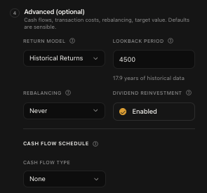
Return Model & Lookback Period
The return model determines how the simulation calculates expected returns:
Historical Returns (default) - Uses actual historical price data for your stocks.
Custom Returns - Let you input your own return assumptions.
The Lookback Period controls how far back the simulation looks at historical data. The default is about 18 years (4,500 trading days), which gives a really robust dataset. The minimum is 252 days, which is roughly 1 year of trading data. The more history you include, the more market regimes (crashes, recoveries, bull runs) get factored into the simulation.
Rebalancing
Rebalancing is when you periodically adjust your portfolio back to your target weights. Say you set AAPL at 50% and MSFT at 50%. After a few months, AAPL might have grown to 60% while MSFT dropped to 40%. Rebalancing sells some AAPL and buys more MSFT to get back to 50/50.
Options:
Never (Buy & Hold) - Set it and forget it. This is the default.
Monthly - Rebalance at the start of every month.
Quarterly - Every 3 months.
Semi-Annual - Every 6 months.
Annual - Once a year.
Dividends & Costs
Dividend Reinvestment is enabled by default. When a stock in your simulation pays a dividend, the cash gets automatically reinvested. Toggle it off if you want dividends to just sit as cash.
If you've enabled rebalancing, you'll also see Transaction Costs:
Commission per Trade - Broker fee per transaction. Most modern brokers charge $0, but if yours charges $5 or $10 per trade, put it here.
Slippage - The difference between the price you expect and the price you actually get. Typically 0-0.5% for liquid stocks.
Dividend Tax Rate - Tax on dividend income. Varies by country and account type. 0% for tax-advantaged accounts, 15-20% for taxable accounts in the US.
Contributions & Withdrawals
This is where you simulate regular cash flows in or out of your portfolio.
None (default) - No regular cash flows.
Contributions (Add Money) - Simulate regular deposits. Like adding $500/month to your portfolio.
Withdrawals (Remove Money) - Simulate regular withdrawals. Useful for retirement scenarios.
For each, you choose:
Amount Type: Flat dollar amount or percentage of portfolio value
Frequency: Monthly, Quarterly, Semi-Annual, or Annual
Inflation Adjustment (for flat amounts): Toggle this on and set an annual inflation rate (default 2%) to have your contributions grow over time
Running Your Simulation
Once everything is configured, you'll see the "Run Monte Carlo Simulation" button at the bottom. It shows the number of simulations and estimated time right on the button so you know what to expect.
Click it and the simulation kicks off. You'll see a progress bar filling up and an elapsed time counter. The simulation runs on our Lambda infrastructure, so your browser just sits back and waits for the results to come back.
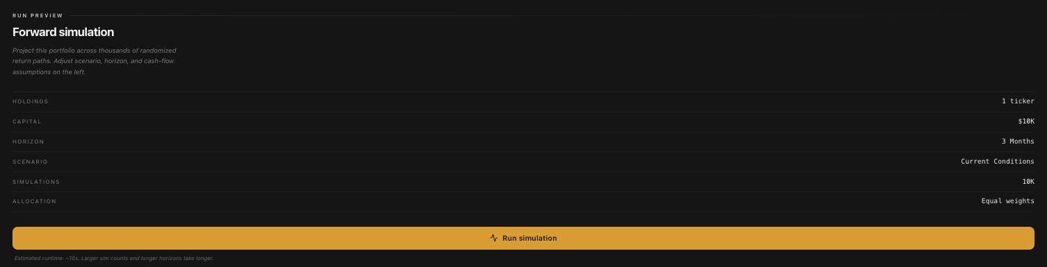
For a Standard run (10,000 simulations), it usually takes about 15-20 seconds. Expert runs (100,000 simulations) take about 3 minutes. The progress bar updates in real time so you're never just staring at a blank screen wondering if something broke.
Once it's done, the results appear right below the configuration on the same page. No page reload, no navigation. Just boom.. results.
Understanding Your Results
Alright, this is the good stuff. When a simulation completes, you get a full dashboard of results. Let me break down each section so you know exactly what you're looking at.
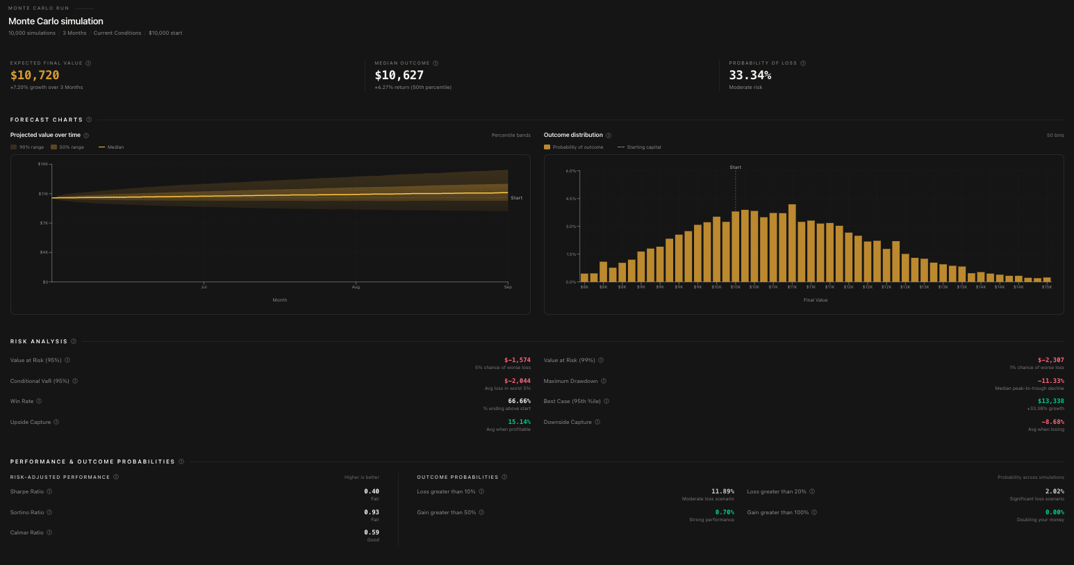
Summary Statistics
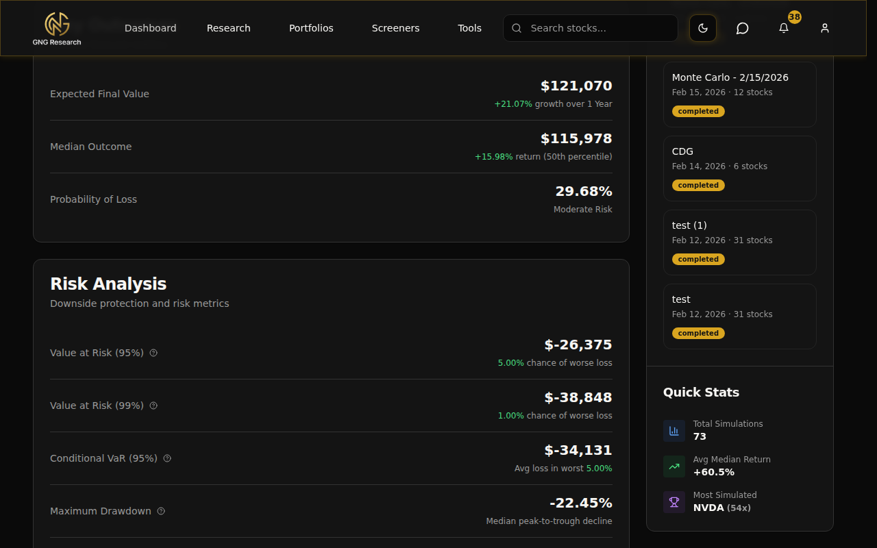
At the top, you'll see the big numbers:
Initial Value - What you started with (your starting capital)
Expected Value - The average endpoint across all simulations
Median Value - The 50th percentile endpoint. Half the simulations ended above this, half below. This is generally more useful than the expected value because extreme outliers don't skew it.
Median Return % - The percentage return at the median
Expected Return % - The average percentage return
Probability of Loss - What percentage of simulations ended with less money than you started with. This is one of the most important numbers on the whole page.
The Fan Chart
This is the centerpiece of the results. The fan chart shows the range of outcomes over time with colored bands representing different percentiles:
The darkest band in the middle shows the range between the 25th and 75th percentiles. This is where 50% of all simulations fell.
The lighter outer bands extend to the 5th and 95th percentiles. 90% of all simulations fell within this range.
The bold center line is the median (50th percentile).
Here's how to read it: the wider the fan spreads, the more uncertain the outcome. A tight fan means most outcomes are similar. A wide fan means there's a huge range of possibilities. If the bottom of the fan dips below your starting value, that's showing you scenarios where you lose money.
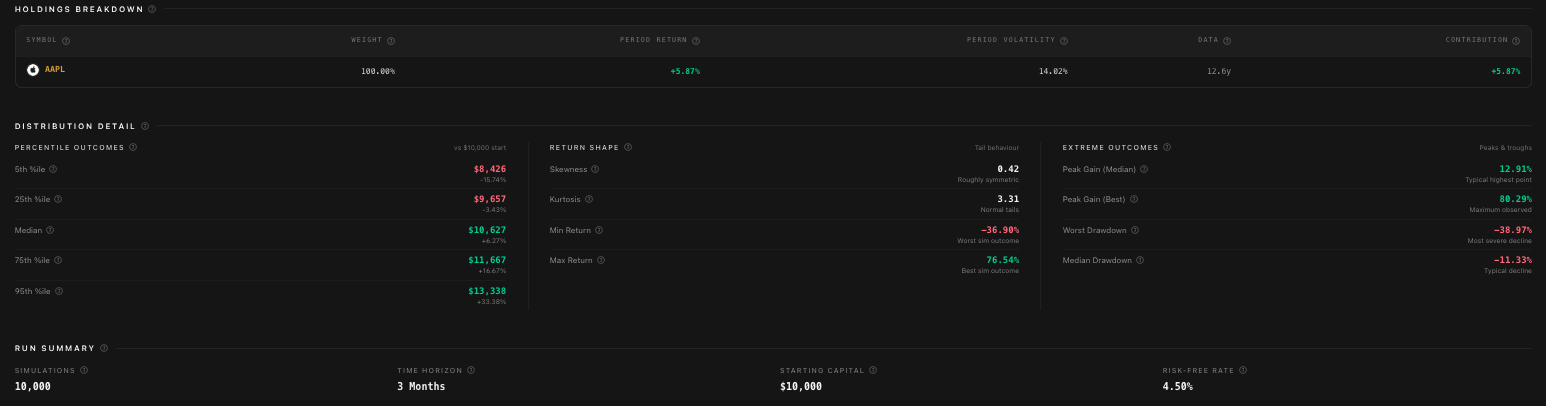
Percentiles Explained
You'll see percentile values throughout the results. Here's what each one means in plain English:
p5 (5th percentile) - The near-worst case. Only 5% of simulations ended worse than this. Think of it as "things probably won't get worse than this."
p25 (25th percentile) - Below average but not terrible. 25% of outcomes were worse.
p50 (50th percentile / Median) - Right in the middle. The most "expected" outcome.
p75 (75th percentile) - Above average. Only 25% of outcomes were better.
p95 (95th percentile) - The near-best case. Only 5% of simulations did better. Don't plan around this one haha.
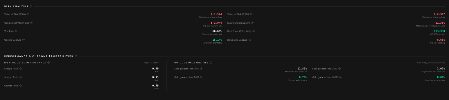
Risk Metrics
This section gives you the hard numbers on risk:
Probability of Loss - Percentage of simulations that ended negative
VaR 95% (Value at Risk) - The maximum loss you'd expect 95% of the time. If VaR 95% is -$15,000, that means there's only a 5% chance you'd lose more than $15,000.
VaR 99% - Same concept but for the 99th percentile. More extreme.
CVaR 95% (Conditional VaR) - The average loss in that worst 5% of outcomes. If VaR tells you the threshold, CVaR tells you how bad it gets beyond that threshold.
Win Rate - What percentage of simulations ended positive
Probability of Losing >10% - Chance of a significant drawdown
Probability of Losing >20% - Chance of a major loss
Probability of Gaining >50% - Chance of a strong positive outcome
Probability of Gaining >100% - Chance of doubling your money
Performance Ratios
Three ratios that help you evaluate risk-adjusted returns:
Sharpe Ratio - Return per unit of total risk. Higher is better. Above 1.0 is considered good.
Sortino Ratio - Like Sharpe, but only counts downside risk. This is a better measure if you care more about avoiding losses than reducing overall volatility.
Calmar Ratio - Return divided by maximum drawdown. Tells you how well the returns compensate for the worst drop.
Drawdown & Peak Gain
Drawdown is the peak-to-trough decline during the simulation. The results show:
Mean Drawdown - The average maximum drawdown across all simulations
Median Drawdown - The middle-of-the-road drawdown
Worst Drawdown - The absolute worst drop in any simulation
p5 / p95 Drawdowns - The range of drawdowns from near-worst to near-best case
Peak gain stats work the same way but for the upside. How high did the portfolio climb at its best point?
Holdings Breakdown
This table shows per-ticker analysis:
Return - Expected return for each stock
Volatility - How much each stock's price bounces around
Weight % - Your allocation to each stock
Contribution to Return - How much each stock contributed to the overall portfolio return
Contribution to Variance - How much each stock contributed to the overall portfolio risk
This is really useful for understanding which stocks are driving your results and which ones are adding the most risk.
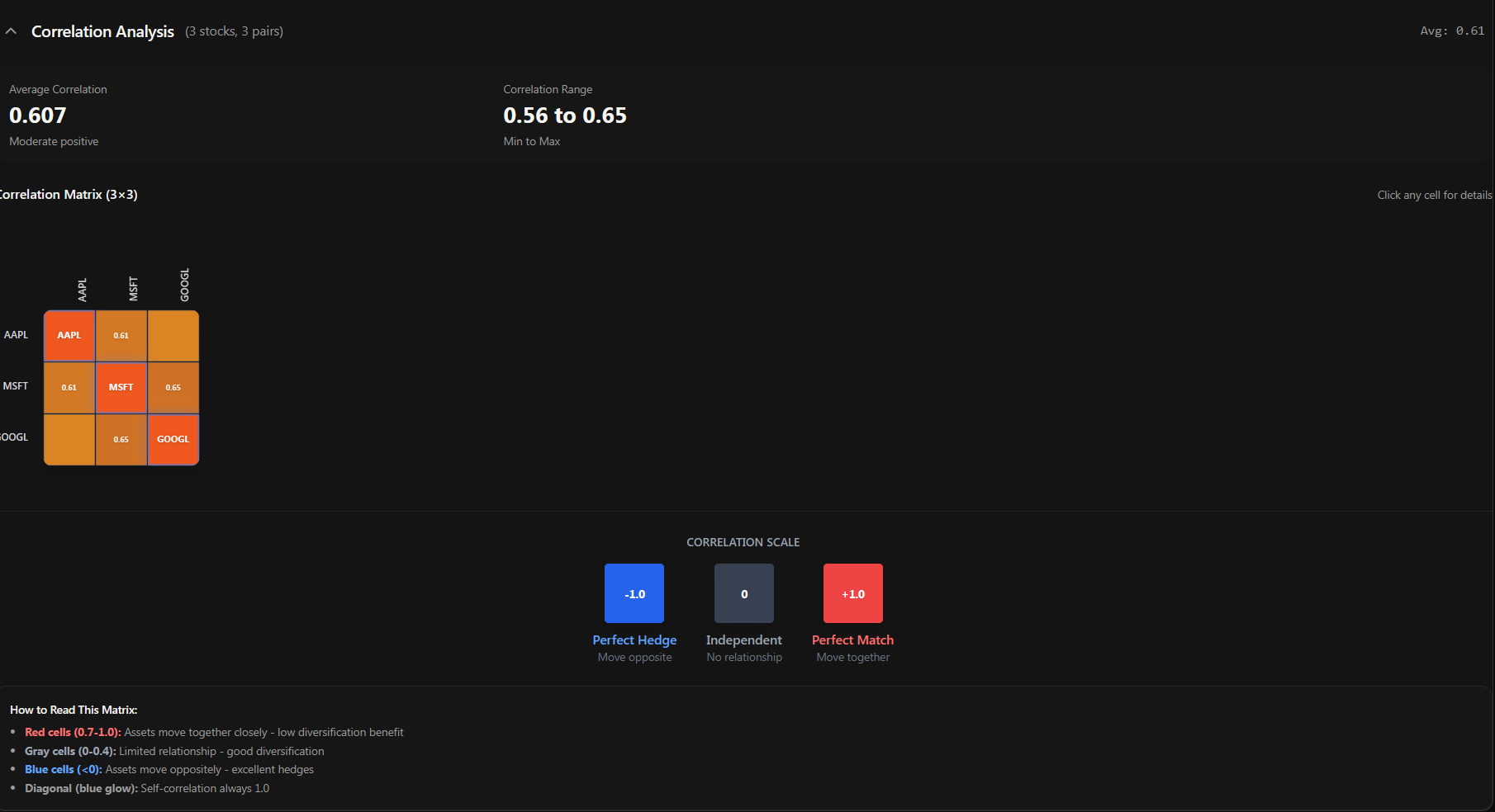
Correlation Matrix
The correlation heatmap shows how your stocks move relative to each other. It's a color-coded grid:
Red (close to +1.0) - These stocks move together. When one goes up, the other tends to go up too.
Blue (close to -1.0) - These stocks move in opposite directions. Great for diversification.
Gray (close to 0) - These stocks move independently. Also good for diversification.
If your entire heatmap is red, you're not as diversified as you think. Your stocks are all moving together, which means in a downturn, they'll probably all go down together. A healthy portfolio has a mix of correlations.
Distribution Histogram
At the bottom, you'll see a histogram showing the distribution of all final portfolio values across every simulation. It gives you a visual sense of where most outcomes cluster and how the tails look. A nice bell curve centered above your starting value is what you want to see.
Exporting Your Results
Want to take your results offline or share them with someone? Hit the "Export to Excel" button. You'll get a clean .xlsx file with all the summary stats, percentile values, risk metrics, performance ratios, holdings breakdown, and the raw percentile time series data.
The Sidebar
On the left side of the main page, there's a sidebar that stays with you as you work. It shows:
Recent Simulations - Your last 5 simulations with their name, date, stock count, and status badge (completed or failed). Click any one to jump straight to its results.
Quick Stats - Your total simulation count, average median return, and most simulated ticker.
Navigation buttons to View Full History and Select to Compare
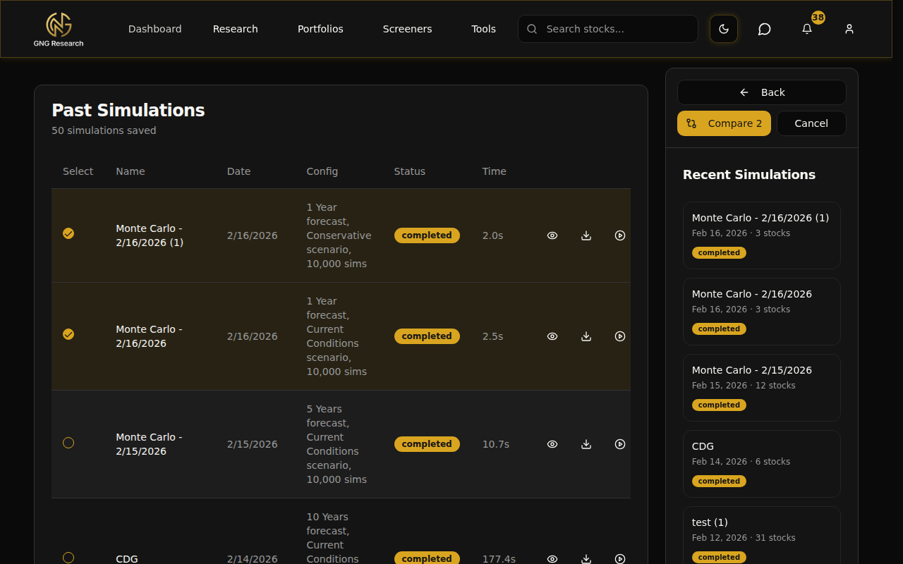
Simulation History
Navigate to the History page by clicking "View Full History" in the sidebar or going directly to Tools > Monte Carlo Simulation > History. This page shows every simulation you've ever run.
Each row in the history table shows:
Name - The simulation name (you can click the pencil icon to rename it inline)
Date - When it was run
Config - A quick summary of the configuration
Status - "Completed" or "Failed" badge
Time - How long it took to execute (in seconds)
On the right side of each row, you've got action buttons:
Eye icon - View the full results
Download icon - Export to Excel
Play icon - Run again with the same configuration
Trash icon - Delete the simulation
Re-Running a Simulation
This is one of those quality-of-life features that saves a ton of time. Click the Play icon on any simulation in your history (or the "Run Again" button on the View page) and boom.. your entire setup is restored. Same stocks, same weights, same time horizon, same risk scenario, same advanced settings. Everything.
The simulation name auto-increments so you can tell the runs apart. "Tech 3-Stock Conservative" becomes "Tech 3-Stock Conservative (1)". All you have to do is click Run.
This is super useful when you want to compare the same setup under different risk scenarios. Run it once with Current Conditions, then re-run it and change just the risk scenario to Conservative. Instant side-by-side comparison material.
Viewing a Simulation in Detail
Click the eye icon on any simulation from the History page and you'll land on the View page. This gives you the complete picture of a single simulation:
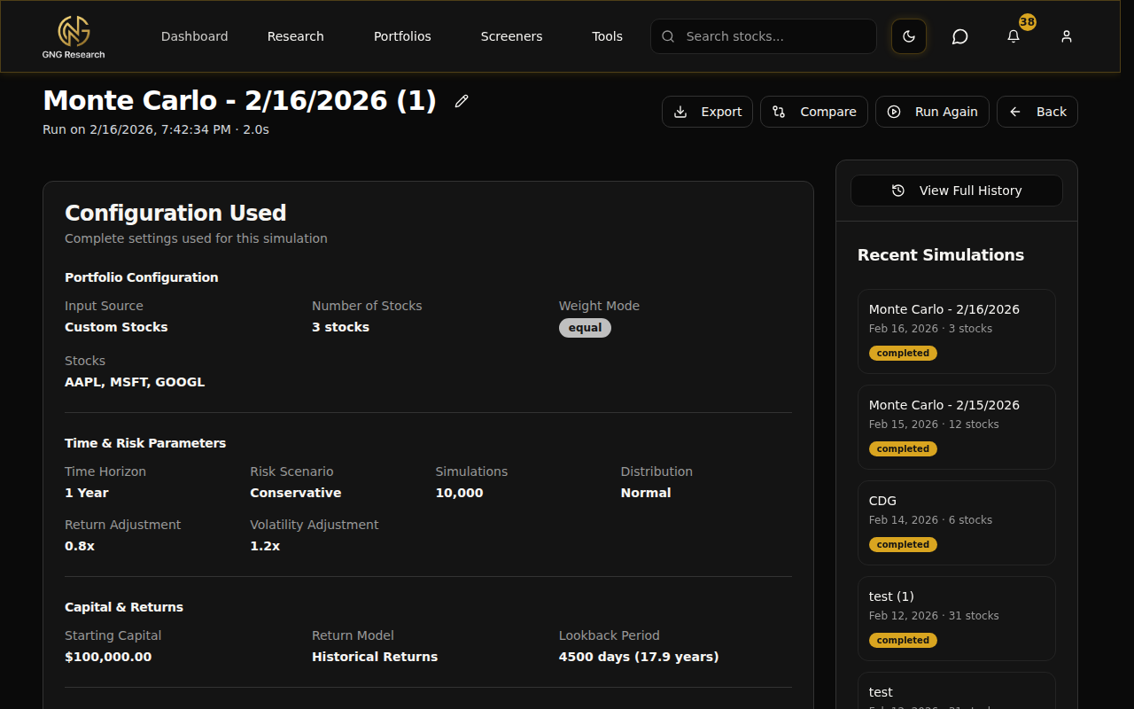
Configuration Summary
At the top, you'll see a read-only summary of every setting that was used for this simulation. It's organized into sections:
Portfolio Configuration - Input source, stock count, weight mode, individual stocks and their weights
Time & Risk Parameters - Time horizon, risk scenario, number of simulations, distribution type
Capital & Returns - Starting capital, return model, lookback period
Rebalancing & Dividends - Rebalancing frequency, dividend reinvestment
Transaction Costs (if applicable) - Commission, slippage, dividend tax
Cash Flow Schedule (if applicable) - Type, amount, frequency, inflation settings
There's a status badge showing "COMPLETED" with the execution time, so you know at a glance how this one went.
Full Results
Below the config summary, you get the full results display. Same charts, tables, and metrics as when you first ran the simulation. Fan chart, percentiles, risk metrics, holdings breakdown, correlation heatmap.. everything.
At the top of the page, you've got action buttons:
Export - Download results to Excel
Compare - Jump to the comparison page with this simulation pre-selected
Run Again - Re-run with the same config
Back - Return to history
Comparing Simulations
This is where the Monte Carlo suite really shines. Running one simulation is useful. Comparing two or three side by side? That's where you start making genuinely informed decisions.
Selecting Simulations to Compare
Head to the History page and click "Select to Compare". This puts the page into multi-select mode. Checkboxes appear next to each completed simulation. Click 2 to 5 simulations, and the "Compare N" button lights up at the top.
Click it and you're taken to the comparison page with all your selected simulations loaded up.
The Comparison Page
The comparison page is packed with insights. Let me walk through each section.
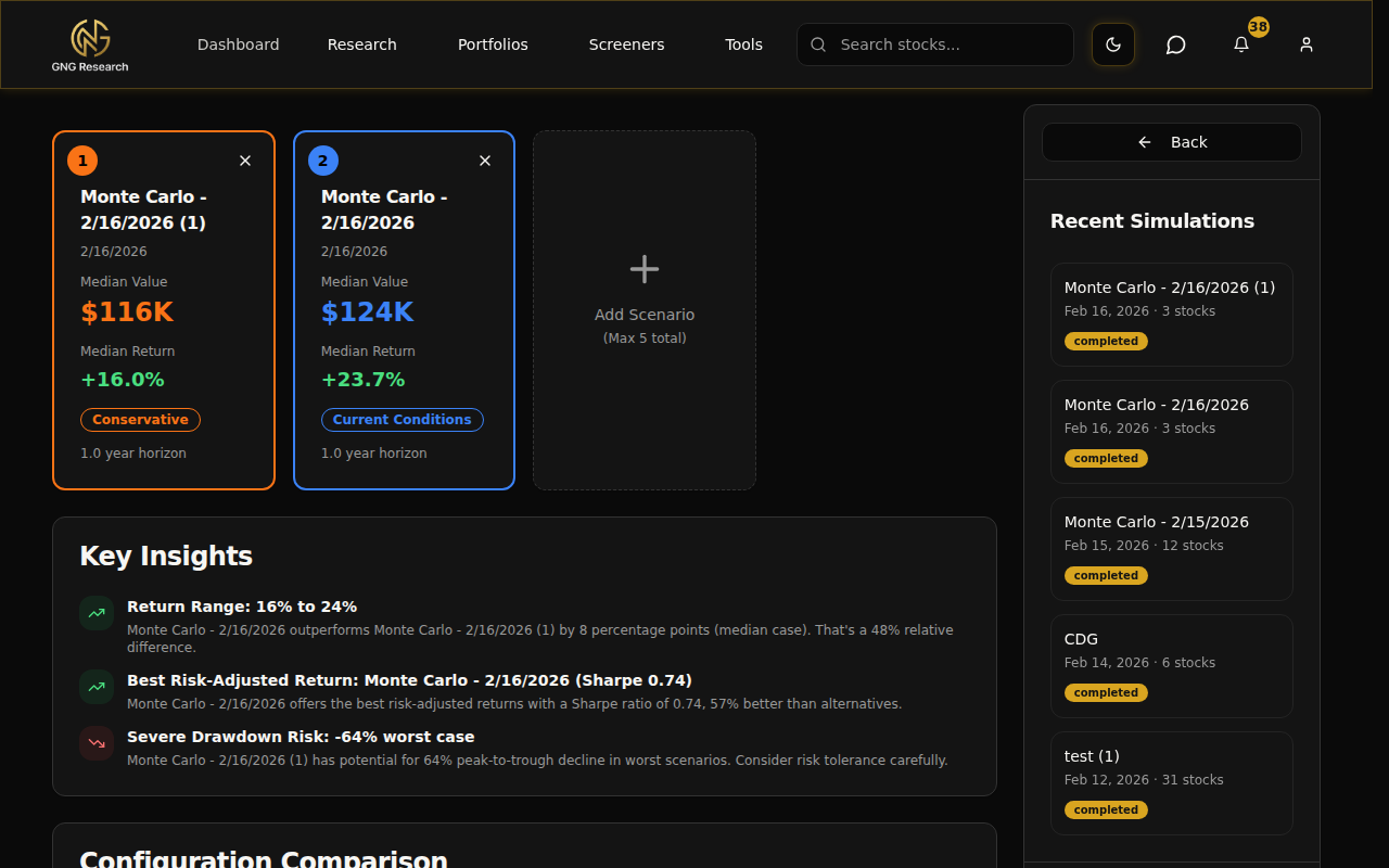
Scenario Cards - At the top, each simulation gets a color-coded card showing its name and a quick identifier. Colors are assigned automatically so you can easily track which line belongs to which simulation in the charts below.
Key Insights Summary - Auto-generated insights that highlight the most important differences. Things like "Return Range: Scenario A returned 12% while Scenario B returned 8%" or "Risk Assessment: Scenario A has 15% lower probability of loss." These are generated dynamically based on your actual results.
Configuration Diff - This section is really clever. It analyzes all the configurations and shows you what's the same across all scenarios (in green) and what's different (in yellow). So if both simulations used the same stocks but different risk scenarios, you'll see "Stocks: Consistent" and "Risk Scenario: Different" right at the top. Makes it immediately clear what variable you're actually testing.
Percentile Comparison Table - A side-by-side table showing p5, p25, p50, p75, and p95 for every scenario. The best values are highlighted in green, worst in red. You can see at a glance which scenario has the best median outcome and which has the worst tail risk.
Overlaid Fan Charts - All scenarios plotted on the same chart with their median lines in bold, color-coded colors. You can toggle confidence bands (p5/p95 dashed lines) on and off. This is the most visually intuitive way to compare scenarios. When the lines diverge, you can see exactly when and by how much.
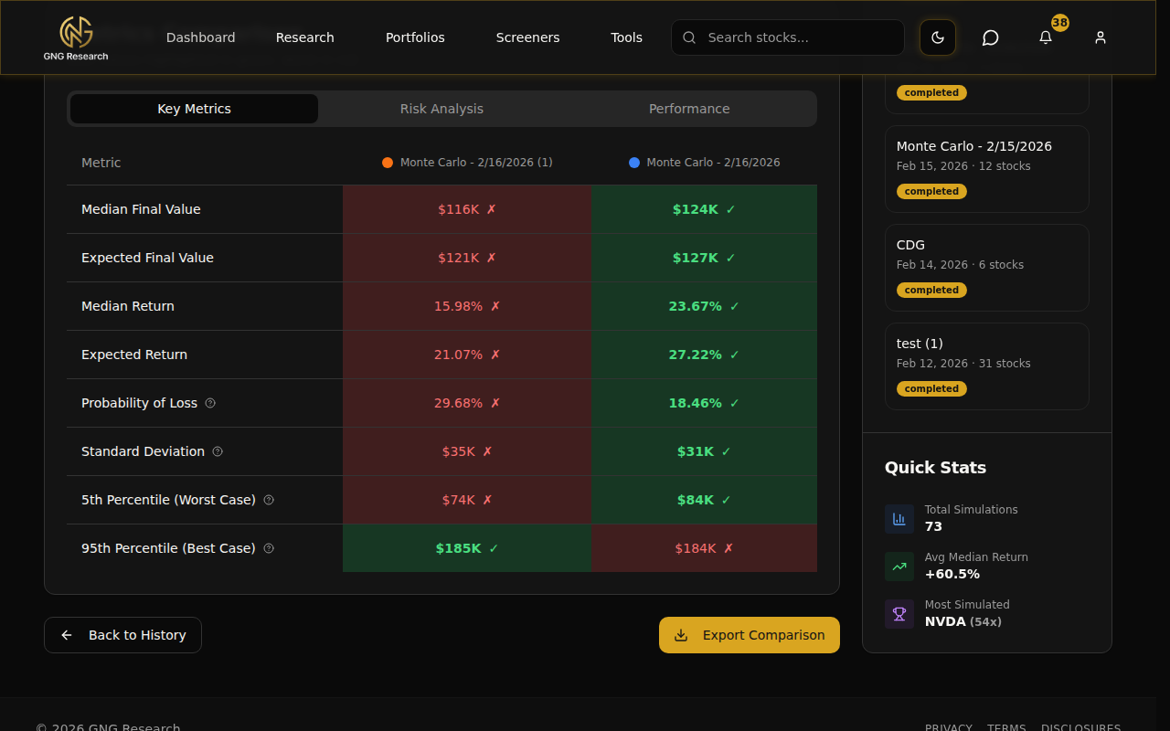
Detailed Metrics Comparison - A tabbed table with three views:
Key Metrics - Median value, expected value, returns, probability of loss, standard deviation
Risk Analysis - VaR, CVaR, probability thresholds, drawdowns, win rate, skewness, kurtosis
Performance - Sharpe, Sortino, Calmar ratios, upside/downside capture
Each metric row shows the value for every scenario with the best value highlighted in green and the worst in red. No mental math needed.. it's all color-coded for you.
Adding & Removing Scenarios
Already on the comparison page and want to add another simulation? Click the "Add Scenario" card. A modal pops up showing all your other completed simulations. Search by name or risk scenario, click one, and it gets added to the comparison instantly.
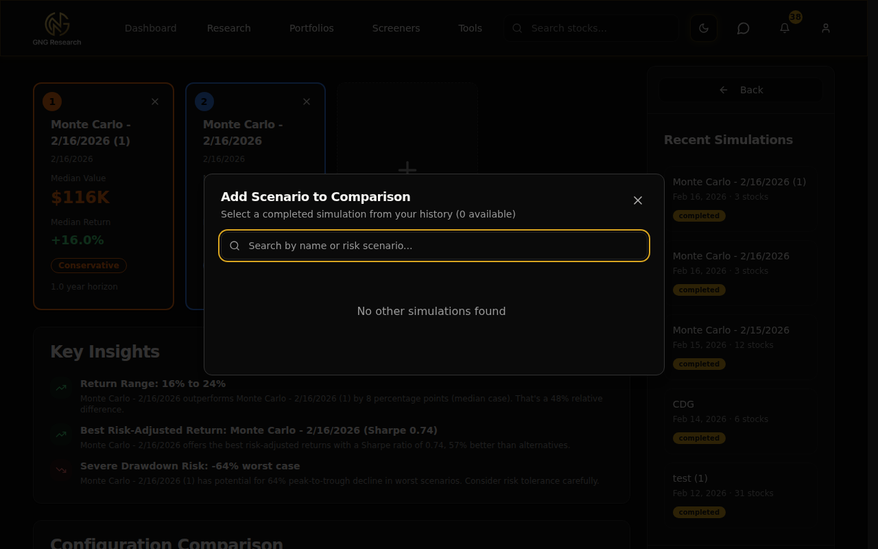
Want to remove a scenario? Click the X on its scenario card. You need at least 2 scenarios to compare, so you can't remove the last two. Maximum is 5 scenarios at once.
Exporting Comparisons
Hit the "Export Comparison" button and you'll get an Excel file with each scenario on a separate sheet. All the metrics, percentiles, and configuration details are included. Great for sharing with someone or doing your own deeper analysis in a spreadsheet.
The Methodology Behind Monte Carlo
Okay, let's talk about what's actually happening under the hood. I'm going to keep this as plain-English as possible because the math doesn't matter as much as understanding the concept.
Here's the process step by step:
Gather historical data. We take your stocks and pull their actual daily returns over the lookback period you selected (default ~18 years). This gives us a real picture of how these stocks have behaved.
Calculate the statistical profile. From that data, we compute the expected return, volatility, and correlations between all your stocks. The correlations matter because stocks don't move independently.. if tech drops, most tech stocks drop together.
Apply the risk scenario adjustments. If you selected "2008 Crisis", we scale down the returns and scale up the volatility. If you selected "Bull Market", we do the opposite. "Current Conditions" leaves everything as-is.
Generate thousands of random paths. Using those statistics, we generate random daily returns for every stock for every day in your time horizon. The randomness follows the historical patterns but explores different possible sequences. One path might have a crash in month 3. Another might have a rally. Another might be flat. That's the whole point.
Apply your settings. For each path, we apply rebalancing (if enabled), dividend reinvestment, transaction costs, contributions/withdrawals, and any other settings you configured.
Measure the outcomes. After running all simulations, we calculate the statistics across all the final values. What's the median? What's the worst 5%? What's the best 5%? What's the probability of loss?
The key insight is that Monte Carlo doesn't give you one answer. It gives you a distribution of answers. And that distribution is far more useful for decision-making than any single number.
What Monte Carlo can tell you: the range of likely outcomes, the probability of hitting certain thresholds, and how different configurations change your risk profile.
What Monte Carlo can't tell you: exactly what will happen. The future doesn't have to follow historical patterns. Black swan events exist. It's a stress test, not a prediction.
Pro Tips
Here are some power-user tricks I've picked up from using this tool myself:
Start with Standard detail (10,000 sims). It's the best balance of speed and accuracy for exploratory work. You can always re-run at Premium or Expert when you need higher precision.
Use different risk scenarios to stress-test your portfolio. Run the same stocks under Current Conditions and 2008 Crisis back to back. The comparison page makes it dead simple to see how your portfolio handles stress versus normal markets.
Name your simulations descriptively. "AAPL-MSFT-GOOGL 1Y Conservative" is infinitely more useful in your history than "Monte Carlo - Feb 16, 2026 (4)". Future you will thank present you.
Compare a 1-year vs 5-year horizon. Time is one of the biggest risk reducers in investing. Running the same portfolio over 1 year and 5 years shows you exactly how time affects your probability of loss. The difference is usually dramatic.
Set a target portfolio value to see your probability of hitting your goal. Planning for $500K in 5 years? Set it as the target and the simulation tells you the exact probability. Way better than guessing.
Export your results to Excel for deeper analysis. The export includes the raw percentile time series, so you can build your own charts or do custom calculations that aren't in the UI.
Use the comparison page to A/B test different allocations. Run the same 3 stocks with equal weights, then again with 60/20/20 weighting. Compare side by side to see if the different allocation actually makes a meaningful difference.
Check the correlation matrix. If everything in your portfolio is highly correlated (lots of red), you're not as diversified as you think. In a downturn, correlated stocks all drop together. Look for low or negative correlations to build a more resilient portfolio.
Wrapping Up
That's the Monte Carlo Simulation Suite from top to bottom. You've got a powerful tool that lets you stress-test any portfolio across thousands of possible futures, compare scenarios side by side, and make decisions based on probabilities rather than single-point guesses.
Whether you're testing your actual portfolio against a market crash, exploring different allocations, or planning for a long-term financial goal.. the Monte Carlo tools give you the data to make informed choices. And the comparison feature honestly changed how I think about portfolio construction. Being able to see two scenarios overlaid on the same chart with all the metrics highlighted in green and red.. it makes the decision obvious most of the time.
The next guide in the series will cover the Dividend Forecaster, which is the other big analytical tool on the platform. Same philosophy: give you the range of outcomes, not just one number.
If you have any questions or feedback about the Monte Carlo tools, drop it in the comments below or jump into Rocket Chat and let me know. I read everything. And if you haven't run a simulation yet, go do it right now.. pick three stocks, hit Standard, and see what happens. It takes about 30 seconds to set up and honestly, once you see your first fan chart, you'll be hooked.
Thanks for reading, and I'll see you in the next guide.