Your Complete Guide to the Research Terminal
Alright.. if you've been wondering how to get the most out of the Research Terminal, this one's for you. I'm kicking off a series of step-by-step guides for every major tool on GNG, and we're starting with the big one. Whether you just signed up yesterday or you've been here since the beginning, I promise you'll pick up something new here. Let's get into it.
What Is the Research Terminal?
Think of the Research Terminal as your personal stock screener on steroids. We currently track over 4,600 companies across every major exchange, with 180+ data points on each one. That means you can filter, sort, and compare pretty much anything you'd want to know about a stock, all in one place. No more jumping between five different websites to piece together basic data.
The data updates daily after market close, so you're always looking at fresh numbers. Whether you're hunting for high dividend yields, undervalued growth stocks, or just trying to figure out what's going on with a specific sector, the Research Terminal is where you start.
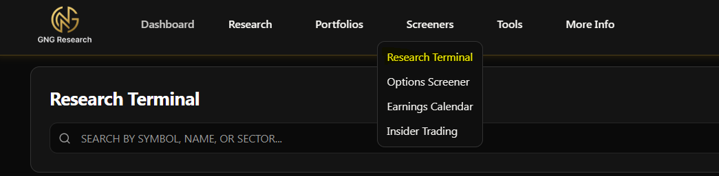
Finding the Research Terminal
Getting there is easy. In the navigation bar at the top, look under the Screeners section. You'll see "Research Terminal" right there. Click it and you're in. That's it.. no hidden menus or secret handshakes required.
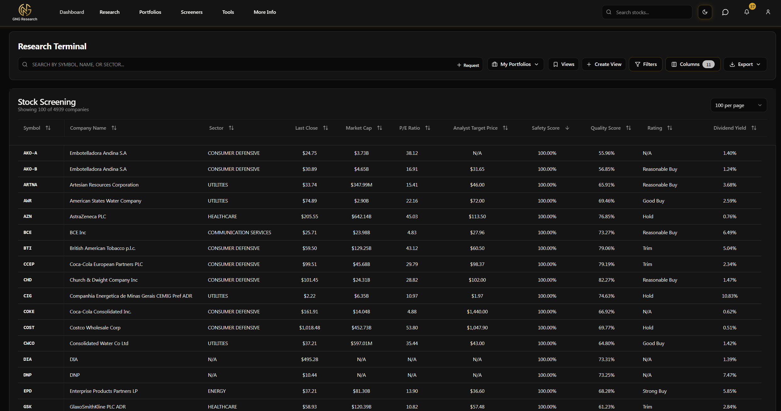
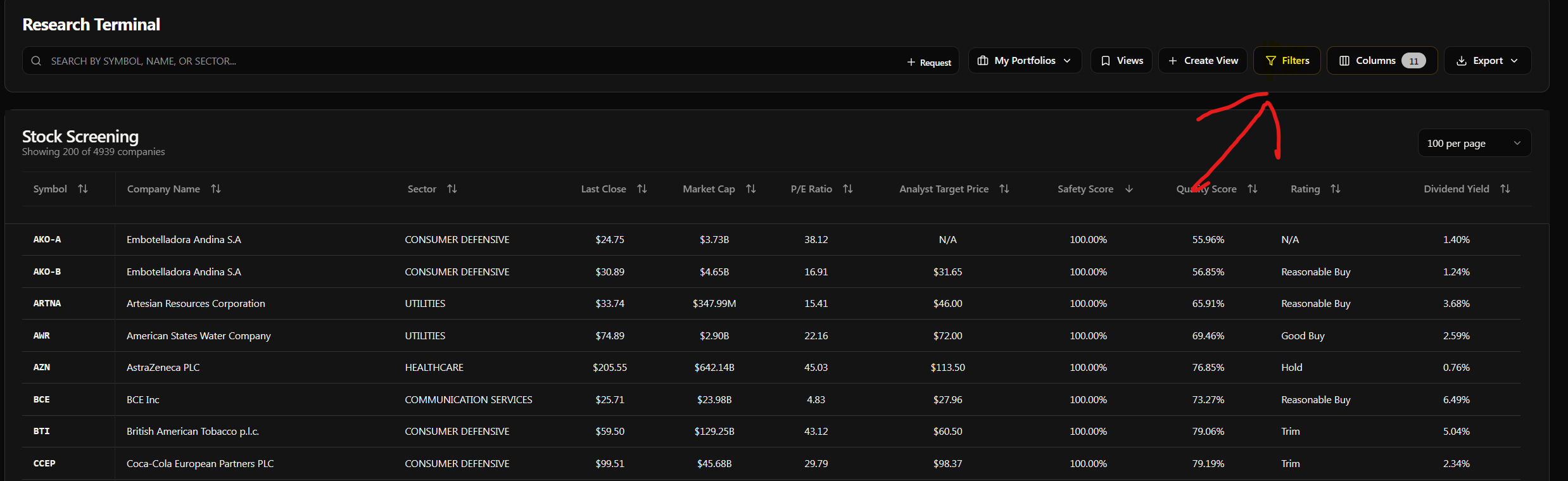
Your First Look - The Default View
When you first land on the Research Terminal, here's what you'll see. Don't be overwhelmed, I'll walk you through everything.
By default, we show you 10 columns to get started:
Symbol - The ticker (AAPL, MSFT, etc.)
Company Name - The full name
Sector - What industry group they belong to
Price - Last closing price
Market Cap - Total market capitalization
P/E Ratio - Price to earnings
Analyst Target - Wall Street consensus target price
Safety Score - Our proprietary safety rating
Quality Score - Our proprietary quality rating
Dividend Yield - Annual dividend as a percentage of price
The table is sorted A to Z by symbol by default. You'll see all 4,500+ companies listed, and as you scroll down, more will load automatically. Simple and clean.
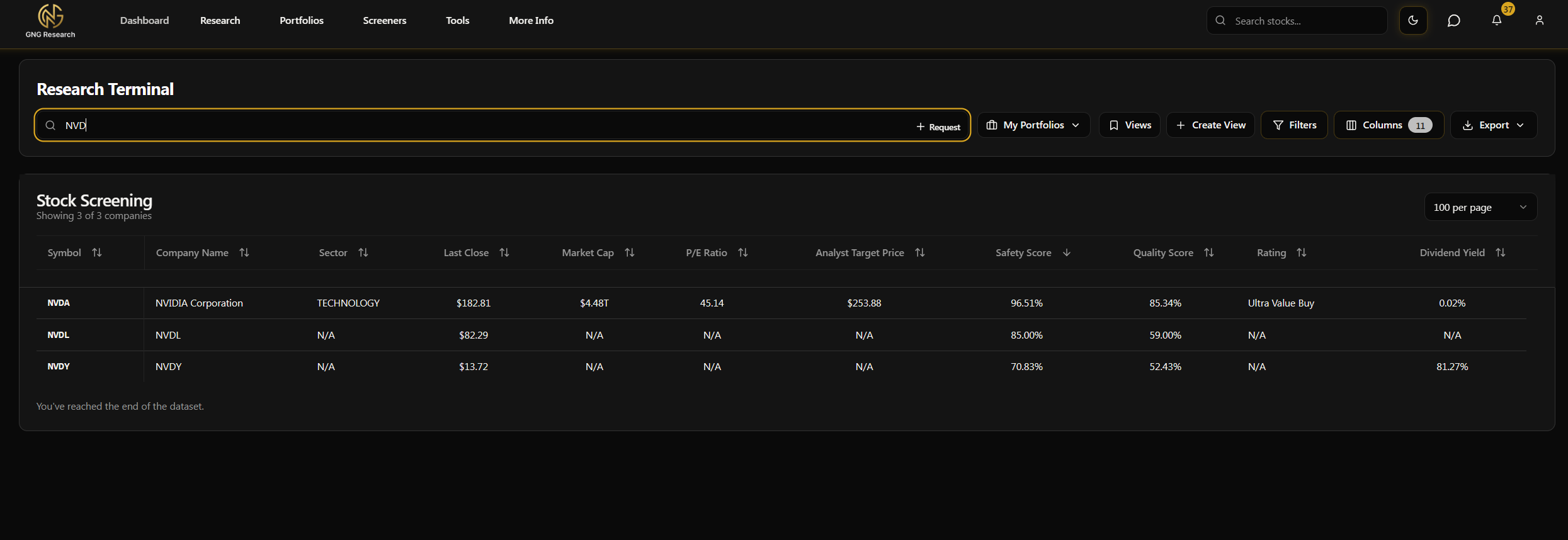
Searching for Stocks
At the very top of the terminal, you'll see a search bar. This is the fastest way to find what you're looking for. Just start typing a ticker symbol or company name and the table will instantly filter down to matching results. For example, type "AAPL" and you'll see Apple right there. Type "Microsoft" and same thing. It searches both the symbol and the full company name, so you don't need to remember exact tickers.
To clear your search, just delete the text. The full list comes right back.
Or Filter for multiple using the Symbols Filter:
Filters - This Is Where It Gets Powerful
Alright, this is the bread and butter of the Research Terminal. The filter system lets you narrow down those 4,600+ companies to exactly what you're looking for. Whether you want stocks with a P/E under 15, a dividend yield above 3%, or companies in the healthcare sector with strong safety scores.. filters are how you get there.
Opening the Filters
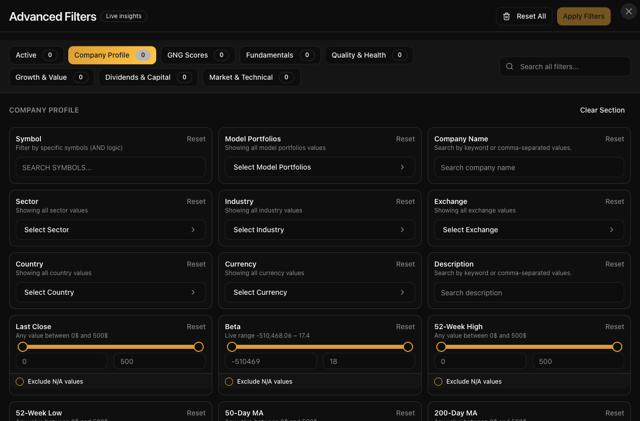
Click the "Filters" button near the top of the terminal. This will open up a modal window where all the magic happens.
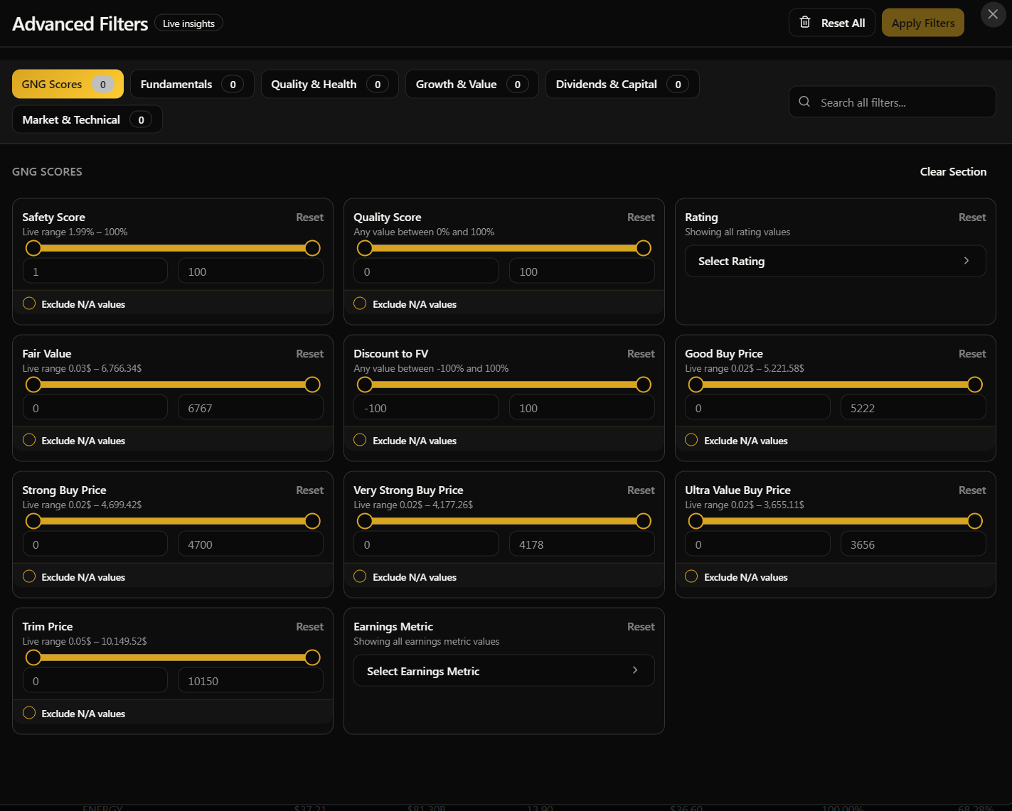
The Six Super Categories
We've organized all 150+ filterable metrics into six super categories to make your life easier. Rather than scrolling through a massive list, you can jump straight to the group that matters to you:
GNG Scores - This is our proprietary stuff. Safety scores, quality scores, valuation ratings, fair value estimates, buy and trim price targets. If you want to filter by our ratings system, start here.
Fundamentals - Your classic valuation ratios. P/E, P/B, P/S, EV/Revenue, EV/EBITDA, PEG ratio, and more. The stuff you'd typically see on any stock screener, but we've got a lot more of them.
Quality & Health - Financial health and balance sheet strength. Current ratio, quick ratio, debt-to-equity, interest coverage, Piotroski F-Score, and other metrics that tell you how solid a company's finances really are.
Growth & Value - Revenue growth rates, earnings growth, EPS CAGR over different time frames, and momentum indicators. If you're looking for fast growers or checking if a company is slowing down, this is your section.
Dividends & Capital - Everything dividend related. Yield, per share amounts, payout ratios, dividend growth CAGR, plus capital allocation metrics like buyback yield and total shareholder yield.
Market & Technical - Trading statistics and technical indicators. Price, beta, 52-week ranges, moving averages, RSI, volume, volatility measures, and momentum. Great for timing and technical analysis.
Each category has subcategories within it, so you can drill down even further. But honestly, the fastest way to find a specific filter is to just use the search bar at the top of the filters modal. Type "dividend" and every dividend-related filter pops right up. Type "debt" and you'll see debt-to-equity, net debt, debt-to-EBITDA, all of it.
How Range Filters Work
Most of the numeric filters are range filters. That means you set a minimum, a maximum, or both. For example:
Dividend Yield: Set minimum to 3% and maximum to 8% to find stocks in that sweet spot
P/E Ratio: Set maximum to 20 to find reasonably valued companies
Market Cap: Set minimum to $10B to only see large caps
Safety Score: Set minimum to 70% to only see companies we rate as highly safe
When you open a range filter, you'll see the actual min and max values from our database, so you know exactly what range of data exists. This is really helpful so you're not guessing what numbers to plug in.
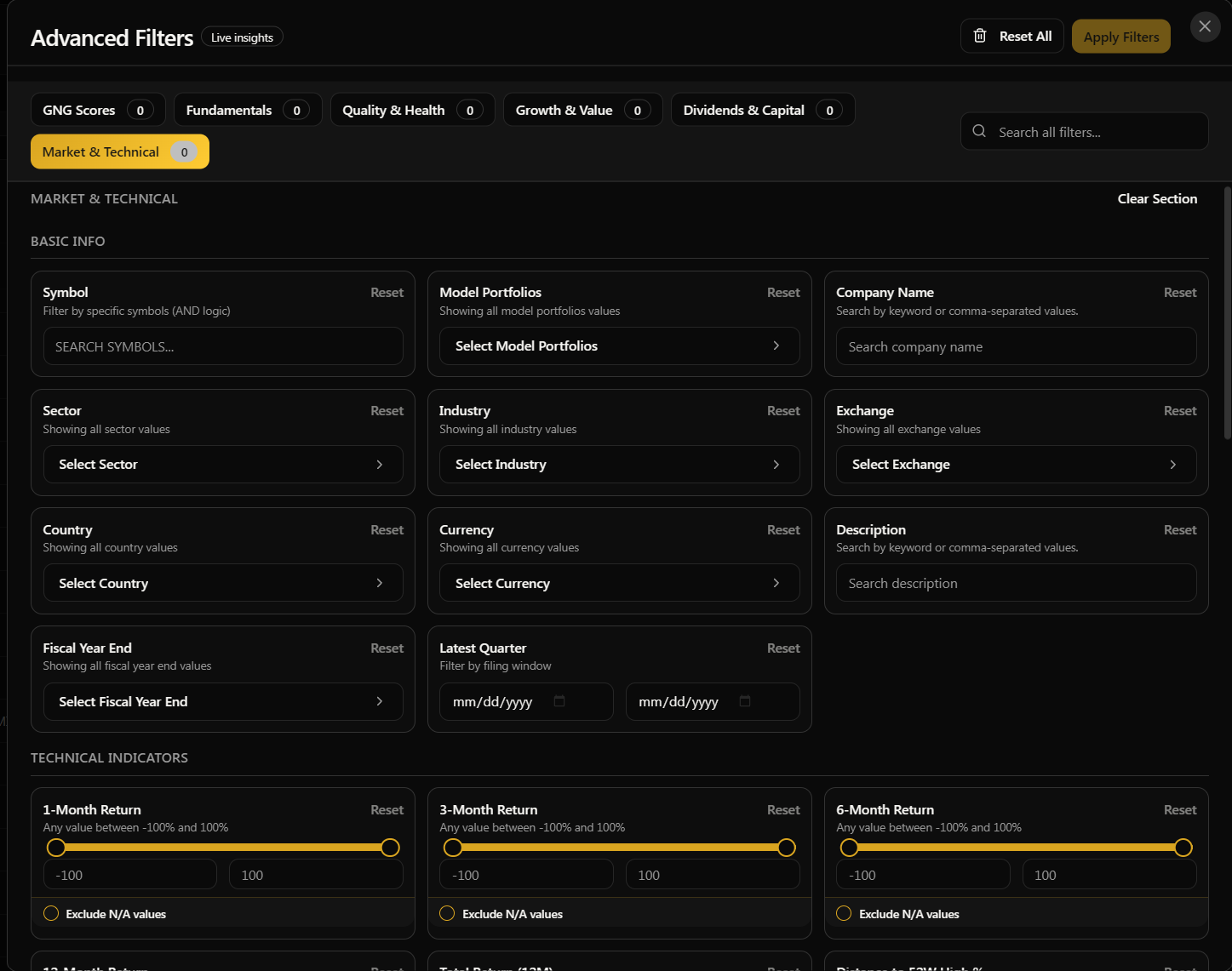
How Multi-Select Filters Work
Some filters aren't numbers, they're categories. These show up as checkbox lists where you can select one or more options:
Sector: Technology, Healthcare, Financial Services, Energy, Consumer Defensive, Industrials, and more (12 sectors total)
Exchange: NASDAQ, NYSE, AMEX, OTC
Country: USA, Canada, China, UK, Germany, Japan, France
Asset Type: Stock or ETF
GNG Rating: Ultra Value Buy, Very Strong Buy, Strong Buy, Good Buy, Reasonable Buy, Hold, Trim
Model Portfolios: Filter to see only stocks that are held in one of our model portfolios
Just check the boxes for what you want to include. For example, if you only want to see Technology and Healthcare stocks, check those two and everything else gets filtered out. Easy.
The Exclude N/A Option
You'll notice on most filters there's an "Exclude N/A" toggle. This is super useful. Some companies don't have data for every metric. Maybe a stock doesn't pay a dividend, so dividend yield shows N/A. Or maybe we don't have enough history to calculate a 5-year growth rate. If you turn on "Exclude N/A", any company that doesn't have data for that specific metric gets filtered out. I highly recommend using this when you're doing serious screening because it keeps your results clean and your analysis more accurate.
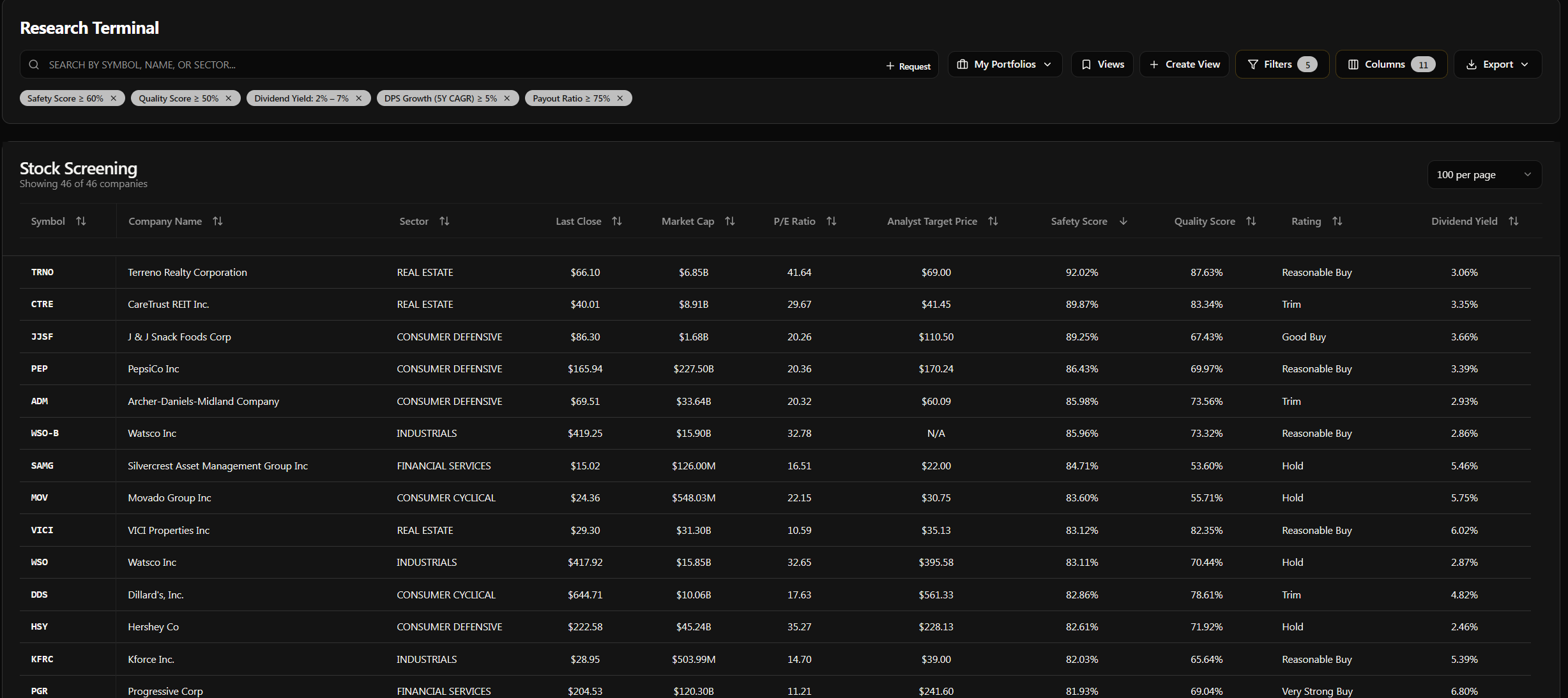
Applying and Clearing Filters
Once you've set up your filters, hit the "Apply" button and the table updates immediately. You'll see the company count change at the top of the terminal, something like "Showing 347 of 4,691 companies", so you know exactly how many stocks passed your criteria.
To clear filters, you have two options:
Clear individual filters by clicking the X next to each active filter chip that appears on the terminal
Clear all filters at once using the clear all button
The Filters button will also show a badge with the number of active filters, so you always know at a glance how many you have running.
Example: Finding High Quality Dividend Stocks
Let me walk you through a real example. Say you want to find high quality dividend stocks with room to grow and a sustainable payout. Here's how I'd do it:
Open Filters
Under GNG Scores: Set Safety Score minimum to 60%
Under GNG Scores: Set Quality Score minimum to 50%
Under Dividends & Capital: Set Dividend Yield minimum to 2%, maximum to 7%
Under Dividends & Capital: Set 5Y Dividend Growth CAGR minimum to 5% (turn Exclude N/A on)
Under Quality & Health: Set Payout Ratio maximum to 75%
Hit Apply
Just like that, you've narrowed down thousands of companies to a focused list of quality dividend growers with sustainable payouts. Play around with the thresholds to loosen or tighten your criteria. That's the beauty of it.
Columns - Build Your Perfect View
Now that you know how to filter, let's talk about columns. This is where you decide what data you actually want to see on your screen. We've got over 150 columns available, but obviously you don't want all of them showing at once.. that would be chaos. The column manager lets you pick and choose exactly what matters to you.
Opening the Column Manager
Click the "Columns" button near the top of the terminal, right next to the Filters button. This opens a modal with two tabs:
Edit Columns - Add or remove columns from your view
Reorder Columns - Drag and drop to rearrange the order they appear
Adding and Removing Columns
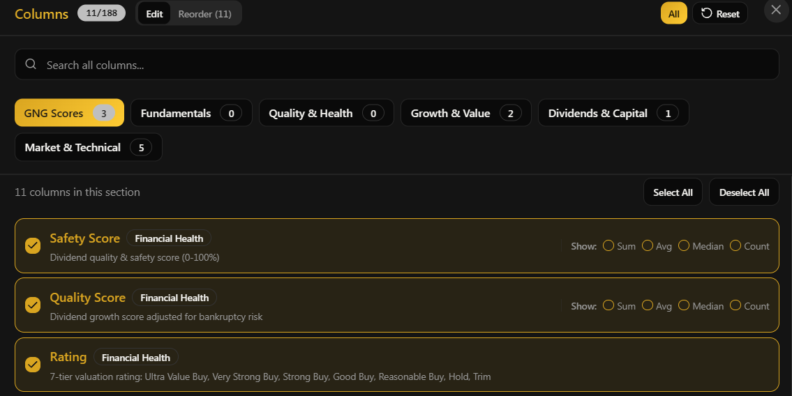
In the Edit Columns tab, you'll see the same six super categories as the filters:
GNG Scores - Safety Score, Quality Score, Rating, Fair Value, Good Buy Price, Strong Buy Price, Ultra Value Buy Price, Trim Price
Fundamentals - P/E, P/B, P/S, EV/Revenue, EV/EBITDA, PEG ratio, Cash-Adjusted PEG, and all your valuation ratios plus the individual fair value methods (P/E FV, P/S FV, P/B FV, etc.)
Quality & Health - Current Ratio, Quick Ratio, Debt/Equity, Interest Coverage, ROE, ROA, ROIC, Piotroski F-Score, Beneish M-Score, Bankruptcy Risk, and more
Growth & Value - Revenue Growth, EPS Growth, FCF Growth, 3Y and 5Y CAGRs, Earnings Power, Gross Profitability, Positive Earnings Streak, Positive FCF Streak
Dividends & Capital - Yield, Dividend Per Share, 5Y Dividend Growth CAGR, Payout Ratio, Buyback Yield, Total Shareholder Yield, Reinvestment Rate, Dividends to Operating Cash Flow
Market & Technical - Beta, 52-Week High/Low, Distance from 52-Week High, 50-Day and 200-Day Moving Averages, RSI, ATR%, Volatility (20d and 60d), Max Drawdown, Price Returns (1M, 3M, 6M, 12M), Volume Surge Ratio
Each column has a checkbox. Check it to add it to your view, uncheck it to remove it. You can have up to 30 columns showing at once. That might sound like a lot, but when you've got 150+ to choose from, you'll want to be selective about what matters for your current research.
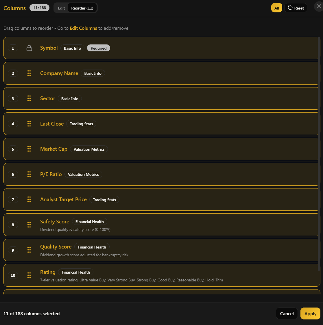
One important thing: Symbol is always locked as the first column. It can't be removed or moved. This keeps your reference point consistent no matter how you customize everything else.
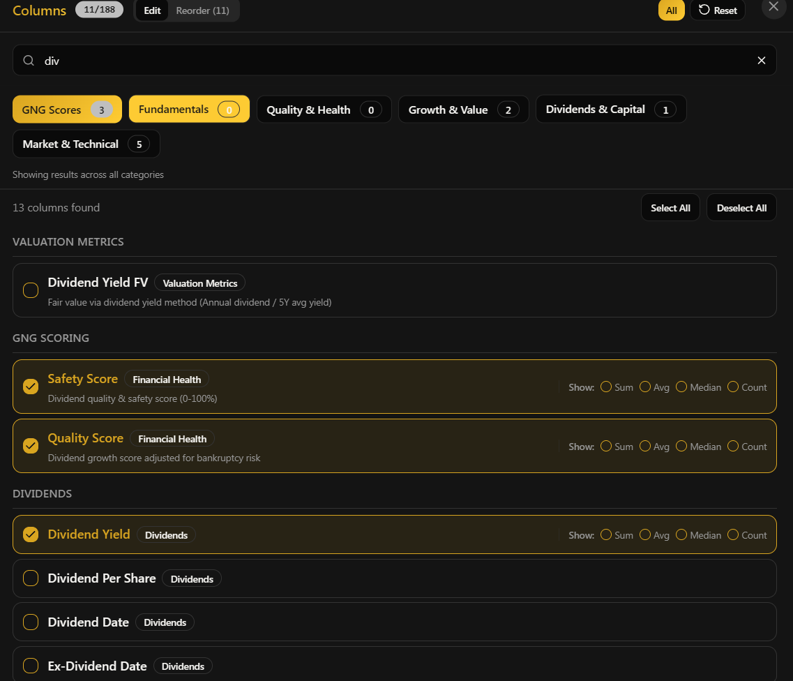
The Search Bar Is Your Best Friend
I cannot stress this enough. Instead of browsing through all six categories trying to find one specific column, just use the search bar at the top of the column modal. Type what you're looking for:
Type "div" to see all dividend-related columns
Type "debt" to find debt-to-equity, net debt, debt-to-EBITDA
Type "margin" to see gross margin, operating margin, net margin, FCF margin
Type "growth" for all growth rate columns
Type "score" for our GNG Safety and Quality scores
Type "fair" for fair value estimates and individual methods
Type "cash" for cash flow, cash per share, cash conversion metrics
The results show up instantly grouped by category. It's way faster than clicking through each super group manually. I built this feature specifically because I got tired of scrolling through everything myself haha.
Reordering Your Columns
Once you've picked your columns, switch to the "Reorder Columns" tab. Here you'll see all your active columns listed in their current order. To rearrange them:
Grab the drag handle on the left side of any column (it looks like six dots)
Drag it up or down to where you want it
Drop it in place
If you're on mobile, the touch targets are nice and large so it's easy to grab and drag even on a phone screen. And for the keyboard users, you can use arrow keys and the space bar to grab and move columns too.
This is really useful when you want your most important columns right next to the symbol so you don't have to scroll horizontally to see them.
Example: Setting Up a Dividend Research View
Here's how I'd set up a view specifically for dividend research:
Open Columns and go to Edit Columns
Search "div" and add: Dividend Yield, Dividend Per Share, 5Y Dividend Growth CAGR, Ex-Dividend Date
Search "payout" and add: Payout Ratio
Search "safety" and add: Safety Score
Search "quality" and add: Quality Score
Search "rating" and add: GNG Rating
Keep the basics: Symbol, Company Name, Sector, Price, Market Cap
Remove anything else you don't need for this specific research
Switch to the Reorder tab and drag Dividend Yield right next to Symbol so it's the first data column you see
Hit Apply
Now you've got a clean, focused view that shows exactly what a dividend investor cares about. And the best part? You can save this as a view so you don't have to set it up again every single time. More on that in a second.
Sorting Your Data
Sorting is straightforward. Click on any column header to sort by that column. Click it again to reverse the sort direction. A small arrow will appear next to the column name showing you whether it's ascending or descending.
Quick tip: when you sort, N/A values always go to the bottom regardless of sort direction. So if you sort by Dividend Yield descending, the highest yields are at the top and any stocks that don't pay dividends (N/A) are pushed to the end. This was a deliberate design choice because nobody wants to scroll past a bunch of N/A values to find actual data.
One thing to note is that you can only sort by one column at a time right now. If you click a different column header, the sort switches to that new column.
Aggregations - Quick Stats at a Glance
This is a feature that a lot of people miss and I think it deserves more love. You can turn on column aggregations to see summary statistics right at the top of the table. This includes:
Sum - Total across all visible rows
Average - The mean value
Median - The middle value (often more useful than average for financial data)
Count - How many companies actually have data for that column
These show up in a sticky row at the top of the table. For example, if you're looking at Dividend Yield with Average enabled, you might see "Avg: 2.45%" which tells you the average yield across your filtered results. Or if you're looking at Market Cap with Sum, you can see the total market cap of every company in your current view.
To enable aggregations, look for the aggregation toggles in the column selector. You can pick which types you want to see on a per-column basis. Really powerful for getting a quick sense of the data without having to export and do math in a spreadsheet.
[Screenshot: Table showing aggregation row at top with Average and Median values visible]
Saving Views - Don't Lose Your Setup
This is one of my favorite features because it saves you so much time. Once you've got your columns, filters, sort order, and everything dialed in exactly how you want it, you can save it as a named view and load it back up instantly anytime you come back.
Creating a View
Set up your terminal exactly how you want it (columns, filters, sort, search, everything)
Click the "Create View" button
Give it a name (something descriptive like "High Yield Dividend Screener" or "Tech Growth Picks")
Optionally add a description so you remember what it's for later
Click Save
That's it. Your entire terminal state is now saved and you'll see it listed under your saved views.
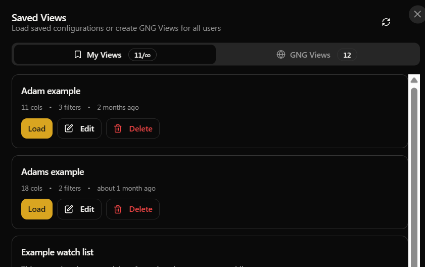
Loading a Saved View
Click the "My Views" button to see all your saved views. Click "Load" on any one of them, and boom.. your terminal instantly restores to exactly how it was when you saved it. Same columns, same filters, same sort, same search term, same everything. No more rebuilding your setup from scratch every session.
GNG Views
In addition to your personal views, you'll also find GNG Views that our team has curated. These are pre-built configurations for common screening strategies that we think are genuinely useful. Think of them as starting templates or inspiration for your own research. You can't edit them directly, but you can fork any GNG View to create your own personal copy and then modify it however you like. This is a great way to get started if you're not sure how to set things up from scratch.
View Limits by Tier
Free: 1 personal saved view
Pro and above: Essentially unlimited personal views
GNG Views: Available to everyone, regardless of your tier
And if you accidentally delete a view, don't panic. You've got a 30-second undo window to bring it right back.
Exporting Your Data
Once you've filtered and sorted the data to your liking, you can export it for offline analysis. Click the "Export" button and choose your format:
CSV - Plain text file that works everywhere. Import into Excel, Google Sheets, or any data tool you use.
Excel - Native .xlsx file with formatting already applied, ready to open
PDF - Formatted report, great for sharing with others or printing
The export includes whatever columns you currently have visible and respects your active filters. So if you've filtered down to 200 companies with 12 columns showing, that's exactly what ends up in your export file. Clean and precise.
Export Limits
Free: CSV only, up to 100 rows, once per week
Pro and above: All formats, unlimited rows, no weekly cap
What's Available on Each Tier
I always want to be transparent about this stuff. Here's the honest breakdown of what each subscription tier gets in the Research Terminal:
Free members get access to around 50 columns, basic filtering on standard metrics like sector, market cap, P/E, price, and dividend yield. You also get 1 saved view and limited CSV exports. It's a solid starting point and genuinely useful for casual research. We're not hiding the product behind a paywall just to frustrate people.
Pro members unlock 100+ additional metrics including our GNG Safety Scores, Quality Scores, and the full valuation ratings system with fair value estimates and buy/trim prices. You also get advanced filtering on every single metric, unlimited saved views, and unlimited exports in all three formats. This is where the real analytical power lives.
Premium and Enterprise gets everything. All 150+ columns, all features, zero limits. The full suite with nothing held back.
The free tier is genuinely functional for basic screening. The Pro tier is where the real power is and where most of our members get the most value. If you're reading this article, there's a good chance you already have access to most of this.
Pro Tips from Someone Who Built It
Here are a few things I've found that make the terminal way more efficient to use. These are the shortcuts I use myself every day:
Always use the search bar in filters and columns. It's faster than clicking through categories. Every single time. Just type what you're looking for and it shows up. I built this because I was tired of browsing the categories myself.
Save views for your recurring workflows. If you check dividend stocks every week, save that view once. If you have a growth stock screener you run monthly, save that too. One click to load instead of five minutes rebuilding every time.
Combine filters strategically. The real power isn't in any single filter, it's in stacking five or six of them together. Safety Score above 60% + P/E under 20 + Dividend Yield above 2% + Revenue Growth above 5% + Payout Ratio under 70%.. that's a serious quality screen that most retail investors don't have access to.
Use Exclude N/A when doing serious analysis. It keeps your results clean and makes the aggregation numbers at the top actually meaningful instead of being skewed by missing data.
Check the GNG Views for inspiration. Even if you don't use them directly, they show you how to set up effective multi-filter screens. Fork one and tweak it to match your own strategy.
Export to Excel for deeper dives. The terminal is amazing for screening, but sometimes you want to run your own formulas, build charts, or do comparisons. Export the filtered data and go wild in your spreadsheet.
Click on any ticker to go deeper. The Research Terminal is great for finding stocks, but once you've identified something interesting, click the ticker to go to its full Company Details page where you'll find everything from financial statements to earnings estimates to our sentiment analysis.
Wrapping Up
That's the Research Terminal from top to bottom. It's one of the most powerful tools we've built, and honestly, the more you use it, the more you'll discover what it can do. If there's a metric or filter you wish we had, or something about the interface that could be better, drop it in the comments below. We're always looking to add what our members actually need, not what we think looks cool.
This is the first in a series of Getting Started guides I'll be publishing for every major tool and feature on GNG. Keep an eye on the Getting Started page and the Articles section for more of these. Next up will likely be the Dividend Forecasting Suite or the Portfolio tools, but feel free to let me know in the comments what you'd like covered next.
As always, if you have any questions, don't hesitate to reach out in Rocket Chat or drop a comment below. We're here to help you make the most of this platform.