Your Complete Guide to the Dividend Forecasting Suite
Welcome to the third installment of our Getting Started series. This time we're diving into one of the most powerful tools on GNG: the Dividend Forecasting Suite. Whether you're a dividend investor planning your retirement income, or you just want to see how your portfolio's dividends might grow over the next decade, this tool was built for you. I'm going to walk you through absolutely everything, from setting up your first forecast to reading every single chart and table in the results. Let's get into it.
What Is the Dividend Forecasting Suite?
The Dividend Forecasting Suite is a projection engine that takes your current dividend-paying stocks and models how your income could grow over time. Think of it like a crystal ball for your dividend income, except instead of magic, it uses historical growth rates, compound math, and optionally Monte Carlo simulations to give you a realistic picture of what your future dividend income might look like.
Here's what makes it special:
Two execution modes — Deterministic (instant) for quick estimates, and Monte Carlo (15-30 seconds) for probability-based projections with confidence intervals
DRIP modeling — See exactly how reinvesting dividends compounds your share count and income over time
Tax-adjusted projections — Set your tax rate and see after-tax income alongside gross numbers
Seven result sections — Income summary cards, monthly income chart, annual projection chart, stock breakdown table, stock income timeline, payment calendar, and safety analysis
Automatic history — Every forecast is saved so you can revisit, rename, and compare scenarios
It works with your existing portfolios, our model portfolios, or completely custom stock selections. No matter how you use it, you'll walk away with a clear picture of where your dividend income is headed.
Finding the Dividend Forecaster
In the navigation bar at the top of the site, look under the Tools section. You'll see "Dividend Forecaster" listed right there. Click it and you're in. You can also find your forecast history under the same menu.
Before you jump in, a quick heads up: at the top of the forecaster page, you'll see a financial disclaimer in a yellow card. It's important to understand that all projections are based on historical data and that dividends can be reduced or eliminated at any time. This tool is for educational and planning purposes, not financial advice. Always consult with a professional for your specific situation.
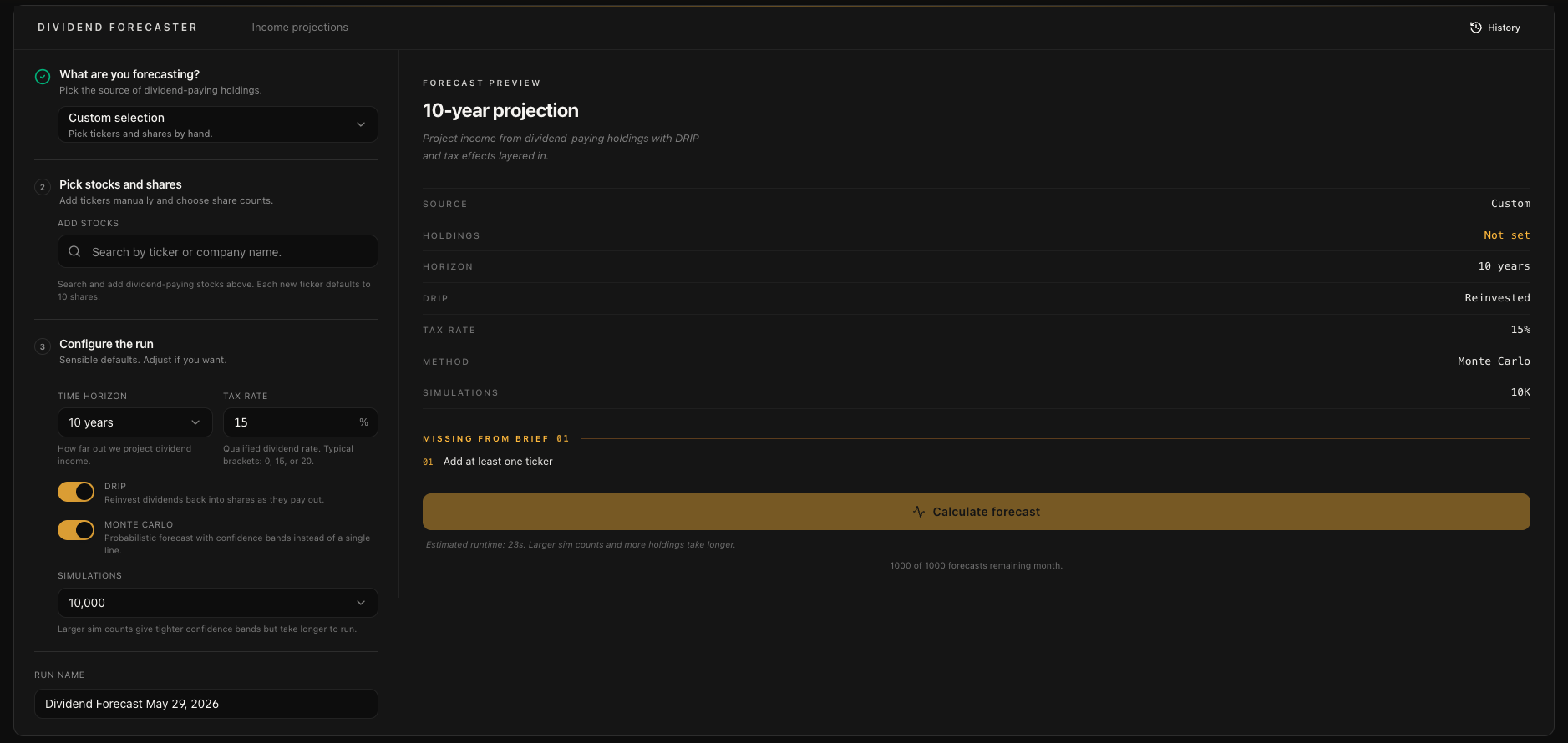
Step 1: Choosing Your Input Source
The very first thing you'll do is choose where your stocks come from. There are three input modes, and each one serves a different purpose:
Portfolio Mode
This is the most common way to use the forecaster. Select one of your existing portfolios and the tool automatically loads all your dividend-paying positions with the exact share counts you already have. It supports both manually created portfolios and Plaid-connected brokerage portfolios. Each portfolio in the dropdown shows the number of positions it contains so you can quickly identify the right one.
This mode is perfect for answering the question: "Based on what I actually own today, what will my dividend income look like in 10 years?"
Model Portfolio Mode
If you want to explore different dividend strategies without building a custom list, the Model Portfolio mode lets you choose from our pre-built dividend portfolio templates. These are organized by investment strategy such as Growth, Income, or Balanced approaches. It's a great way to see how a curated dividend portfolio might perform over time and compare it against your own holdings.
Custom Mode
This is for complete flexibility. In Custom mode, you can search for any stock by ticker or company name and add it to your forecast list one at a time. For each stock you add, you can specify the exact number of shares (the default is 10). This is ideal for testing "what if" scenarios, like "What if I bought 50 shares of JNJ and 100 shares of O? What would my income look like in 20 years?"
Step 2: Configuring Your Forecast
Once your stocks are loaded, it's time to dial in the settings. Every setting here changes how the forecast is calculated, so it's worth understanding what each one does.
Time Horizon
This is how far into the future you want to project. You get a dropdown with the following options: 1, 2, 3, 5, 7, 10, 15, 20, 25, or 30 years. The default is 10 years, which is a nice balance between seeing meaningful compound growth and keeping the projection within a reasonable confidence range.
My recommendation: start with 10 years to get a feel for things, then try 20 or 30 years if you want to see the full power of compound dividend growth. The longer the horizon, the more dramatic the compounding effect becomes, especially with DRIP enabled.
DRIP (Dividend Reinvestment)
This toggle controls whether dividends are automatically reinvested to buy additional shares. Enabled by default, and I strongly recommend leaving it on for most scenarios.
When DRIP is on, every dividend payment gets used to purchase additional fractional shares at the current price. Those new shares then generate their own dividends, which buy more shares, which generate more dividends.. and so on. This is the magic of compound growth in dividend investing, and seeing it modeled over 10-30 years is genuinely eye-opening.
Turn DRIP off if you want to model a scenario where you're living off the dividend income rather than reinvesting it. For example, someone in retirement who needs the cash flow would want to see the no-DRIP projection.
Tax Rate
Set your dividend tax rate anywhere from 0% to 40%. The default is 15%, which is the qualified dividend tax rate for most US investors in the middle tax brackets.
Every chart and table in the results will show both gross and after-tax numbers, so you can see the real impact of taxes on your projected income. If you're not sure what rate to use, 15% is a solid starting point for qualified dividends. Consult with a tax professional for your specific situation.
Monte Carlo Mode
This is the big one. The Monte Carlo toggle switches between two fundamentally different calculation approaches:
Off (Deterministic mode) — Uses a single projection path based on historical growth rates. Results are instant. You get one clean line showing where your income is headed.
On (Monte Carlo mode) — Runs thousands of randomized simulations to produce probability distributions. Takes 15-30 seconds. You get confidence bands showing the range of likely outcomes.
I'll explain the difference between these modes in detail later in this guide, but the short version is: use Deterministic for quick estimates and Monte Carlo for serious analysis.
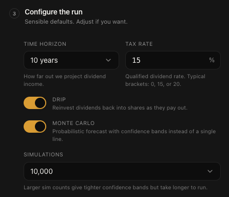
Number of Simulations (Monte Carlo Only)
When Monte Carlo is enabled, you can choose how many simulations to run:
1,000 simulations — Fast, good for testing
5,000 simulations — Quick but reasonably accurate
10,000 simulations — Recommended for most users (this is the default)
25,000 simulations — High accuracy for detailed analysis
50,000 simulations — Maximum precision, takes the longest
More simulations means more accurate probability distributions, but it also takes longer. For most people, 10,000 is the sweet spot. You don't need to go higher unless you're doing very precise scenario planning.
Step 3: Running Your Forecast
Once everything is configured, hit the "Calculate Dividend Income" button. What happens next depends on your execution mode:
Deterministic mode: Results appear almost instantly. The calculation runs on a single projection path using each stock's historical dividend growth rate.
Monte Carlo mode: You'll see a loading indicator that says something like "Running Monte Carlo (10,000 sims)..." The system polls every 2 seconds until the simulation completes. This typically takes 15-30 seconds, but can take longer for larger portfolios or higher simulation counts.
Behind the scenes, the forecast runs on a dedicated backend that processes your stock data, applies growth models, handles DRIP calculations, factors in taxes, and generates all seven result sections. Your forecast is automatically saved to your history so you can always come back to it.
Understanding Your Results
This is where things get really good. After the calculation completes, you'll see seven distinct sections of results. Each one gives you a different angle on your dividend income projections. Let me walk you through every single one.
Income Summary Cards
Right at the top of your results, you'll see four milestone cards that give you the big picture at a glance:
Current Annual Income — Your baseline: what your portfolio would pay in dividends right now based on current rates
Year 1 Income — Projected income after the first year, with the percentage growth from current
Year 5 Income — Mid-term projection showing meaningful compound growth
Year N Income — Your final year projection (Year 10, 20, or 30 depending on your time horizon) with total growth percentage
Each card shows both the annual amount and the monthly equivalent, so you can think about it in terms of monthly cash flow if that's more intuitive for you. The growth percentages are color-coded green to help them stand out.
Below the four cards, you'll see a Growth Summary Bar that shows the total transformation: "Your income grows from $X to $Y over N years" with a DRIP indicator if reinvestment is enabled. This is the "wow" number that puts it all in perspective.
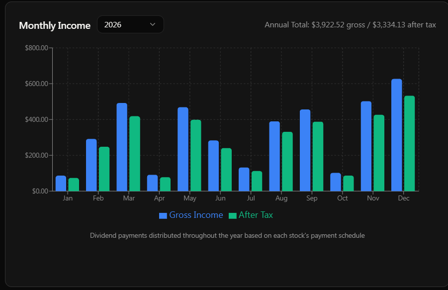
Monthly Income Chart
The monthly income chart is a bar chart that shows your dividend income broken down by month. Each month gets two bars:
Blue bar — Gross income (before tax)
Green bar — After-tax income
At the top of the chart, there's a year selector dropdown that lets you view the monthly breakdown for any year in your projection. Start with Year 1 to see your near-term income, then jump to Year 10 or beyond to see how monthly payments change as dividends grow.
You'll notice that some months have significantly higher bars than others. This is completely normal. It happens because companies pay dividends on different schedules (quarterly, monthly, semi-annually) and the payment dates cluster in certain months. March, June, September, and December tend to be heavier months because that's when most quarterly dividends land.
Hover over any bar to see the exact dollar amounts in a tooltip.
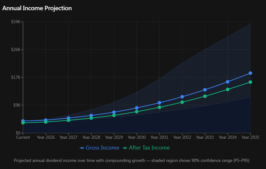
Annual Projection Chart
This is the chart that makes people's jaws drop. It's a line chart showing your total annual dividend income over the entire time horizon.
In Deterministic mode, you'll see two clean lines:
Blue line — Gross annual income trend
Green line — After-tax annual income trend
In Monte Carlo mode, those lines are surrounded by a shaded region representing the 90% confidence band (P5 to P95). This means the simulation says there's a 90% probability your actual income will fall within this shaded range. The wider the band, the more uncertainty there is.
The X-axis runs from "Current" through each year to your final projection year. Hover over any point to see the exact annual amount, monthly equivalent, and (in Monte Carlo mode) the confidence range.
With DRIP enabled on a 20 or 30 year horizon, you'll typically see the line curve upward exponentially. That's the compound effect in action. It starts slow and then accelerates dramatically in the later years. This is why dividend investors talk about "the snowball effect" so much.
Stock Breakdown Table
Now we're getting into the per-stock details. The Stock Breakdown Table (also called the "Current Snapshot" tab in the Stock Analysis section) is a fully sortable table that shows you exactly what each stock in your portfolio contributes.
Here's what each column tells you:
Stock ticker — The symbol
Current shares — How many shares you own right now
Current dividend per share — The annual dividend paid per share at current rates
Current yield % — The stock's current dividend yield
Historical growth rate % — The historical dividend growth rate with a trend arrow showing direction
Payment frequency — How often the stock pays dividends (quarterly, monthly, semi-annually, etc.)
Current annual income — What this stock pays you per year right now
Projected Year N dividend per share — What the dividend per share is expected to be at the end of your time horizon
If DRIP is enabled, you'll also see:
Year N shares — How many shares you'll have accumulated through reinvestment
Yield on Cost (YoC) % — Your effective yield based on your original cost basis
And finally:
Year N total income — Total annual income from this stock at the end of your projection
At the bottom, there's a Totals Row showing portfolio-wide current income versus projected final-year income. Click any column header to sort ascending or descending.
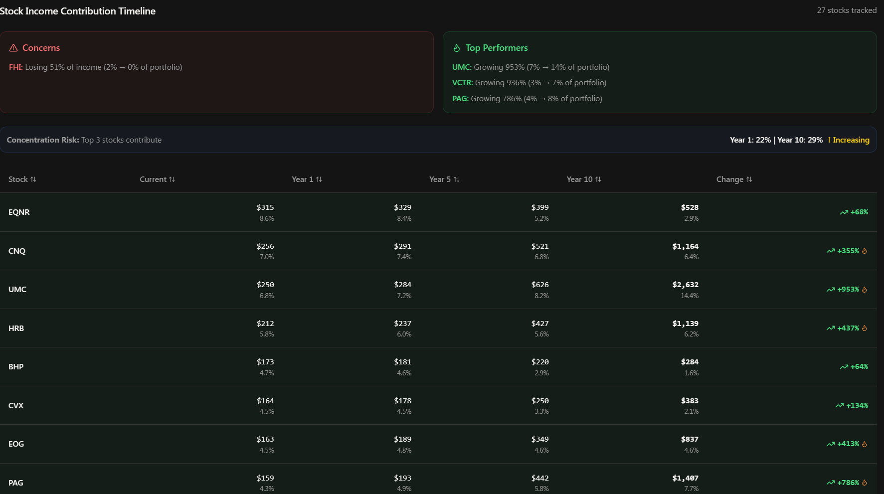
Stock Income Timeline
The Stock Income Timeline is the second tab in the Stock Analysis section, and it's one of the most insightful views in the entire tool. It shows how each stock's contribution to your total portfolio income changes over time.
The table shows each stock with columns for:
Current income and its percentage of total portfolio income
Year 1 income and percentage
Year 5 income and percentage (if your time horizon is 5+ years)
Year 10 income and percentage
Total change % — Color-coded green for growing stocks, red for declining ones
But the real value is in the auto-generated insights below the table:
Concerns Section
A red-highlighted box listing stocks that are losing income contribution over time. Each concern shows the stock, the issue (like declining growth rate), and an impact score that combines the stock's portfolio weight with the decline magnitude. The top 3 problem stocks are highlighted so you know where to focus your attention.
Top Performers Section
A green-highlighted box showcasing stocks with exceptional growth (over 50%). These are ranked by total change percentage, showing you which stocks are really pulling their weight in growing your income. Stocks with over 200% growth get a special flame icon.
Concentration Risk Banner
A blue information banner that tracks whether your top 3 stocks' share of total income is increasing or decreasing over time. If concentration is increasing (meaning a smaller number of stocks is dominating your income), you'll see an upward arrow and a warning. If it's diversifying, you'll see a downward arrow and a positive indicator. Anything over 30% concentration gets an alert triangle.
Rows in the table are also color-tinted: green for stocks growing more than 20%, red for stocks declining more than 20%. It makes it really easy to scan visually and spot the winners and losers at a glance.
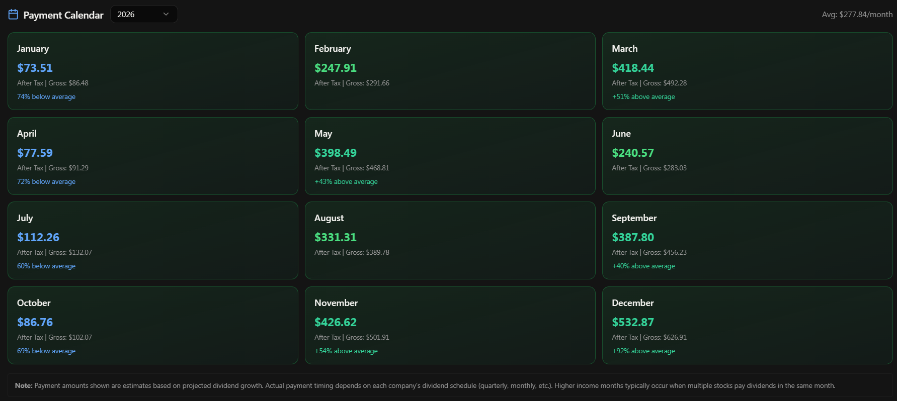
Payment Calendar
The Payment Calendar gives you a month-by-month view of when you can expect dividend payments. It's laid out as a grid of 12 monthly cards, one for each month of the year.
Each month card shows:
Month name
After-tax income — The primary number, color-coded by size
Gross income — Shown as a secondary reference number
Deviation indicator — Shows if this month is significantly above or below your monthly average
There's a year selector at the top so you can view the calendar for any projection year. The average monthly income is also displayed at the top for quick reference.
The color coding makes patterns jump out immediately:
Emerald — Significantly above average (more than 120% of average)
Green — Normal month
Blue — Below average (less than 80% of average)
Gray — Past months (dimmed)
This view is incredibly useful for cash flow planning. If you're relying on dividend income for expenses, you'll know exactly which months are heavy and which are light so you can plan accordingly.
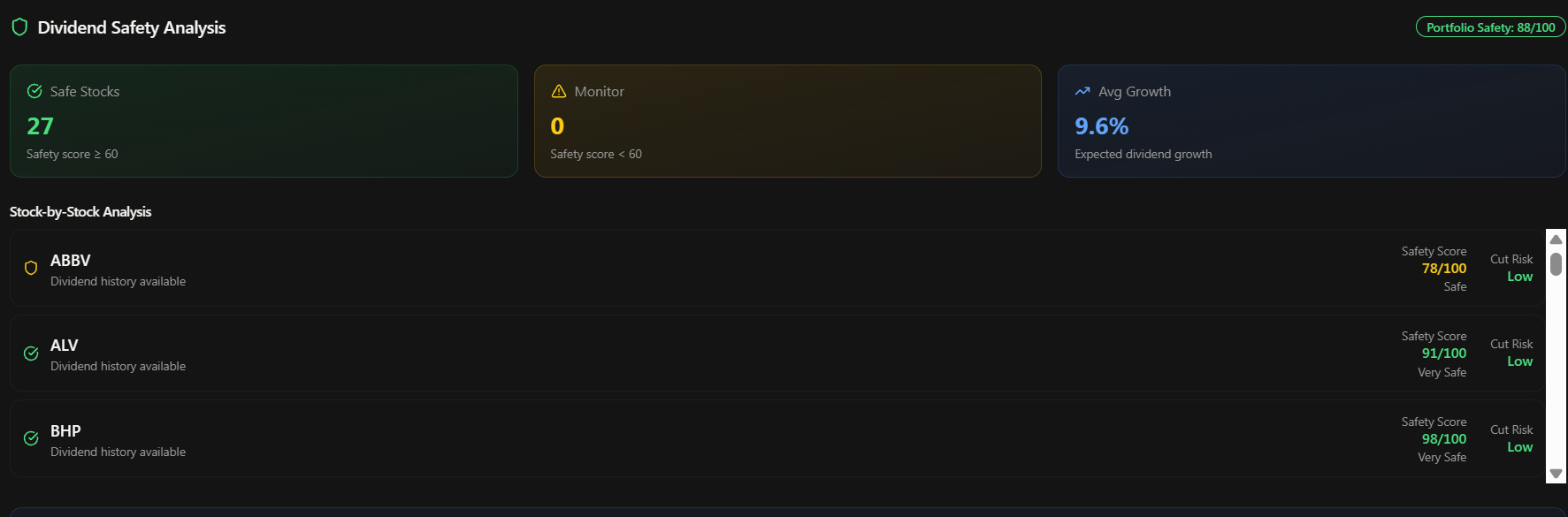
Safety Analysis
The Safety Analysis card is your dividend sustainability check. It answers the critical question: "How likely are these dividends to actually get paid?"
At the portfolio level, you'll see:
Overall safety score badge — A composite score from 0-100
Safe stocks count — Number of stocks with a safety score of 60 or higher
Monitoring stocks count — Number of stocks with a safety score below 60 that warrant attention
Average portfolio growth rate — The mean historical dividend growth across all holdings
Below that, you get a stock-by-stock breakdown in a scrollable list. Each stock shows:
Safety icon — Checkmark, shield, or warning icon based on the score
Safety score out of 100 — Color-coded: Green (80-100) Very Safe, Yellow (60-79) Safe, Orange (40-59) Moderate, Red (below 40) Risky
Cut Risk label — Very Low, Low, Moderate, or High based on the probability of a dividend cut
Payout ratio — Percentage of earnings paid as dividends (lower is generally safer)
Our safety scores are a composite of multiple factors: payout ratio sustainability, dividend payment streak length, earnings consistency, and debt levels. A high safety score means the company has a strong track record of maintaining and growing its dividend with solid financial backing.
Deterministic vs Monte Carlo: When to Use Each
Let me break this down in plain English because it's one of the most common questions we get.
Deterministic Mode
Deterministic mode assumes each stock's dividend will grow at its historical rate every single year, no variation. It gives you one clean projection line. Think of it as the "if everything goes exactly according to plan" scenario.
Use it when:
You want a quick estimate in under a second
You're comparing multiple scenarios rapidly
You want a simple, easy-to-understand baseline
You're just getting started and want to see the tool in action
Monte Carlo Mode
Monte Carlo mode doesn't assume the future will look exactly like the past. Instead, it runs thousands of simulations where each stock's growth rate varies randomly (but realistically) from year to year. The result is a probability distribution showing the range of outcomes you might experience.
Instead of one line on a chart, you get a shaded band showing the 90% confidence interval (P5 to P95). The median line represents the most likely outcome, and the band shows where 90% of all simulated outcomes fell.
Use it when:
You want a realistic range of outcomes, not just one number
You're making actual financial planning decisions
You want to understand downside risk (the P5 line shows the pessimistic case)
You have the 15-30 seconds to wait for results
My honest recommendation: use Deterministic for quick exploration and scenario comparison, then switch to Monte Carlo with 10,000 simulations when you want the real analysis. The confidence bands add genuine value for understanding what your income might actually look like.
DRIP Deep Dive: The Compound Machine
DRIP (Dividend Reinvestment Plan) is arguably the single most powerful feature in the forecaster. Let me explain why.
Without DRIP, your share count stays fixed. If you own 100 shares of a stock and it pays $4/share annually, you get $400/year. As the dividend grows, your income grows linearly with the per-share increase.
With DRIP, every dividend payment buys additional shares at the current market price. Those new shares then earn dividends, which buy more shares, which earn more dividends. This creates an exponential growth curve instead of a linear one.
Here's what you'll see in the results when DRIP is enabled:
Income Summary Cards show dramatically higher final-year numbers
Annual Projection Chart curves upward exponentially instead of growing linearly
Stock Breakdown Table adds "Year N Shares" and "Yield on Cost" columns
Growth Summary Bar shows a DRIP indicator confirming reinvestment is active
The "Yield on Cost" column is particularly interesting. It shows your effective yield based on your original cost basis, not the current price. With DRIP and dividend growth working together over 10-20 years, it's not uncommon to see yield-on-cost numbers of 8%, 12%, or even higher for strong dividend growers. That's the compound machine at work.
Try running the same forecast with DRIP on and DRIP off to see the difference. On a 20-year horizon, the gap can be enormous.
Saving and Revisiting Forecasts
Every forecast you run is automatically saved to your history. You don't need to do anything special. Just run it and it's there.
Accessing Your History
Navigate to Tools > Dividend Forecaster > History (or click the history link from the forecaster page). You'll see a table listing your past forecasts with:
Name — Editable. Click the pencil icon to rename it to something meaningful like "Retirement Portfolio 2026 Baseline"
Created date
Config summary — Quick reference like "12 stocks • 10yr • DRIP • MC"
Status — Completed or Failed
Execution time
What You Can Do With Saved Forecasts
View — Click the eye icon to open the full results exactly as they appeared when you ran them. All seven result sections are preserved.
Run Again — Click the play icon to load the same configuration into a new forecast. This is perfect for updating a forecast with the latest data or tweaking one setting to compare scenarios.
Delete — Click the trash icon to remove a forecast (with a confirmation dialog so you don't accidentally delete anything).
Rename — Click the pencil icon to give your forecast a descriptive name. The system checks for duplicate names and saves instantly.
Your history shows the last 50 forecasts, which is plenty for ongoing analysis and scenario comparison.
Tier Access and Monthly Limits
Here's the honest breakdown of what each tier gets:
Free: 10 forecasts per month. This is enough to get familiar with the tool and run basic scenarios. All features are available, including Monte Carlo mode.
Pro: 50 forecasts per month. Plenty for active investors who want to run multiple scenarios, compare portfolios, and iterate on their analysis regularly.
Premium: 200 forecasts per month. For power users who use the forecaster as a core part of their investment workflow.
Enterprise/Admin: Unlimited.
The monthly count resets at the beginning of each calendar month. There's no daily limit, so you can use all your monthly forecasts in one session if you want.
Pro Tips from Someone Who Built It
Here are the things I've found that make the Dividend Forecaster way more useful. These are the workflows I use myself:
Run DRIP on and DRIP off side by side. The contrast is striking, and it really drives home why reinvesting dividends matters. Use the History page to flip between both results.
Start with 10 years, then extend to 20 or 30. The first 5 years of compound growth are modest. Years 10-30 are where the exponential curve really takes off. Seeing the full picture changes how you think about long-term dividend investing.
Use Custom mode for "what if" scenarios. Thinking about adding a new stock to your portfolio? Add it in Custom mode with your planned share count and see how it impacts your projected income. It's like test-driving a stock before you buy.
Check the Safety Analysis before relying on projections. A stock might show amazing growth projections, but if its safety score is below 40 with a high cut risk, those projections are built on shaky ground. Always sanity-check with the safety card.
Watch the Income Timeline for concentration risk. It's easy to get excited about your fastest-growing stock, but if it's becoming 40% of your projected income, that's concentration risk. The auto-generated insights will flag this for you.
Use Monte Carlo for real decisions, Deterministic for exploration. When you're just playing around, Deterministic mode gives instant feedback. When you're actually planning your retirement income or making investment decisions, switch to Monte Carlo with 10,000 simulations for the confidence bands.
Name your forecasts descriptively. "Portfolio A - DRIP - 20yr - Feb 2026" is way more useful than "Forecast 47" when you're looking at your history three months later.
Compare your portfolio against a Model Portfolio. Run your actual portfolio, then run a Model Portfolio with a similar strategy. The side-by-side comparison in History can reveal opportunities you're missing or confirm you're on the right track.
Frequently Asked Questions
How accurate are the projections?
The projections are based on each stock's historical dividend growth rate. They assume the future will roughly resemble the past, which is a reasonable starting point but never a guarantee. That's exactly why Monte Carlo mode exists, it shows you the range of possibilities, not just one path. Use the projections as a planning tool, not a prediction.
Why do some months show way more income than others?
Most US companies pay dividends quarterly, and the payment dates tend to cluster in certain months (especially March, June, September, and December). This is normal and reflects actual dividend payment schedules. The Payment Calendar makes this pattern easy to see.
What happens if a company cuts its dividend?
The forecaster uses historical growth rates, so it doesn't predict future cuts. However, the Safety Analysis section gives you tools to assess cut risk before you trust the projections. Stocks with low safety scores and high payout ratios are the most likely candidates for cuts.
Does the tool account for stock splits?
Yes. Our data pipeline adjusts historical dividend data for stock splits, so the growth rates you see are accurate reflections of actual per-share dividend growth, regardless of any splits that occurred.
Can I forecast ETFs?
If the ETF pays dividends and is in our database, yes. However, ETF dividend growth tends to be less predictable than individual stocks since it depends on the underlying holdings and fund management decisions.
Why does Monte Carlo take longer?
Instead of running one calculation, Monte Carlo runs thousands. With 10,000 simulations, the system is essentially computing 10,000 different possible futures for your portfolio and then aggregating the results into probability distributions. That takes more processing power, but the insights are worth the wait.
What's the difference between Current Yield and Yield on Cost?
Current yield is the annual dividend divided by today's stock price. Yield on cost is the annual dividend divided by what you originally paid. Over time with dividend growth, your yield on cost rises while current yield stays anchored to today's price. The Stock Breakdown Table shows both when DRIP is enabled.
Wrapping Up
That's the Dividend Forecasting Suite from top to bottom. It's one of the tools I'm most proud of because it takes something that's genuinely hard to visualize, the long-term compound growth of dividend income, and makes it tangible and interactive.
Whether you're a new dividend investor just starting to build positions or a seasoned income investor optimizing a mature portfolio, this tool gives you the data you need to make informed decisions about your dividend strategy.
If you haven't tried it yet, go run your first forecast right now. Start with your actual portfolio, leave DRIP enabled, set 10 years, and switch Monte Carlo on with 10,000 simulations. The results might surprise you.
As always, if you have questions, feedback, or feature requests, drop them in the comments below or reach out in Rocket Chat.