

Introduction
What if the best portfolio of the past five decades is exactly the wrong portfolio for the next two?
I have had this question in my head ever since I read a morning newsletter from Finanzen.net, which is one of Germany's largest financial media platforms. It's funny because I have been on their mailing list for many years, yet I never really pay much attention. However, the day I actually took the time to read it, I found a fascinating topic that I want to discuss with you.
It was based on research by Nick Maggiulli from Of Dollars And Data, who used 54 years of data (1972 through 2025) to find the asset mix with the best return per unit of risk.
The answer surprised a lot of people.
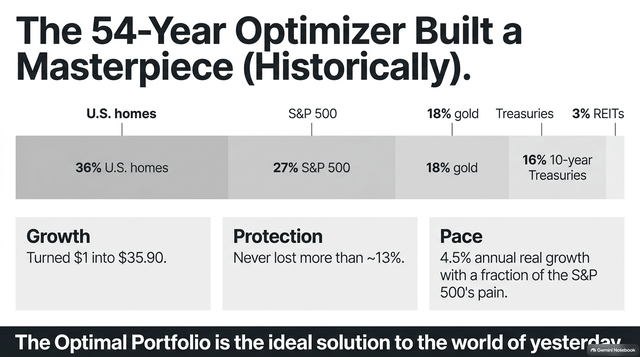
36% U.S. homes
27% S&P 500
18% gold
16% 10-year Treasuries
3% REITs
Here's what that looks like on the efficient frontier:
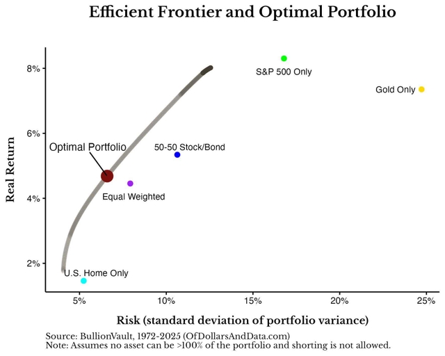
It's a fantastic portfolio. Historically.
There's just one problem.
When I dug into the data behind it, as well as a 95-year study from Man Group and Duke University, I found that most of this "optimal" portfolio is the result of one very specific era: four decades of falling rates, rather low inflation, and bonds that rallied whenever stocks fell (which implies the optimal balance of stocks and bonds).
We are now in a different era.
In this article, I'll explain why the famous winning portfolio is built for the wrong regime, what a century of data says about the assets that work when inflation runs hot, and where my own portfolio lands. That includes a chart that made me pretty uncomfortable at first, and why I believe it ends up confirming the way I invest.
So, as we have a lot on our plate today, let's dive in!
Sign in to leave a comment and join the discussion.
Sign Up Free