    Advanced Charting

    Compare two stocks side by side

    See a stock’s daily P/E history where earnings data supports it, alongside valuation lines, to assess today’s price against its past.

    This tool is free with a free GNG account, and it will stay free. You must log in to use it.

    You must be logged in to view this page. Log in or create a free account.

    Free to join. No credit card. Takes seconds.

    Overview

    Advanced Charting at a glance

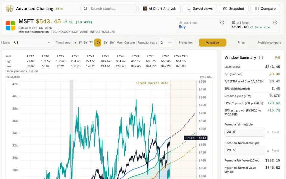
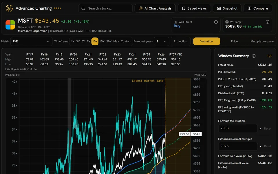
    Most investors start with one question: is this stock cheap or expensive vs its past? Advanced Charting answers it with a daily P/E ratio chart where positive earnings data is available. The close each day is divided by trailing twelve-month EPS, with smoothing between reports, so the P/E history moves with price. The Historical Normal line shows the price implied by the stock’s typical multiple over your window, and the Formula Fair Value line shows where a growth-based multiple would put the price.

    Earnings are only one way to judge value. You can also switch the chart to price-to-sales, EBIT, EBITDA, operating cash flow, free cash flow, book value, or price to FFO for firms that report funds from operations data, if the data is there. PEG adjusts for growth, and PEGY adjusts for growth plus dividends. You can add analyst estimates to project the lines years ahead, compare two stocks at once, and save the views you want to check later.

    Formula Fair Value is a multiple-based estimate for research, not a DCF model or a hint about price direction. All chart features are free with a GNG account, and they will stay free. The chart’s GNG Rating and Vulcan cards need Pro Lite or a higher plan.

    What you get

    • Daily P/E ratios and other multiples vs their own past data
    • Price vs Formula Fair Value and Historical Normal lines
    • Past data for P/E, price to free cash flow, PEG, and PEGY
    • Analyst estimates with projected returns
    • Side-by-side stock comparisons on one metric and time span
    • Chart views, notes, and shareable images you can save

    Product tour

    A closer look at Advanced Charting

    Projections ahead of today

    Consensus estimates extend the chart years ahead, and the projection card shows the return and CAGR to any target.

    For example, the Microsoft view projects from the current price toward a later point on the Historical Normal consensus line. The card shows the target value and multiple, price return, dividends, total return, and annual growth. Dashed lines and fiscal rows marked with E separate estimates from past data.

    • Pick start and target points to test different cases
    • Separate price gain from actual and projected cash dividends
    • See the target date and key assumptions next to the result
    • Projection dividends are not assumed to be reinvested

    Compare two companies

    Put two companies side by side on the same metric and window, each with its own estimates.

    To compare two stocks, click Compare in the chart header and search for the second firm. Microsoft and Apple will appear side by side with the same valuation metrics and past windows. Each chart keeps its own price scale, value lines, fiscal-year highs and lows, and estimate rows, which helps give a deeper view of value and growth than price alone.

    • Click Compare, then search for the second company
    • Use one shared metric and time range across both charts
    • Review each company’s available analyst estimates
    • On small screens, the comparison charts stack vertically

    Draw on the chart

    Trend lines, price levels and notes stay with your account on the Price chart.

    The Price view shows Microsoft candlesticks and trading volume next to a support trend line and a horizontal resistance level, with a text note. The desktop drawing toolbar lets you mark levels and notes that you want to revisit. Your account preserves annotations for the selected firm.

    • Trend lines, horizontal lines and rays, vertical lines, and text notes
    • Select any drawing to remove it, or clear all drawings from the chart
    • Switch between candlestick, OHLC, line, and area charts
    • Use the desktop toolbar to create drawings

    Choose the multiple

    Value a company on earnings, sales, EBIT, EBITDA, cash flow, book value, PEG or PEGY.

    Choose the multiple shown behind the chart: P/E, price to sales, operating income, cash flow, book value, or a growth-adjusted metric. The example keeps Microsoft’s price and value history visible under the menu, so each choice redraws the multiple history and value lines on the same chart.

    • P/E, P/S, P/EBIT, P/EBITDA, P/OCF, P/FCF, and P/B are available when they apply
    • PEG and PEGY forms are based on P/E or EV/EBITDA
    • Metric choices depend on the data for the company
    • Pair price to free cash flow with earnings-based value

    Features

    What you can do with Advanced Charting

    Valuation criteria

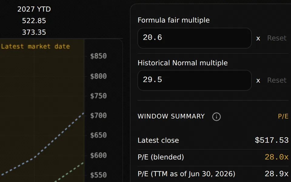
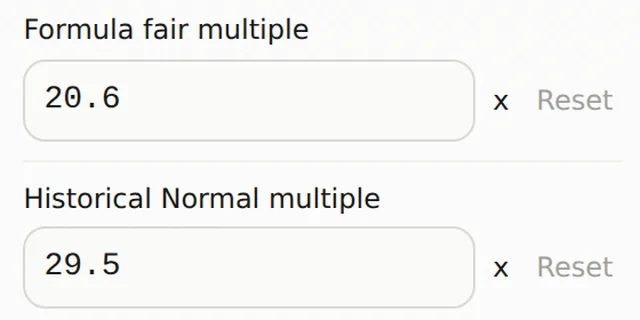
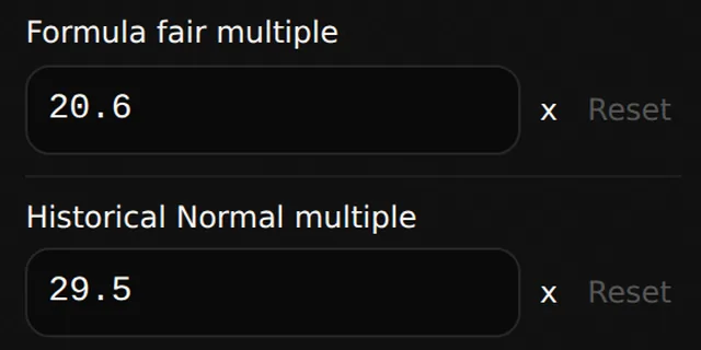
    Formula Fair Value uses a growth-based fair multiple for the chosen per-share metric. Historical Normal uses the stock’s trimmed average multiple for the chosen time span. In a single-company view, you can change either multiple to test your own assumptions and reset it to the computed value.

    • Custom inputs can change the value lines and output for that session
    • P/FFO is available for firms that report funds from operations data
    • Control price, multiple, value, dividend, and recession layers
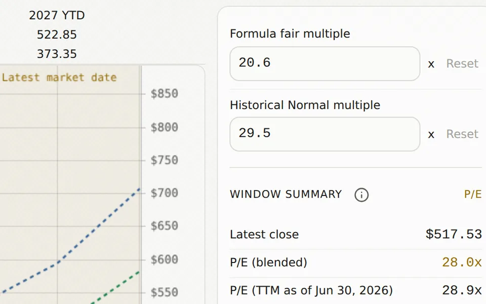
    Formula fair multiple and Historical Normal multiple inputs beside the Microsoft valuation chart.

    Information display

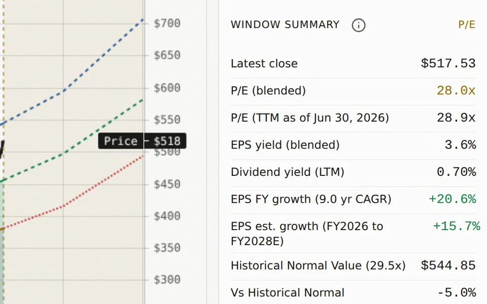
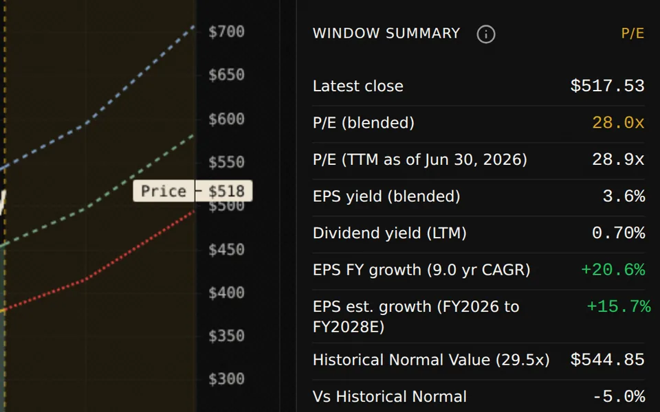
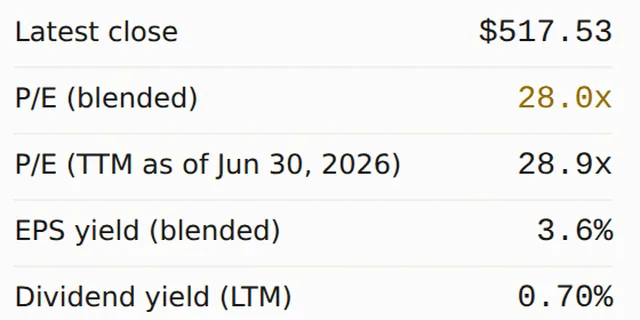
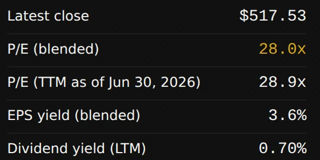
    The summary ties the latest close to the current multiple, metric yield, dividend yield, past growth, and expected growth. It shows premiums or discounts vs the value benchmarks and dated implied returns when forecast data is available. Hover over the chart to see details for one point.

    • Blended and trailing multiples show the basis being used
    • PEG and PEGY contrast consensus growth with past growth rates
    • Compare growth-adjusted ratios with their past median values
    • Implied returns show the target date and dividend assumptions
    Microsoft window summary showing the latest close, P/E ratios, yields, growth and Historical Normal valuation.

    Fiscal context

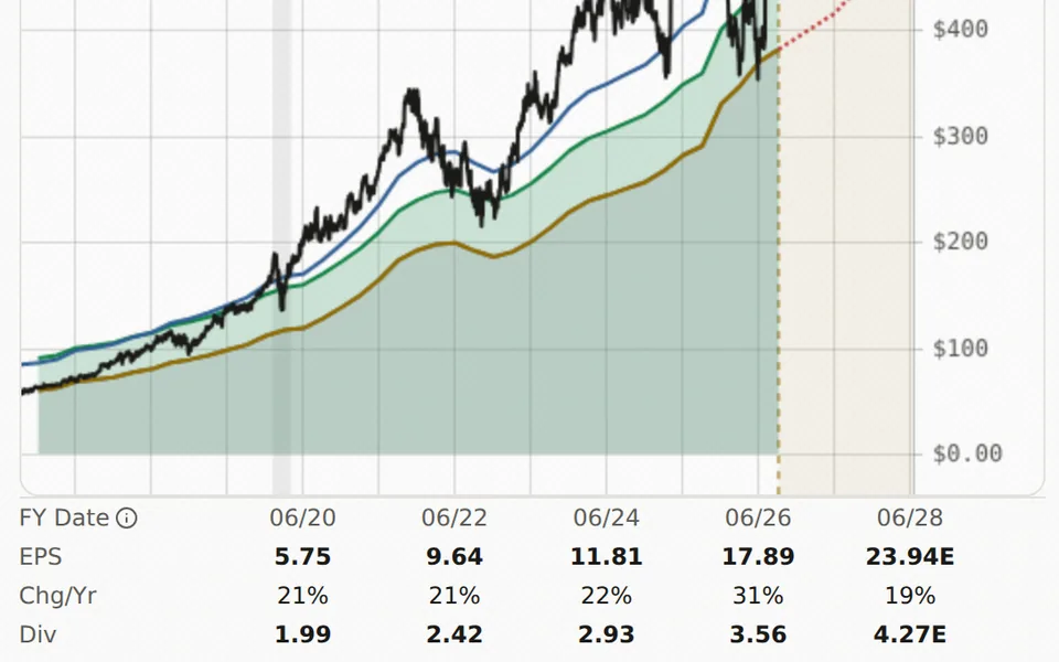
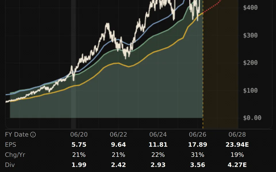
    The rows around the valuation chart line up fiscal-year highs and lows with the per-share metric, yearly growth, and dividends. Forecast columns are marked as estimates. Both preset and custom date ranges can change the past context without breaking the link between price and fundamental data.

    • Review fiscal data, metric values, growth figures, and dividends together
    • The forecast span uses the available estimates for the company and metrics
    • The readout is under the chart on small screens
    Microsoft valuation chart above fiscal dates, EPS, yearly growth and dividend rows with estimates marked E.

    Trends in dividends

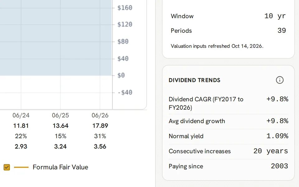
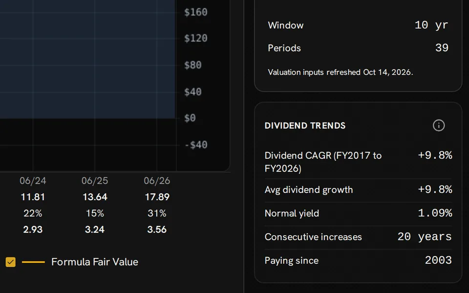
    For firms that pay dividends, track dividend growth over the chosen period, average annual growth, and the usual yield. The dividend history also shows consecutive increases and the year of the first payment when available, so you can connect income history with stock value.

    • Fiscal dividend values are split-adjusted and include special distributions
    • Regular dividend yields are shown separately in PEGY calculations
    • Past dividends and consensus dividends form separate layers on the chart
    Microsoft Dividend Trends showing dividend CAGR, average growth, normal yield, consecutive increases and the first payment year.

    Overlay of prices

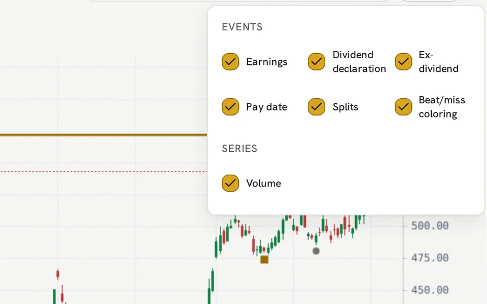
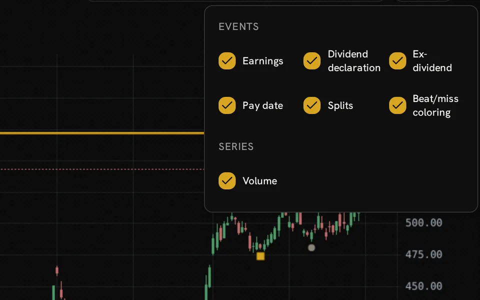
    Add markers for earnings reports, dividend declarations, ex-dividend dates, payment dates, and stock splits on the Price chart. You can also toggle the volume pane and the colors for earnings beats or misses so market moves can be tied to company events. The chart uses daily price data and shows the most recent market date.

    • Review past price moves with major events
    • Toggle event groups and the volume pane on or off
    • Pan and zoom to focus on the time span you need
    Microsoft Price chart with event markers and the Overlays panel showing earnings, dividend, split, beat/miss and volume controls.

    Comparison of multiples

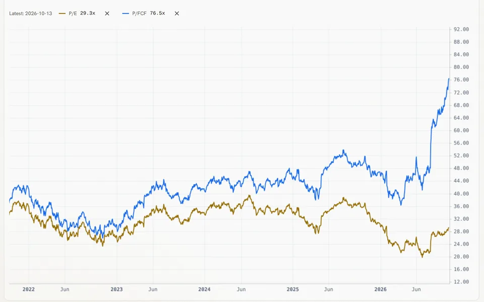
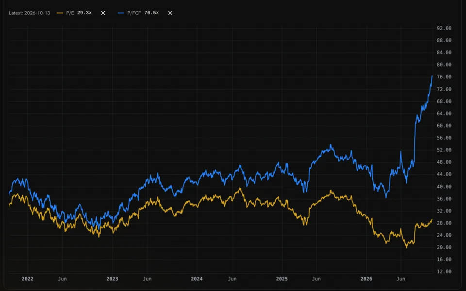
    The Multiple compare view lets you plot selected valuation ratios for one company on a single historical chart. You can add or remove comparison ratios, check values at chosen dates, and compare the current growth-adjusted figure with its past median when the data exists.

    • Compare earnings, sales, cash flow, and other useful multiples
    • Include PEG or PEGY forms in the comparison
    • Read the growth basis and consensus context for derived ratios
    Microsoft P/E and P/FCF histories on one chart, with both latest values and a shared date axis.

    Views that are saved

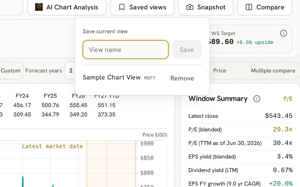
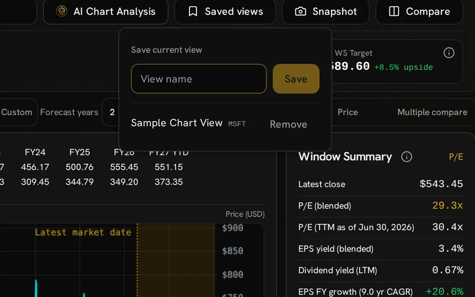
    Save a chart setup under a name so you can return to the same company, metric, time span, forecast choice, and chart view. You can open a view from the Saved views menu or delete one you no longer need. Limits on saved views and drawings are set by the tool, but free chart access stays free.

    • Saved setups keep the key overlay and comparison choices
    • Annotations are kept separately for each firm
    • Multiple overrides are session assumptions, not saved-view changes
    Saved views popover with a view-name field and an existing Sample Chart View for MSFT.

    Sharing charts

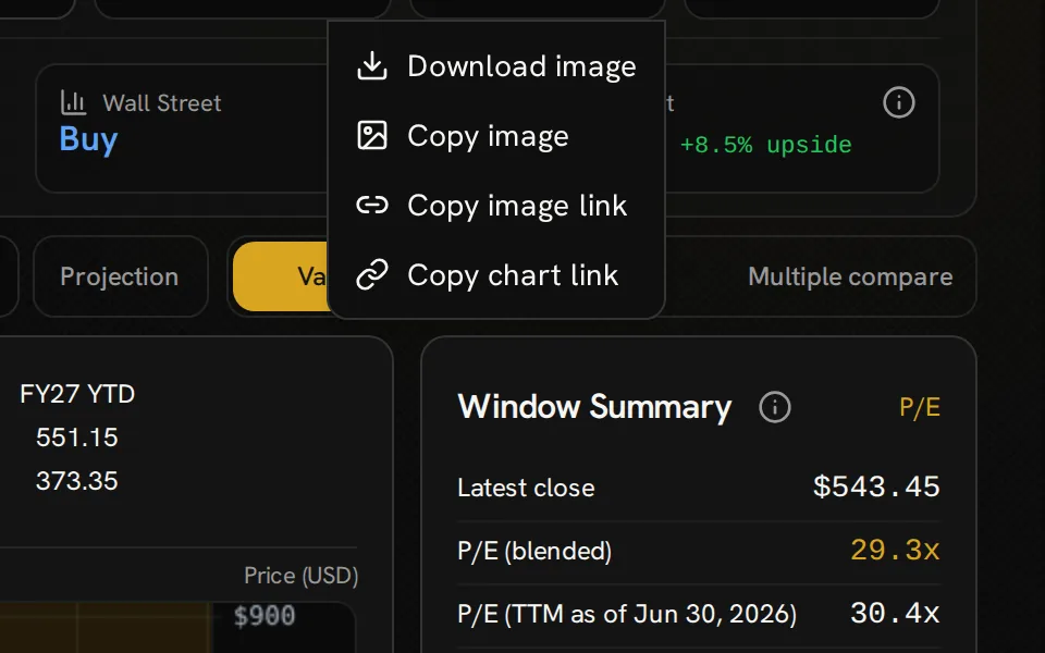
    Download chart images, copy them to the clipboard, or create a hosted image link for sharing. The copied chart link includes the selected company, metric, time span, view, and forecast settings. An image keeps the view as seen, while a chart link opens the tool with those same choices already loaded.

    • Image snapshots include the chart’s company and value context
    • Chart links can include the chosen comparison company
    • Private notes and custom multiple settings are left out of chart links
    Chart snapshot menu offering image download, image copy, image-link copy and chart-link copy above the Microsoft window summary.

    Context from GNG Analyst

    Launch AI Chart Analysis to ask the GNG Analyst about the selected company and chart setup. The analysis uses the chosen metric, past time span, value settings, and any projection or multiple comparison context, so you can discuss the logic behind the view.

    • Ask about value gaps, growth forecasts, or comparisons
    • GNG Analyst access and credit limits apply on their own
    AI Chart Analysis entry button in the Advanced Charting header above Microsoft company details, timeframe controls and valuation chart.

    Getting started

    How Advanced Charting works

    1. Select a company

      Search for a stock, choose a time span or create a custom date range, and select the multiple for charting, starting with the P/E ratio.

    2. Analyze the valuation

      Compare the current P/E with the normal multiple in the summary, then compare price with the Historical Normal and Formula Fair Value lines. Read the fiscal-year rows for context.

    3. Investigate a scenario

      Click Compare to show a second company beside the first, add forecast years, or select plotted points for a projection. The Price view shows price moves and key past events.

    4. Document your research

      Save your chart setup for later, download or share an image, and use the research tools to explore any open questions.

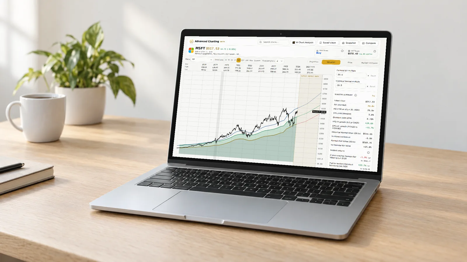
    Laptop on a desk showing Advanced Charting with the Microsoft valuation chart and window summary.

    FAQ

    Common questions about Advanced Charting

    Is Advanced Charting free?

    Yes. Valuation and price charts, daily multiples, estimates, comparisons, annotations, saved views, and snapshots are all free with a free GNG account, and it will stay free. The chart’s GNG Rating and Vulcan cards need Pro Lite or a higher plan.

    How can I tell if a stock is cheap or expensive?

    Compare the current multiple with its past multiples. A daily P/E well above its historical normal multiple suggests investors pay more than usual per dollar of earnings, and well below it, less. Formula Fair Value adds a growth-based view. Neither is a buy or sell signal.

    How is the daily P/E found?

    For days with usable positive earnings data, the chart divides the close by trailing twelve-month EPS, smoothed between reports. The latest reading may blend in an analyst estimate; the readout labels its basis. Missing or nonpositive earnings leave gaps.

    What methods do you use to judge fair value?

    Common methods include discounted cash flow analysis and valuation multiples. GNG Formula Fair Value uses multiples: it applies a growth-based fair multiple to a per-share metric like earnings. Historical Normal shows the stock’s standard multiple across your chosen time span.

    What makes a good P/E ratio?

    There is no single answer. Growth, risk, and earnings quality all matter, so compare the current multiple with the company’s past P/E data and the normal multiple in the summary. A negative P/E means the company is losing money. Look at other multiples like sales or cash flow.

    Are analyst estimates and projections guaranteed?

    No. Future lines use available analyst consensus, while projections estimate returns between selected chart points. They are estimates, not promises. Future results, pricing, and dividends may differ from the stated assumptions.

    Advanced Charting

    Create your free account, pick a stock, and see its P/E history.

    Free to join. No credit card. Takes seconds.

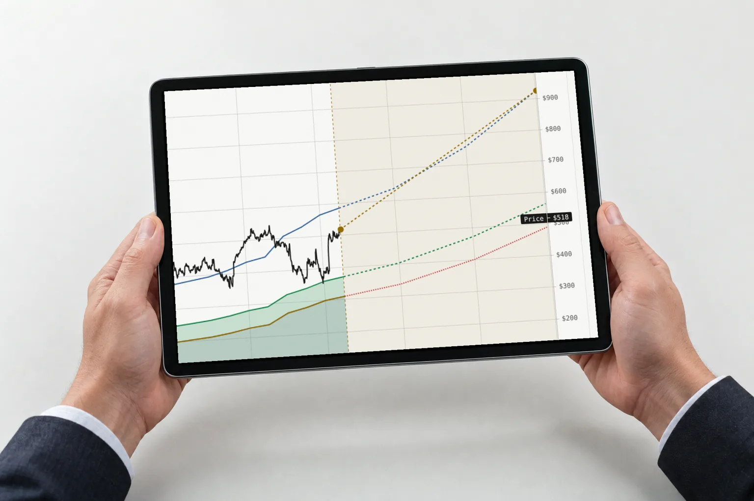
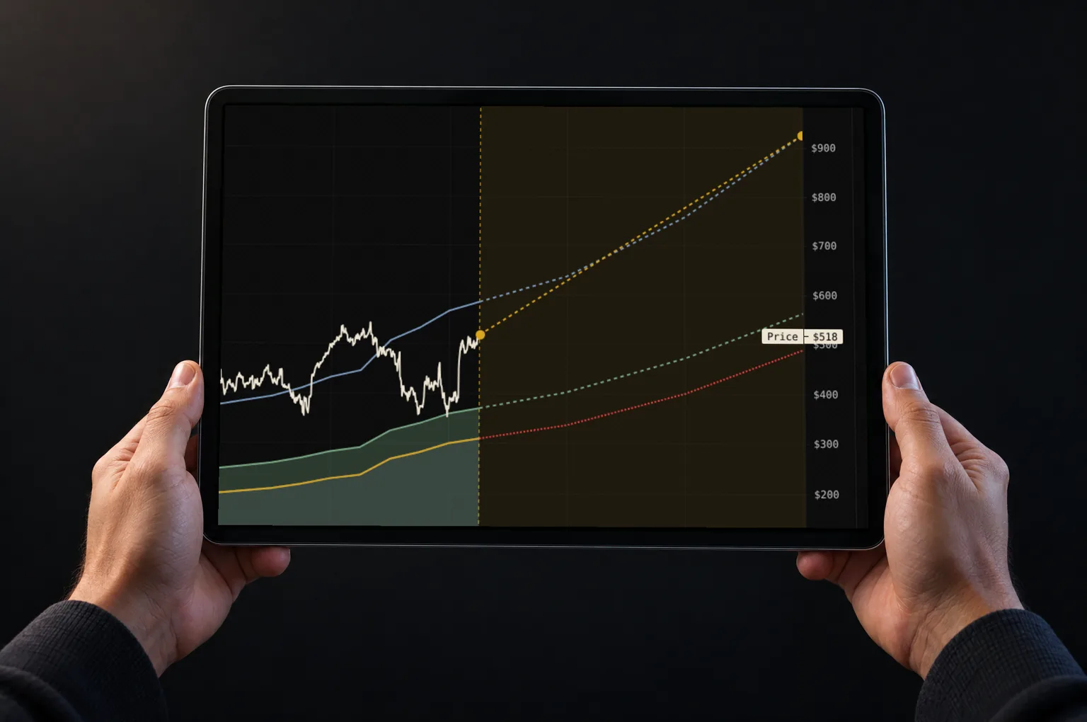
    Hands holding a tablet showing Microsoft price and valuation lines with dashed forecasts and projection endpoints.

    Formula Fair Value, Historical Normal, analyst estimates, and projections are calculations for research. They are not promises of future results or recommendations to buy or sell any security.