

Written by Jeremy Champagne
A Note From Leo
Today's article comes from Jeremy Champagne, and I'm thrilled to share it.
Many of you have asked how the VIX can sit around 15 while our portfolios swing every day. Jeremy found the answer, and he built an indicator to measure it. Right now, it suggests the VIX is roughly seven points calmer than it should be.
That matters. March showed how quickly the "brakes" can come off, and how fast great companies get sold alongside bad ones. This article helps you understand what's happening under the hood, so you're prepared rather than surprised.
It's one of my favorite MSA pieces so far.
Jeremy, thank you!
Introduction
The markets are increasingly rocky, yet the VIX doesn’t seem to care. In March, after the war in Iran broke out, it did its job and closed above 30. It has been in a downtrend ever since, down to around 15 as I write this, even though the average S&P 500 stock is still priced to swing about 11% in a month, against roughly 4% for the index.
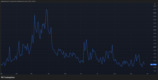
After reading the comments on Main Street Alpha articles, I realized I wasn't alone in noticing the market's never-ending calm while my portfolio kept swinging every day. Nate (ndardick) put it very well in a comment on an older article by Leo:
What is not a no-brainer, and scares me these days, is the fact that the VIX keeps falling below 15, evincing unjustifiable investor complacency in a challenging investment environment. - ndardick
The problem isn’t the VIX itself, which still uses the same formula as before. A combination of factors, from the S&P 500 construction to active market participants, converges to blind the VIX to what we are feeling.
While this is a complex subject related to market plumbing, in this article I will provide a high-level overview, offer my perspective on what is driving this phenomenon, and present the Hidden Panic Indicator, a composite indicator I built. Then I’ll cover how it relates to our theses regarding AI’s impacts on the market, and what I plan to do about it.
I'm excited to write this, but before we go on, buckle up: this article contains a lot of TLAs, three-letter acronyms, of course.
Why The VIX Looks Complacent
When markets get concentrated, common knowledge suggests they should become more volatile. This makes sense, as one company’s volatility matters more when it represents a larger share of the index.
However, idiosyncratic asynchrony, a fancy way of saying that the biggest companies now move independently, changes the math. Their moves are big, and they represent a large chunk of the market, but they don’t line up, so they partly cancel out at the index level. For example, on July 1st, Meta Platforms (META) surged 9% on reports that it would sell its surplus AI computing capacity, Micron (MU) fell 10%, and the S&P 500 barely moved.
These companies have intense volatility swings, and reduced correlation and increased dispersion (which here represents the expected performance gap between the market's winners and losers) work to keep the S&P 500 fairly stable and the VIX mathematically subdued.
The chart below lets us quickly visualize the relationship between the S&P 500’s implied volatility index (VIX), the market-weighted average implied volatility of its constituents (VIXEQ), and the implied dispersion between its constituents (DSPX).
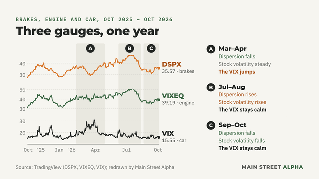
This is by design: VIX2 = VIXEQ2 - DSPX2. We can quickly see how single-stock volatility and dispersion cancel out, creating a calm index-level implied volatility conundrum. Put simply, the VIX measures volatility times alignment: how much stocks move, and how much they move together.
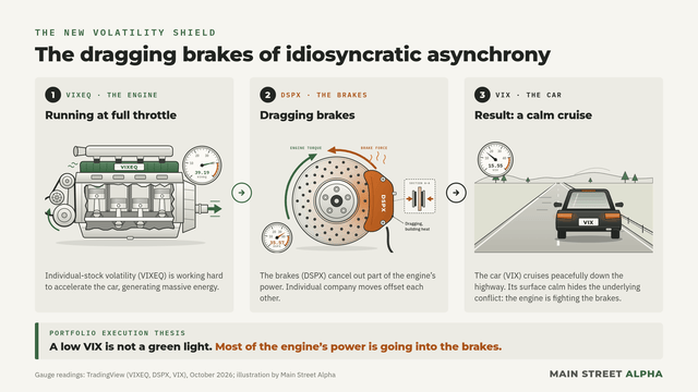
Think of it as a car on the highway with dragging brakes. The engine (VIXEQ) runs at full throttle, working hard to accelerate. At the same time, the brakes (DSPX) apply and cancel out part of the engine’s effort, so the car (VIX) appears to cruise peacefully on the highway.
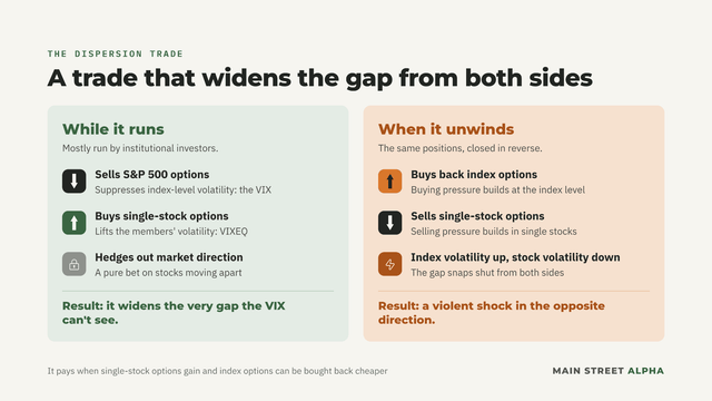
A second contributing factor is the dispersion trade. Mostly run by institutional investors, it sells S&P 500 options and buys options on its individual members, usually hedging out the market's direction. The bet is simply that stocks will keep moving apart.
When they do, the single-stock options gain value because those stocks move a lot, while the index’s options lose value because those moves cancel out at the index level, so the trader can buy them back cheaper. That trade widens the gap from both sides: selling index options in size suppresses index-level volatility, while buying single-stock options lifts it for the members. It widens the very gap the VIX can't see. As you can imagine, unwinding these trades creates a violent shock in the opposite direction, as buying pressure builds at the index level and selling pressure builds in single stocks.
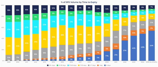
A third factor is where options trading has moved. The VIX is built only from S&P 500 options expiring 23 to 37 days out, blended into a 30-day reading, so anything shorter never enters the formula. Meanwhile, same-day options, known as 0DTE, have become the busiest corner of the market: they made up about two-thirds of all S&P 500 options volume in July, a record, according to Cboe. When a trader buys protection in the morning and closes it by the afternoon, that fear is real, but it lives and dies inside a single session, and the VIX never sees it.
Other factors could be at play, like the growing assets under management (AUM) of covered-call funds. However, Cboe claims the main factor is the first one I outlined: dispersion cancels out single-stock volatility. It says the other factors may contribute, but with little impact.
The Hidden Panic Indicator
Many investors use the VIX as shorthand for market anxiety, and that has worked for the past few decades. Now, the decoupling between its reading and what some investors feel is driving anxiety.
After spending many hours trying to find an index or measure that matched how I felt, I stumbled upon the ones I charted earlier (VIXEQ and DSPX), as well as the SKEW index.
The SKEW index measures the market’s perceived risk of a black swan event by comparing the price of out-of-the-money puts with out-of-the-money calls. Essentially, if the former rises faster than the latter, investors are paying a premium for insurance against a large market drop.
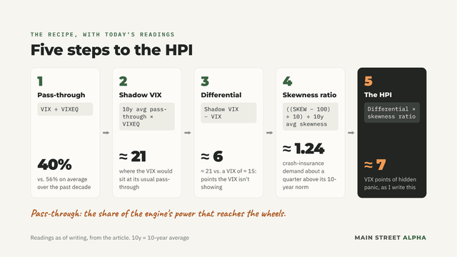
Since none of these provided a satisfying answer, I began looking for ways to relate them. I built the Hidden Panic Indicator (HPI) in 5 steps, and I’ll give you today’s readings along the way.
Step 1: Measure The Pass-Through
Analyze exactly how much of the stocks’ volatility, shown by VIXEQ, reaches the index’s volatility, the VIX.
Pass-through = VIX / VIXEQ
Back to our car: this is the share of the engine’s power that reaches the wheels. Over the past decade, about 56% of it got there on average. Today, just 40%. The rest is going into the brakes.
Step 2: Calculate The “Shadow VIX”
This calculates what the VIX would be based on the current VIXEQ value and the 10-year rolling average of the pass-through.
Shadow VIX = 10y-average pass-through * VIXEQ
Step 3: Calculate The “Shadow VIX” - VIX Differential
Subtract the VIX from the “Shadow VIX”.
Differential = Shadow VIX - VIX
Today, the Shadow VIX reads about 21, against a VIX of about 15. That’s roughly six points the VIX isn’t showing.
Step 4: Calculate The Skewness Ratio
Cboe defines the SKEW index formula like this: SKEW = 100 – 10 * S, where S represents skewness. The goal is to extract S as a positive value for charting, which amplifies changes in SKEW, and divide it by its 10-year average to get a ratio.
Skewness Ratio = ((SKEW - 100) / 10) / 10-year average skewness
Today, the skewness ratio comes at about 1.24.
Step 5: The Hidden Panic Indicator
By combining the above, we can gauge how distorted the VIX is relative to VIXEQ and incorporate the investor’s appetite for tail-risk insurance to mathematically capture market “panic.”
To do so, I simply multiply the differential by the skewness ratio.
HPI = Differential * Skewness Ratio
Or
HPI = ((10y average of VIX/VIXEQ) VIXEQ - VIX) ((SKEW - 100) / 10) / 10-year average skewness
Put together, today’s HPI reads about 7.
The HPI In A Chart
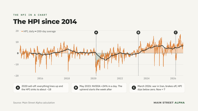
In the chart below, I computed the HPI over the longest horizon I could, back to 2014, when VIXEQ started. To make the chart as long as possible, I set the 2014-2024 period to use the 10-year average VIX/VIXEQ for the entire period rather than a rolling average, which starts in 2024. That means the early years are measured against an average that includes later data. The SKEW goes back to 1990, so I use its 10-year rolling average for the whole chart.
I added a 200-day average to smooth it out and help us see trends through short-term noise; for now, it has no other use.
What This Tool Represents
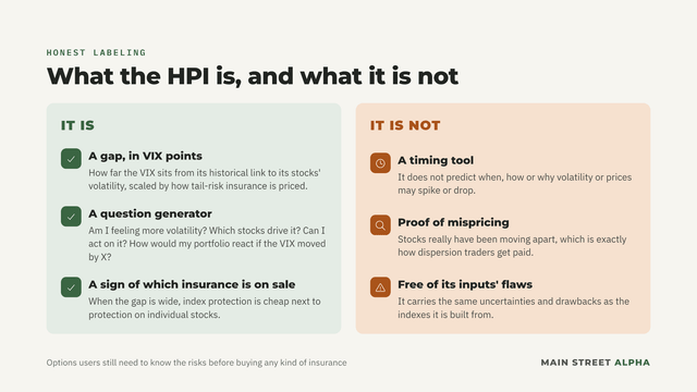
I want to be really honest about what the HPI is and what it is not. It measures, in VIX points, how the VIX is moving relative to its historical relationship with the volatility of its underlying companies, multiplied by how the market is pricing in tail-risk insurance.
In plain words, it reflects how many points the VIX would have to move to return to its historical norm, based on the market's perceived risks. We can use it to ask ourselves different questions: Am I feeling more volatility? Which stocks are driving it? Can I do something about it? How would my portfolio react if the VIX moved by X?It also matters for options users. When the gap is wide, protection on the index is cheap compared with protection on individual stocks. That isn’t the same as mispricing, because stocks have really been moving apart, which is exactly how dispersion traders get paid. But it does tell options users which kind of insurance is on sale, provided, of course, that they know the risks.
One thing the HPI is not: a timing tool. It does not predict when, how, or why volatility or prices may spike or drop in the market. It inherently carries the same uncertainties and drawbacks as the underlying indexes it uses.
The Limitations
As I mentioned earlier, the data is very young: the VIXEQ starts in 2014, so it is experimental in a sense. Over time, we will likely find more ways to use it, refine the formulas, adjust the rolling-average periods, and learn how it reacts to different cycles. For now, keep that in mind.
Also, a relatively short-term rolling average period (10 years) lets us quickly spot regime changes in the market, but a regime that lasts slowly becomes the new normal. Since mid-2023, the VIX has carried far less of its stocks’ volatility than it did in the decade before. If that lasts, the 10-year average will treat it as normal by about 2033, and the HPI will drift back toward zero even if nothing about the market has changed. This limitation, of course, comes from limited data, and I’m looking forward to experimenting more as new data comes out.
Technological Revolutions And Their Impacts
Looking back at the HPI chart, some of you may have noticed the uptrend that started in 2023, the year AI went mainstream. ChatGPT reached 100 million users in two months, and Google (GOOGL), Meta (META) and Amazon (AMZN) raced to launch their own models.
The uptrend really started the week after NVIDIA (NVDA) jumped 24% in a day on its May guidance. That is when investors realized AI was starting to have real market impact and that it could become immensely profitable for companies down the line.
Since that week, the HPI has been positive nine days out of ten. Before it, less than half.
We suspect that AI's general trends, and the technology itself, cast a veil over long-term forecasts because of disruption risk. A 2009 study by Ľuboš Pástor and Pietro Veronesi, published in the American Economic Review and the 2024 Stephen A. Ross Prize in financial economics winner, examines how technological booms influence the market. It covers innovations from the rail expansion to the dotcom bubble.
The Price Of Not Knowing
One of their main findings, and frankly the one that surprised me the most, is that uncertainty makes the “new economy” stocks expensive. We are wired to think uncertainty translates to risk and thus warrants a discount, but at first, when it comes from innovation, the opposite is true.
If we stop and think about it, it makes a lot of sense. Let’s think this through from the lens of a Mag7 investor. These are mostly high-quality companies, and therefore investors see their “legacy” businesses as the floor. No matter what happens, YouTube revenue comes in, iPhones sell, and delivery trucks roam the streets.
Because this becomes the perceived floor, investors now try to price in open-ended, long-term earnings growth. No one knows how profitable this CapEx will be or how long it will last, and that uncertainty drives higher valuations because the range of outcomes is enormous and the upside counts more than the downside.
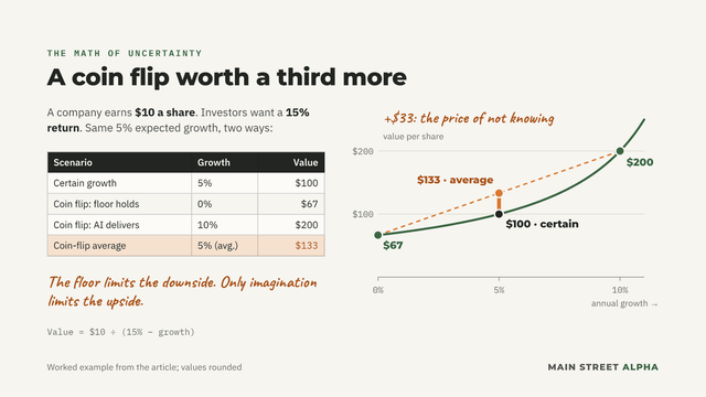
By using a “quick and dirty” approach, we can visualize how this could affect valuations. Take a company with $10/share of earnings and investors who want a 15% return. If it’s certain to grow 5% a year, it’s worth $100. Now make growth a coin flip: 0% if the legacy business just holds the floor, or 10% if AI delivers. At 0%, it’s worth $67. At 10%, it’s worth $200. The average is $133, a third more than the “certain” price, for the same 5% average expected growth. The floor limits the downside. Only imagination limits the upside.
Learning Adds Volatility
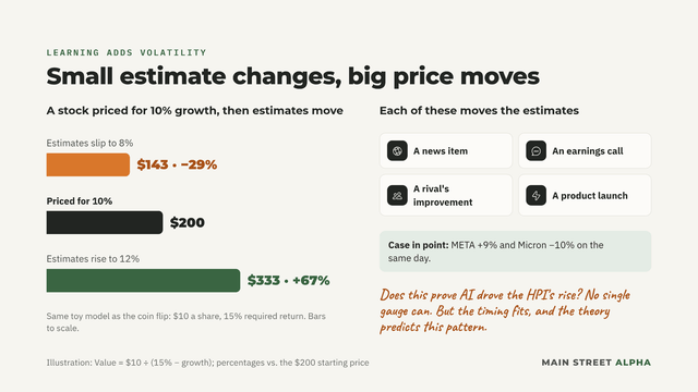
The same math explains the added volatility. When estimates move by a few points, the repricing is instant and violent. When a stock is priced for 10% annual growth and estimates move to 8% or 12%, the stock moves accordingly.
Every news item, earnings call, competitor improvement, or product launch moves estimates, driving the elevated volatility.
Learning how a new innovation affects the market and its companies makes investors react strongly. The example I outlined earlier, with Meta jumping 9% and Micron stumbling 10%, fits this narrative well.
Does this prove AI drove HPI’s rise? No single gauge can. But the timing fits, and the theory predicts exactly this pattern.
How Revolutions End
When the technology starts, its risks are mostly company-specific, which increases uncertainty and valuations for the companies behind it because long-term outlooks are clouded.
As adoption spreads, investors start pricing these risks into the broader market, which drives valuations down as they demand higher returns to compensate. This happens even when the innovation is successful. The Nasdaq in the dotcom era illustrates this well. It quadrupled from 1996 to 2000, then tumbled back to its 1996 level, even though the internet was a transformative technology. Meanwhile, its volatility more than quadrupled.
The Following Rotation
The study also found that the end of a revolution hits the whole market, but not evenly: the innovators fall hardest.
Usually, as adoption grows, both new- and old-economy stocks fall, and they bottom out once the economy has largely adopted the new technology. Old-economy stocks usually fall less because their valuations were generally less stretched, and they start to benefit from the productivity gains. While they fall less, these stocks can still incur painful losses, though a broken stock price does not mean a broken company.
The paper's railroad data shows it clearly. Between mid-1853 and late 1857, railroad stocks lost 58%, while the rest of the market lost 34%. The internet boom followed the same blueprint: the Nasdaq and the broader market both bottomed in 2002, once technology was everywhere.
The way I see it, the main long-term beneficiaries of a new technology are those who put it to work to increase productivity, not those who build it.
So, Should We Brace For More Single-Stock Volatility?
The first question that came to mind when I saw the HPI results was: should we prepare for more single-stock volatility? My answer is: yes, but also for the days it stops being single-stock volatility.
The study says revolutions start with the market pricing in company-level risks and end by applying those risks to the whole market. The HPI measures how much of the market's risk is still company-specific, so it is well suited to tracking how volatility spreads.
Using the general sequence provided in the paper, I believe we are still in the first act. Correlation is low, volatility is high and mostly concentrated in AI-adjacent companies, and the broader market is relatively calm, although other factors are also driving market pressures.
By adding the HPI to the VIX, we get the Panic-Adjusted VIX, which shows where the VIX would read if it returned to its historical norm. Today, the VIX sits about seven points below it. The chart overlays the two, and the gap between them is the panic the VIX isn't showing.
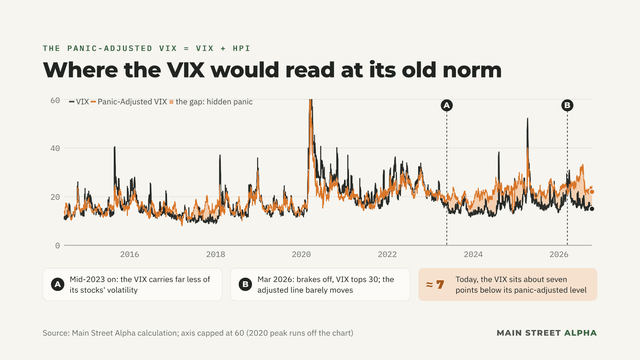
In March, after the war in Iran broke out, the brakes disengaged. Implied correlation rose sharply, dispersion fell, and the engine’s power pushed the VIX above 30. The HPI then turned negative as the VIX outran its historical relationship with stock-level volatility, signalling a global risk event. Meanwhile, the Panic-Adjusted VIX barely moved, because the engine barely changed; only the brakes did. Today, the Panic-Adjusted VIX reads about 23, right where it sat through the whole March scare. The engine is revving about as hard as it was then. The VIX just isn’t showing it.
Before we go further, I want to remind you that this is a theoretical exercise, and investors should be aware of the risks, especially since I am referring to a very young indicator. The following analysis is meant as a thought experiment, and you should not use it as a sole source of information.
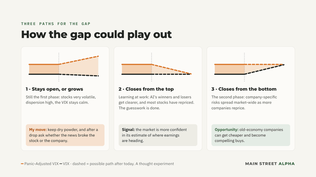
The gap between the VIX and the Panic-Adjusted VIX can move in three ways, each affecting stock prices differently. Our TOLL+M and PLOW+M frameworks apply to all three, forcing us to question how protected cash flows are and whether the company can use them to generate shareholder value. While stock prices are uncertain and can move quickly, the frameworks help us identify what's worth owning so we can prepare our next move.
The gap stays open, or grows: We are still in the first phase of the innovation pattern. Stocks are still very volatile, and dispersion is high, meaning that the VIX stays calm. Here, I would revisit the questions I raised earlier and keep some dry powder to add to my favourite companies after assessing whether the news broke the stock or the company.
The gap closes from the top: This is learning at work, as AI’s winners and losers become clearer, and the Panic-Adjusted VIX falls back toward the VIX. This means most stocks have repriced, and the market is becoming more confident in its estimate of earnings' future trajectory. In other words, the guesswork is done.
The gap closes from the bottom: The VIX catches up to the Panic-Adjusted VIX, meaning we are entering the second phase of the innovation pattern. Company-specific risks are now spreading across the market, driving market-wide moves as more companies reprice. This is where “old-economy” companies can become cheaper and offer us a compelling opportunity to buy.
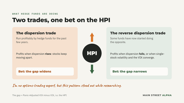
I’m no options-trading expert, but while researching this article, I found an interesting pattern. Hedge funds have run the profitable dispersion trade for the past few years, profiting from increases in dispersion. Now, some have started doing the opposite, reverse dispersion trades. By doing so, they aim to profit from a reduction in dispersion, or from single-stock volatility and the VIX converging. Both these trades are basically a bet on the direction of the HPI, and therefore on the gap between the Panic-Adjusted VIX and the VIX.
As a long-term investor, I see the market pricing in more risk than the VIX currently reflects. Single-stock volatility is very high, and out-of-the-money put premiums have consistently stayed above their 10-year average since 2023. With no defined market-wide risk yet, I expect sudden moves in my holdings rather than a sudden drop in all of them, but March showed how quickly that can change. So I am adjusting and planning the dry powder I want to hold, and the best way to deploy it, so I am ready when the opportunity arises.
Takeaway
The VIX isn’t lying. It measures volatility times alignment, and since NVIDIA’s May 2023 guidance, stocks have been volatile but out of step, so the index reads calm while our portfolios swing.
The HPI puts a number on the difference: roughly seven points of panic the VIX isn't showing as I write this. And March showed what happens when the brakes fade: everything lines up at once, and the VIX catches up in days.
I believe we are still in the first act of the AI revolution. So I’m preparing for two things: single-stock swings now, and a sudden lining-up later. That means sizing positions for both, keeping dry powder ready, and owning businesses a sell-off can’t break, even when it breaks the stock.
The dashboard says we’re cruising. Under the hood, the engine is revving at a high RPM, and the brakes are getting hot.
Sign in to leave a comment and join the discussion.
Sign Up Free